We are nearing the end of our second order entry sprint and we would like to inform you of the progress we have made so far.
The sprint began on the 5th of April and we had the following already worked on from the previous sprint as shown here Order Entry UI Sprint 1 Progress:
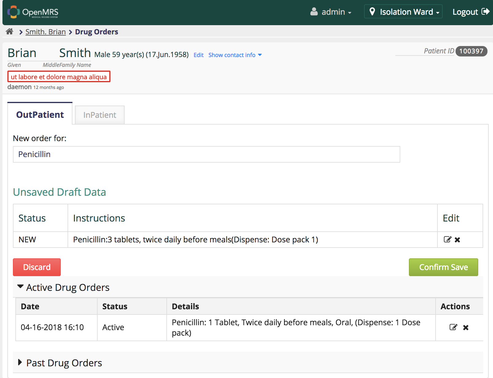
A re-design of the drug order entry page.
Implementation of the navigation bar.
Implementation of the breadcrumb functionality.
Implementation of the patient information header.
Implementation of the tabbing functionality for the inpatient and outpatient.
In this second sprint, we were able to complete a few other features:
Drug search functionality.
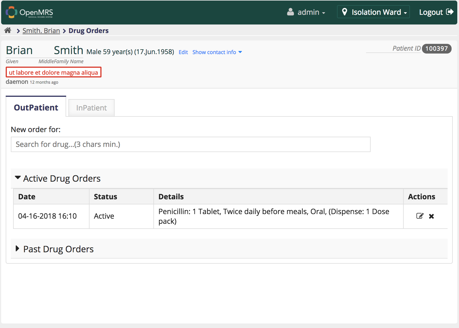
Active drug orders display functionality.
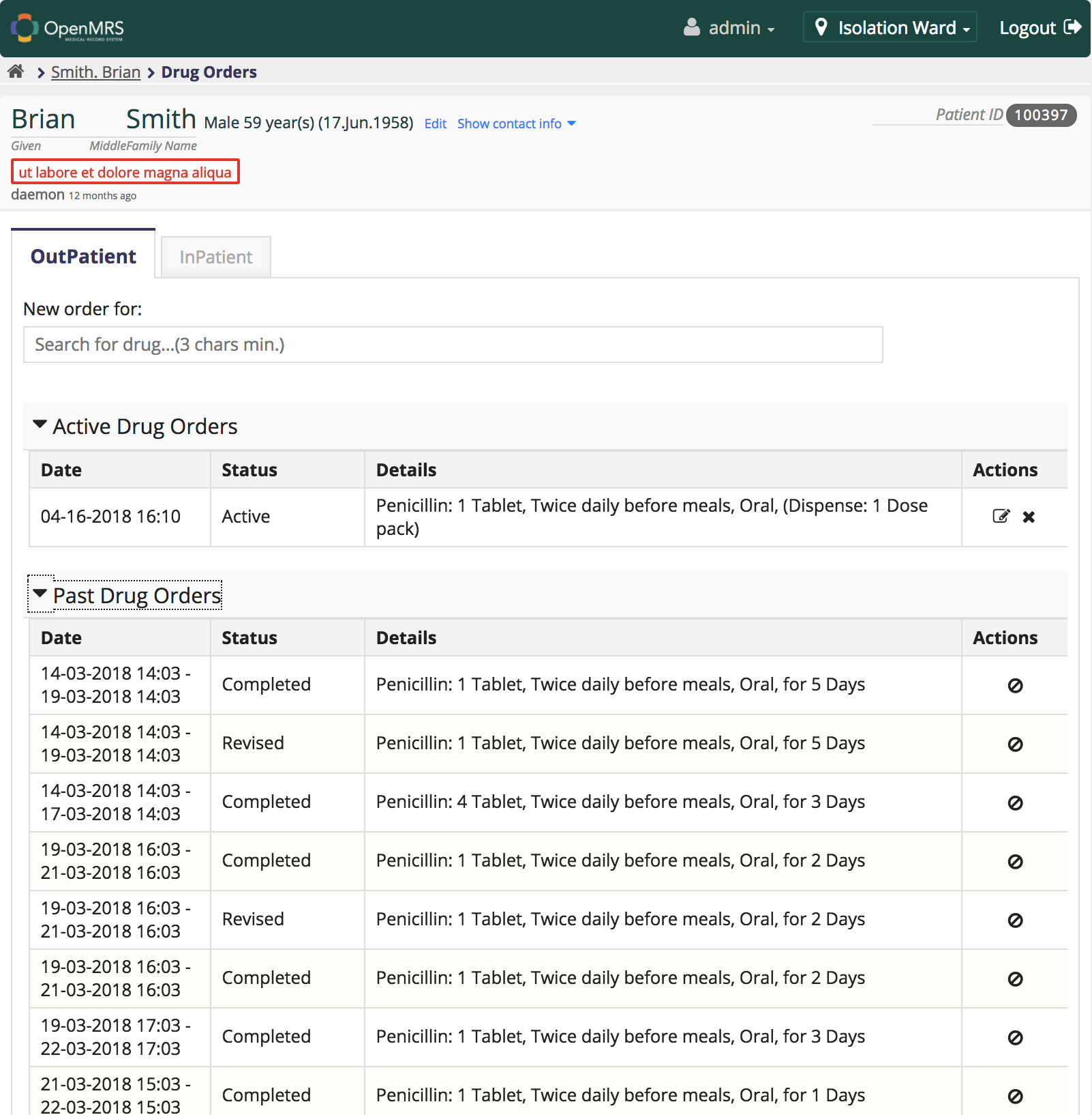
Past drug orders display functionality.
Implementation of the accordion for the tap display of active and past drug orders.
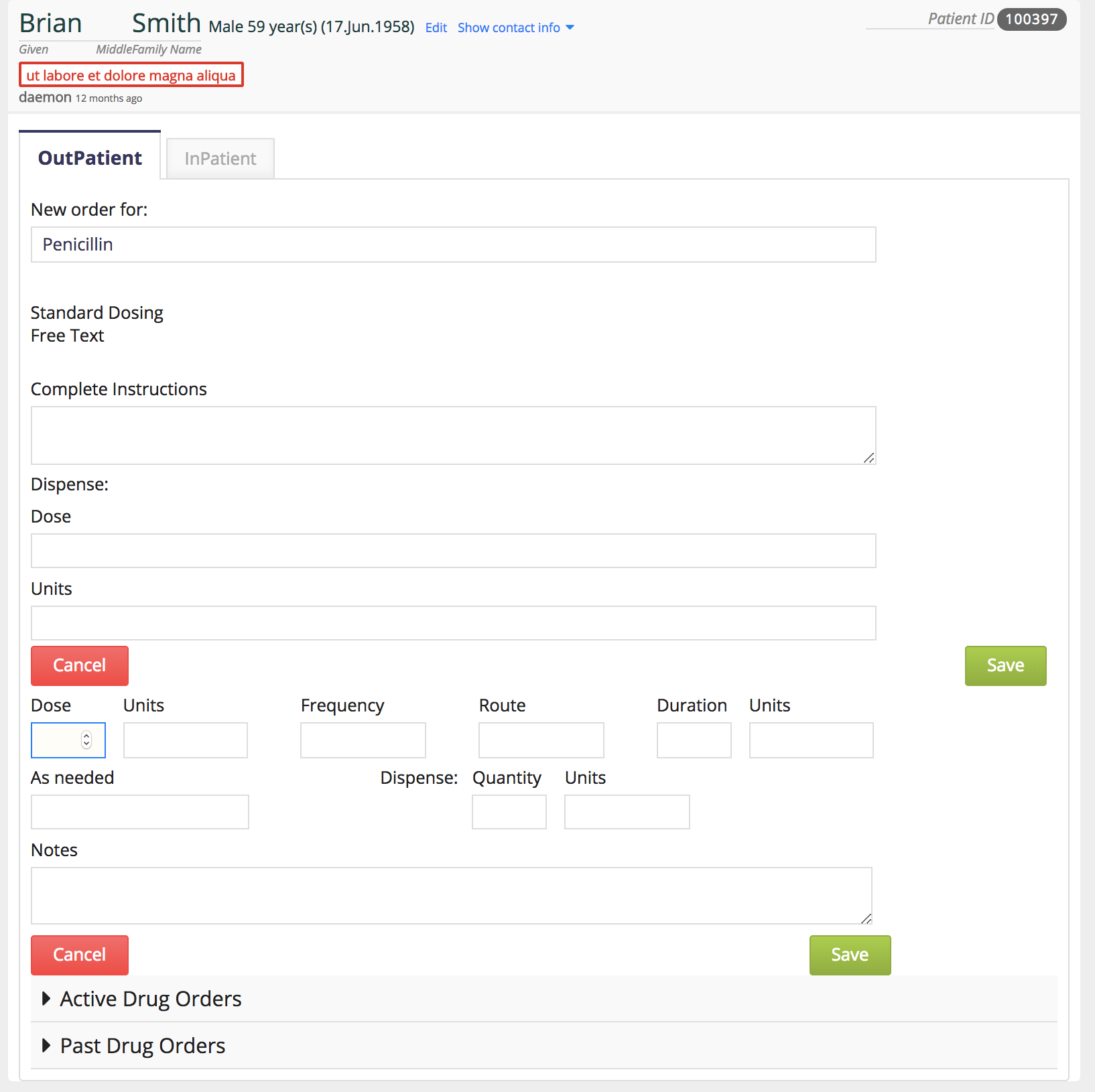
Styling of the standard dosing form.
A table that shows what a user is about to order before the user actually orders.
Check whether the encounter type is available as a global property for it is needed when adding and editing drug orders.
There is a heading like “Active Drug Orders”. So it will contains all the active drugs list. Then why the list want to show the Status as Active for all rows. Better to remove that column but it will affect the consistency among other tables.
Unsaved Draft Data table contains a heading as “Edit”. Since that column contains the edit and delete buttons, better to rename as “Actions”
Keep the alignments of the Save buttons and text boxes along with other pages.
Exciting to see this progress! I was disappointed after the first sprint to see us reimplementing all the header functionality in a way that shouldn’t need to be continually repeated, so I’m much happier to see that you’re now building the real Order Entry functions.
I have one UI comment:
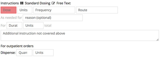
First, when I was trying to implement this I spent a long time tweaking the Standard Dosing screen, under the guidance of @jteich. We ended up with this (the grouping and text hints are important):
I would suggest to make it look just like that, until we’re able to get feedback from doctors who will use this tool. (I like the current screenshot in your post less.)
 ! Thanks for the awesome work.