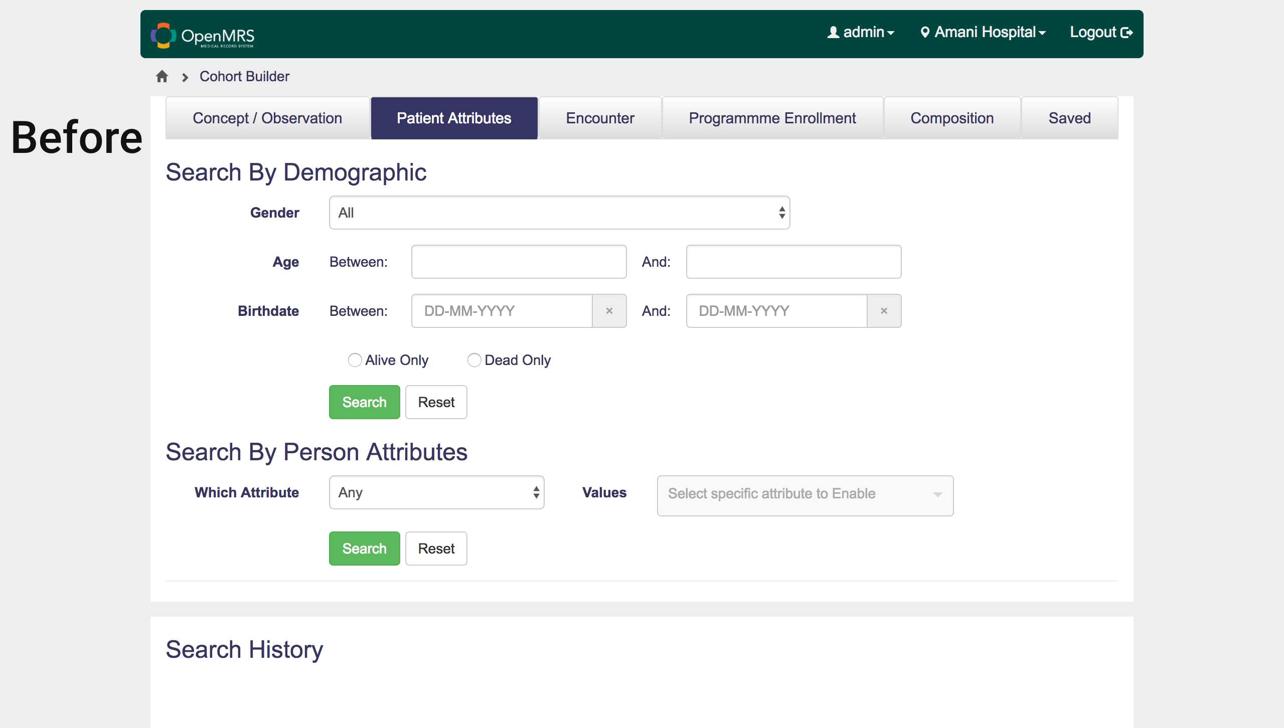
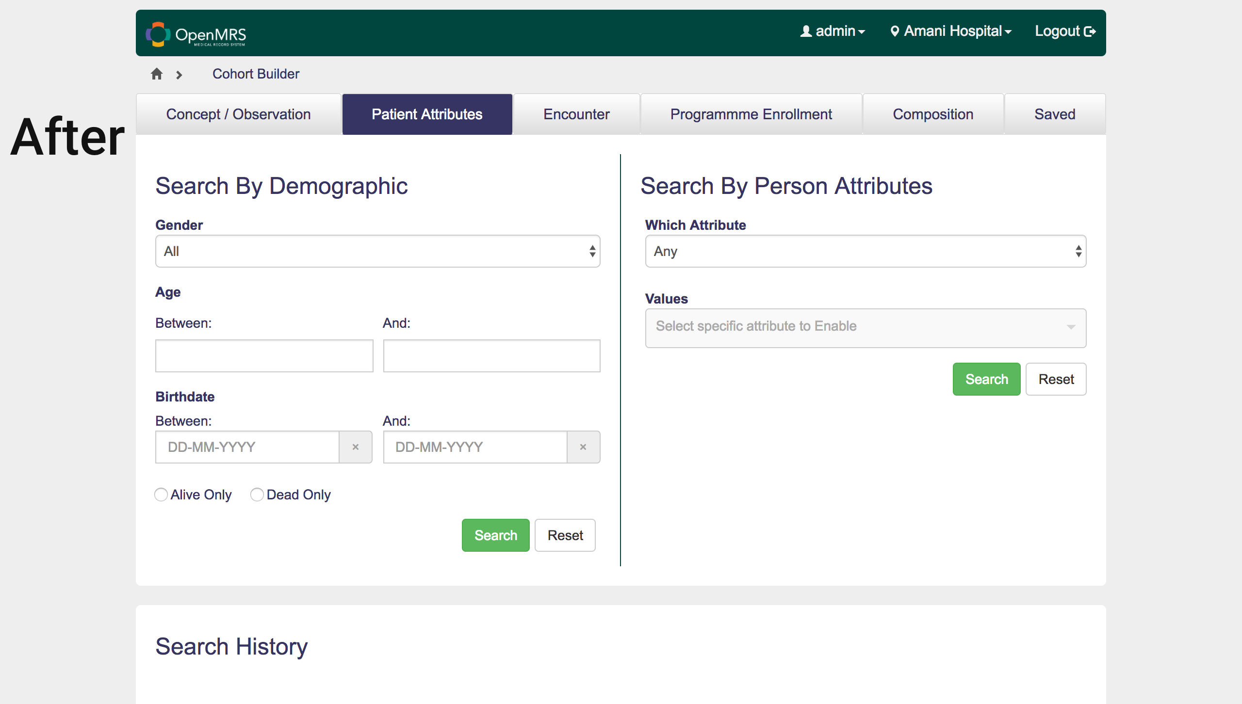
Hi everyone, good day. We’re looking to include a little restructuring we made in one of our component’s user interface for cohort builder OWA in the beta version that will be released soon. Therefore, we would please need your suggestions on whether to keep the current user interface labeled “before” or the restructured interface labeled “after”; we will also appreciate any other feedback on the UI design. Below are the images of the two interfaces
@suthagar23 what do you think about the design proposal above?
Can you have both?
@ssmusoke The current design labeled “before” uses list view, but the current design labeled “after” uses grid view. So please how do you suggest we have both? Any ideas as to how we can merge both views?
I prefer After. (Just to verify you’re asking if these can be side-to-side instead of vertical?)
Taking a step back, though, I’m not sure it’s intuitive to have these two things on the same tab. I wonder if it’s better to have the first on a tab called Demographics, and the second on another tab called Attributes.
(In the even bigger picture I wonder if there’s a better approach than tabs that may have multiple possible queries inside them. But that’s a question for another day.)
Another option would be vertical tabs.
@kingisaac95 Amazing 
I have some feedbacks about the After Tag
-
Can you check the Breadcrumbs, It differs from the usual one what we are having.
-
You are using Grid view for Search By Demographic and Person Attributes. Normally we haven’t this type of search options in the web applications. Simple you can put two Radio buttons above the search component and ask to select one to get the respected search form (default select one radio button). When user click on the radio buttons, It should respond and show the respected search forms below
-
Normally we only have one body part in the OWA(like that one white container part). But you have defined two bodies for search and search History). Can you make it into one body? In my idea - Just show search form in the body and create one button for search history. When user click that search history then show a pop up(best user experince) or redirect to another page (poor user experience) to show the Search History

-
Can you implement a home page for this OWA and implement larger buttons on the home page with this following buttons (Main components of your OWA) - Like large buttons in Re-Application HomePage (1). Then we can remove those top menus in the OWA.
- Concept / Observations
- Encounter
- etc
AFIK, These are just my comments . @dkayiwa Can you please review it?
Thanks @darius @lluismf and @suthagar23 I will adjust the design and repost it here later today while waiting for @dkayiwa’s opinion too.
Thanks for taking out the time to review.

I assume the whole idea is to give the user a choice between two somewhat different types of search – that is, you would never be filling in fields in both the Demographics and the Attributes form. In that case, the After version is much more visually supportive of this workflow, compared to Before – but I agree with @suthagar23 that the best idea would be to toggle between the two form types at the very beginning, and then show only that form on the screen.
Yes, it’s one extra mouse click, but in this case you more than make up for it with a clean form; the user never has to wonder if they need to put something in the other form’s fields.
Jonathan
Thanks @jteich The suggestion is really sound. I am currently working on a redesign using Bootstrap Accordion and I’ll be submitting it here for review by Monday
1 Like
Hi Kingdom,
I suggest that if you are considering that kind of redesign, to think about what it would look like for all of the searches, and not just the two that are on that tab.
(Maybe that’s already what you meant by using the accordion.)
-Darius (by phone)
Thanks @darius I’ll put that into consideration
Here a picture of the component now using accordion that the user can select. On first load the page looks like this

The user can then click on “Search by person attributes” and the other form will be revealed

Please what do you think of this design?
cc: @dkayiwa @darius @jteich @suthagar23n @lluismf @ssmusoke @jeiddiah @millicent @upendo
1 Like
It does show only one form now, but I think it’s not quite clear that there are two distinct types of searches available on this tab, because the Attribute search is way down the screen and isn’t easily recognized as a button. I would still suggest something at the top, perhaps with a radio button control or push buttons.
Should they actually just be two separate tabs??
I like it, but I’m not a UI expert. At least it’s flexible (more sections can be added easily if needed).
I like this less than your previous mockup, for the same reason that Jonathan says: it’s easy to miss the other option (unless all the accordions start out closed).
In the whole picture I think it’s a mistake to have (1) tabs, and then (2) some other navigation approach within the tabs.
The quick fix is to split these two forms onto two different tabs (“Demographics”, and “Person Attributes”). In the big picture you should look at how many total different kinds of searches there are across all the tabs, and consider whether it makes sense to list out all of them at the top level (maybe using vertical tabs, or accordion).
1 Like
Thanks @darius
@darius about your suggestion - “In the big picture you should look at how many total different kinds of searches there are across all the tabs, and consider whether it makes sense to list out all of them at the top level (maybe using vertical tabs, or accordion).” - I thought about it and then looked at the functionalities of each of the tabs we have in the cohort builder. 6 tabs out of a total of 7 are for searching different sub-sections/data of patients using the OpenMRS application. This brings me to thinking: since basically all tabs are for searching, why should we add another home component for all the searches again? I may about this so I’m open to your clarification.
Our goal is to have a UI that our users will find engaging and easy to use, and I’m happy you all are helping me in achieving that goal. Thanks
cc: @dkayiwa
@kingisaac95 I guess I didn’t explain what I was trying to say well enough.
Looking at all of the different searches I see:
- Concept/Observation tab
- by concept -> for obs
- Patient Attributes tab (these two do not make intuitive sense together, so should be split out)
- Demographics
- Person Attributes
- Encounter tab
- Encounter
- Location (This doesn’t make sense on an Encounter tab, it should get its own tab)
- Program Enrollment tab
- Program Enrollment
- Drug Order
- Taking Drug
- Stopped/Changed Drug
- Composition tab
- Composition
- Saved tab
- Saved definition
- Saved cohort
In most of the cases where we have two different forms on the same tab, it does not actually make logical sense to have them together. So, my suggestion is to redo the design of “do a search” from scratch, and consider getting rid of these horizontal tabs (since they’re not the correct grouping).
Instead, we have 11 individual kinds of searches (those are the second-level things below the tabs), each of which could have a recognizable name, and we could put these 11 searches together in some new UI that you’d design. For example you could have 11 vertical tabs, and whichever you click on displays its form to the right. Or it could be an autocomplete text box for “What search do you want to do?” and if you type “Enc” and choose “by Encounter” you get the form for that search.
Now, in practice these would be big changes, and I imagine you’re not looking to do a wholesale redesign of the cohort builder UI now. (If you are, I’m happy to look at possible mockups…)
So in real life I suggest that you just do something much more simple:
- Add a new tab titled “Demographics”, as the very first tab
- if this doesn’t fit, then rename the “Concept / Observation” tab to just “Observations”, which is actually what it should be called.
- Move the “Search by Demographics” form to that tab.
3 Likes