I love the idea.
@darius That’s amazing.I love the idea too.
Good idea @darius  .
.
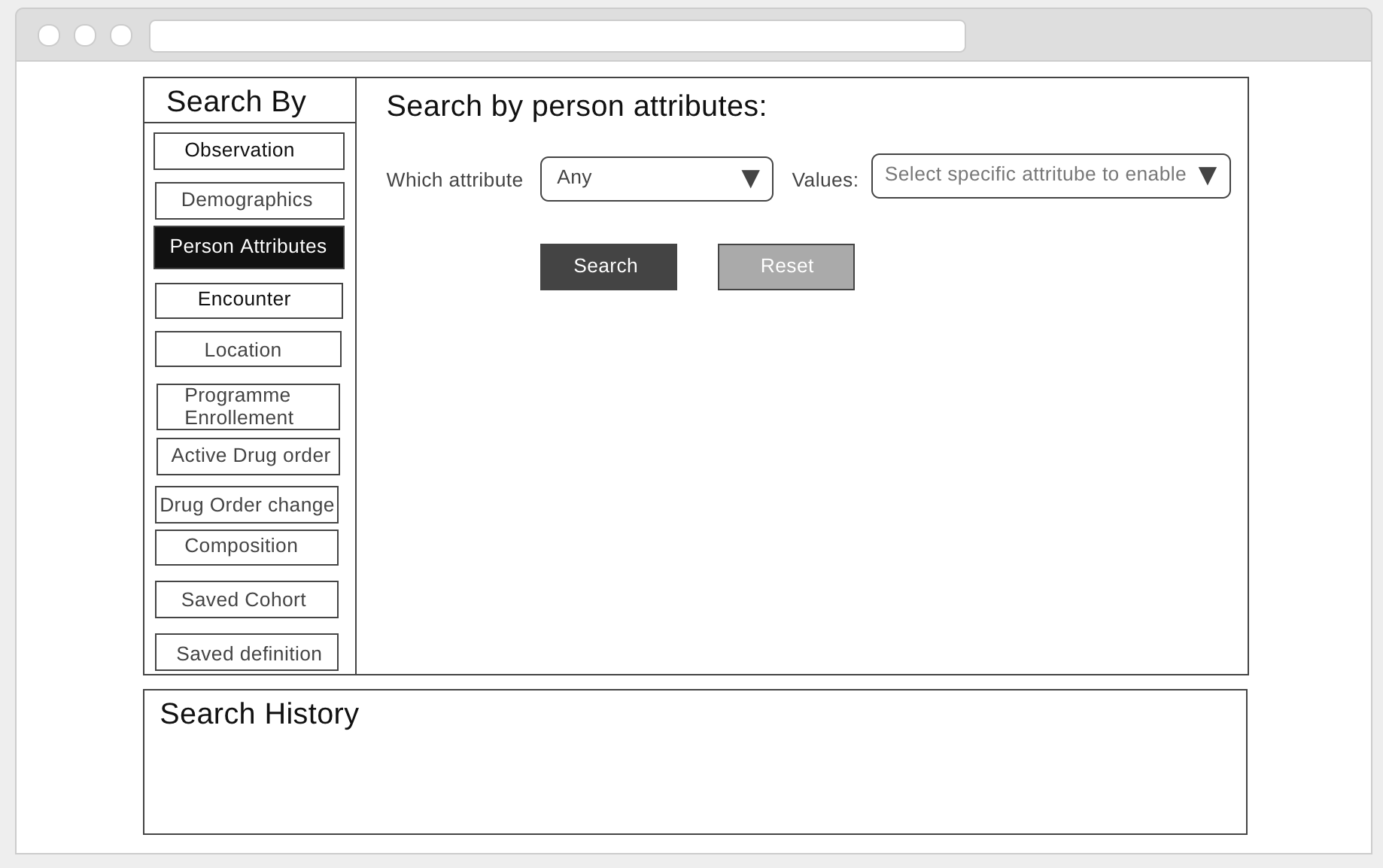
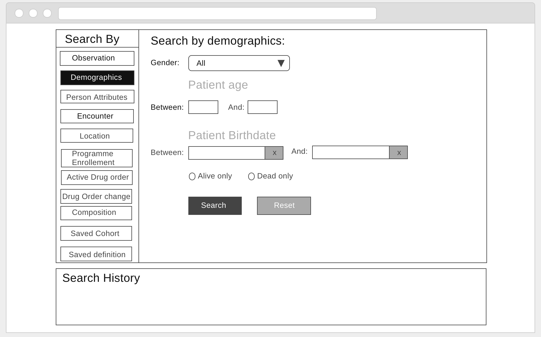
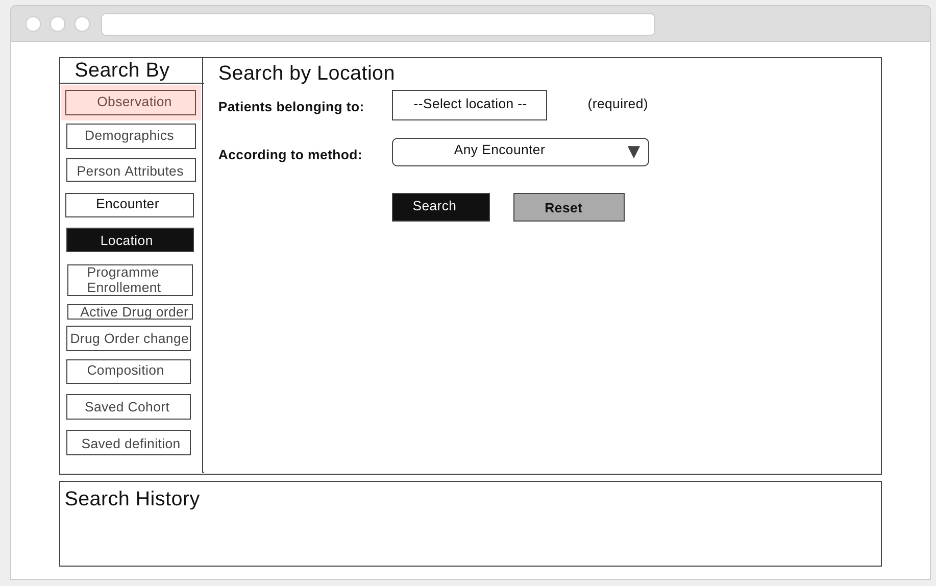
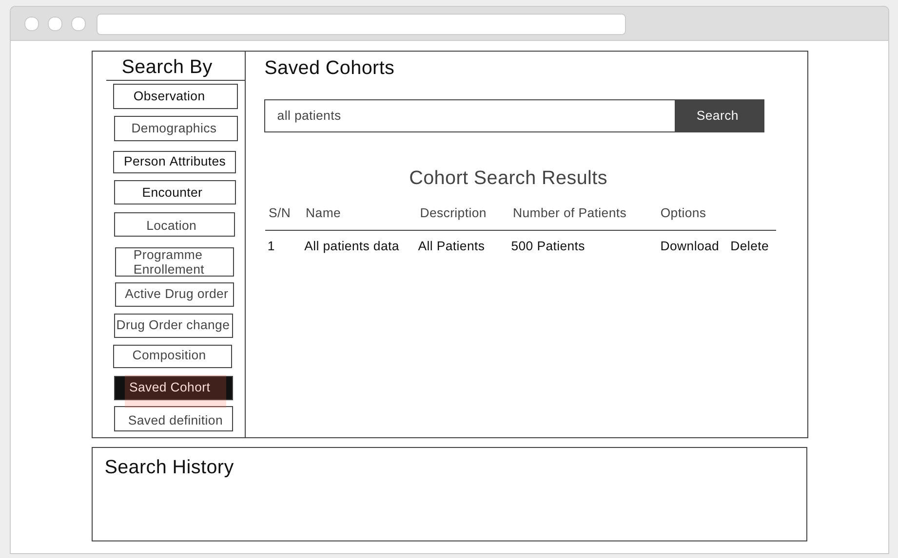
and better to move Search History to another tab or any where  . It seems two body part in a view!
Please think about the Search History part too
. It seems two body part in a view!
Please think about the Search History part too
Thanks @darius, this explanation is really helpful. I’ll work on a prototype and put the design up here.
1 Like
@kingisaac95, I’m looking forward to seeing ideas. I suggest starting with low-fi (cheap!) mockups to get broader feedback before committing a lot of time to prototype what I’m describing.
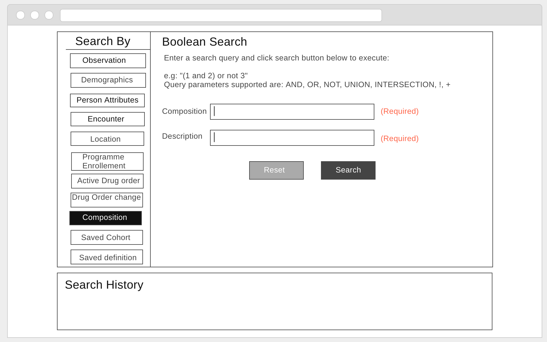
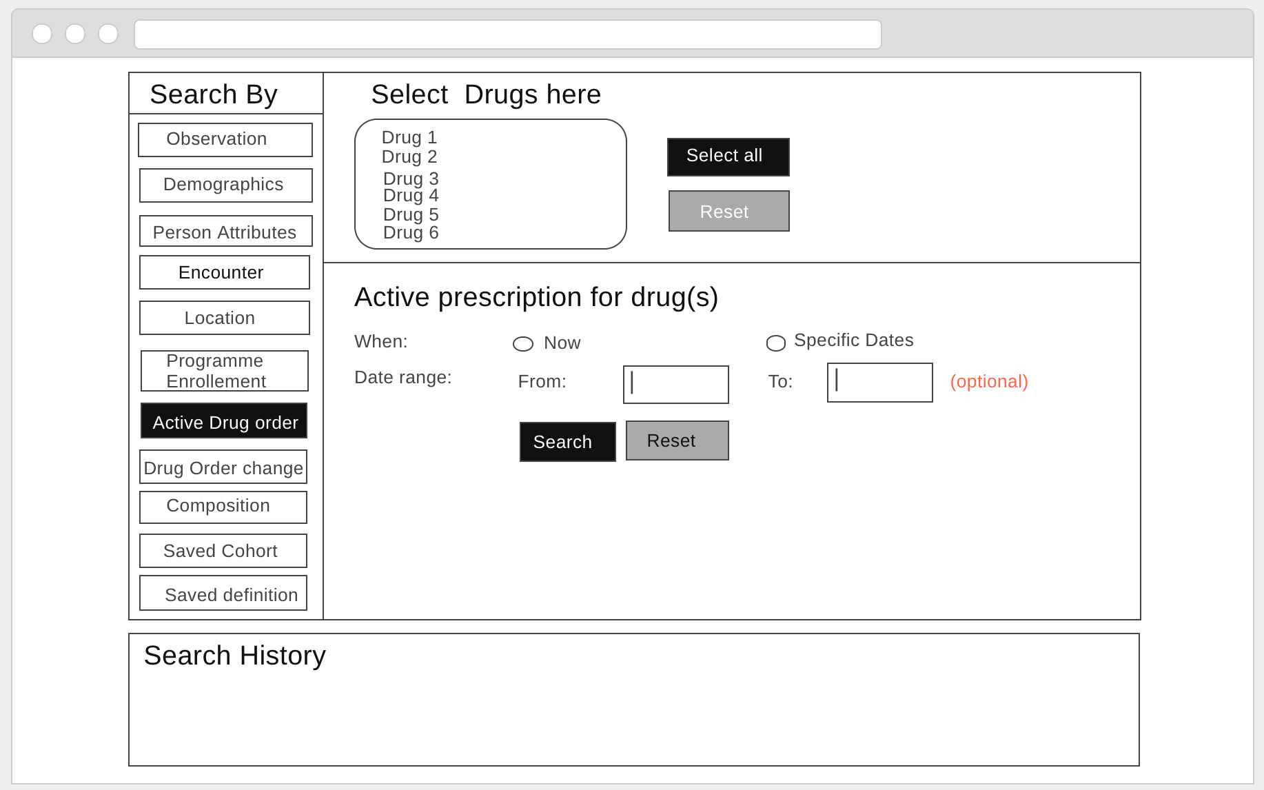
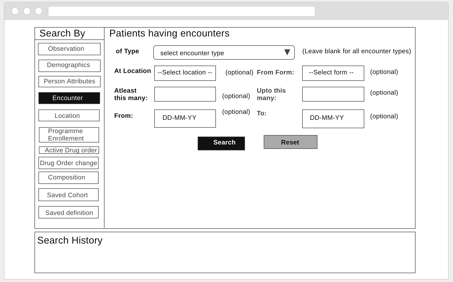
In the big picture I think it’s more important to get all of the searches working, and to the get the OWA released in beta or 1.0 form, before doing a wholesale UI redesign. And there are other specific parts of the UX that I think would be more valuable to look at. (For example, a better way to combine searches without having to type a boolean algebra expression.)
Historically, with the legacy version of the current UI, I have not heard of users having trouble with the tabbed search component that we’re currently talking about. So unless everything else is done, I would limit the effort you commit to this specific part of UI redesign, especially without finding a way to get some feedback from real users, and not just interested devs like those on this thread!
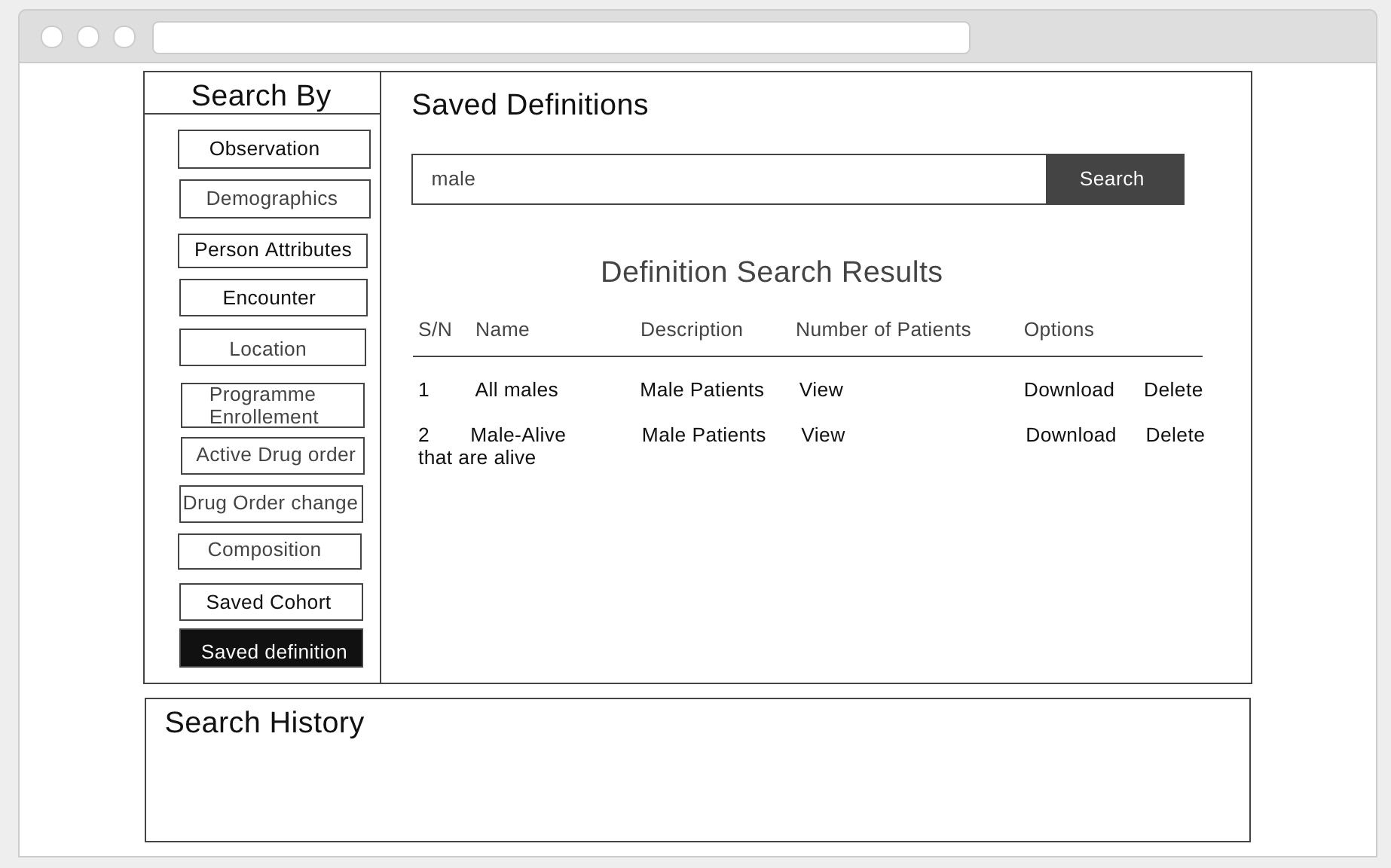
The Search History is actually the fundamental most important part of this page. It’s the “Do A Search” that should function more like a popup, or overlay. It would be okay for Searching to be its own view, but the main view the page is built around should be the History one.
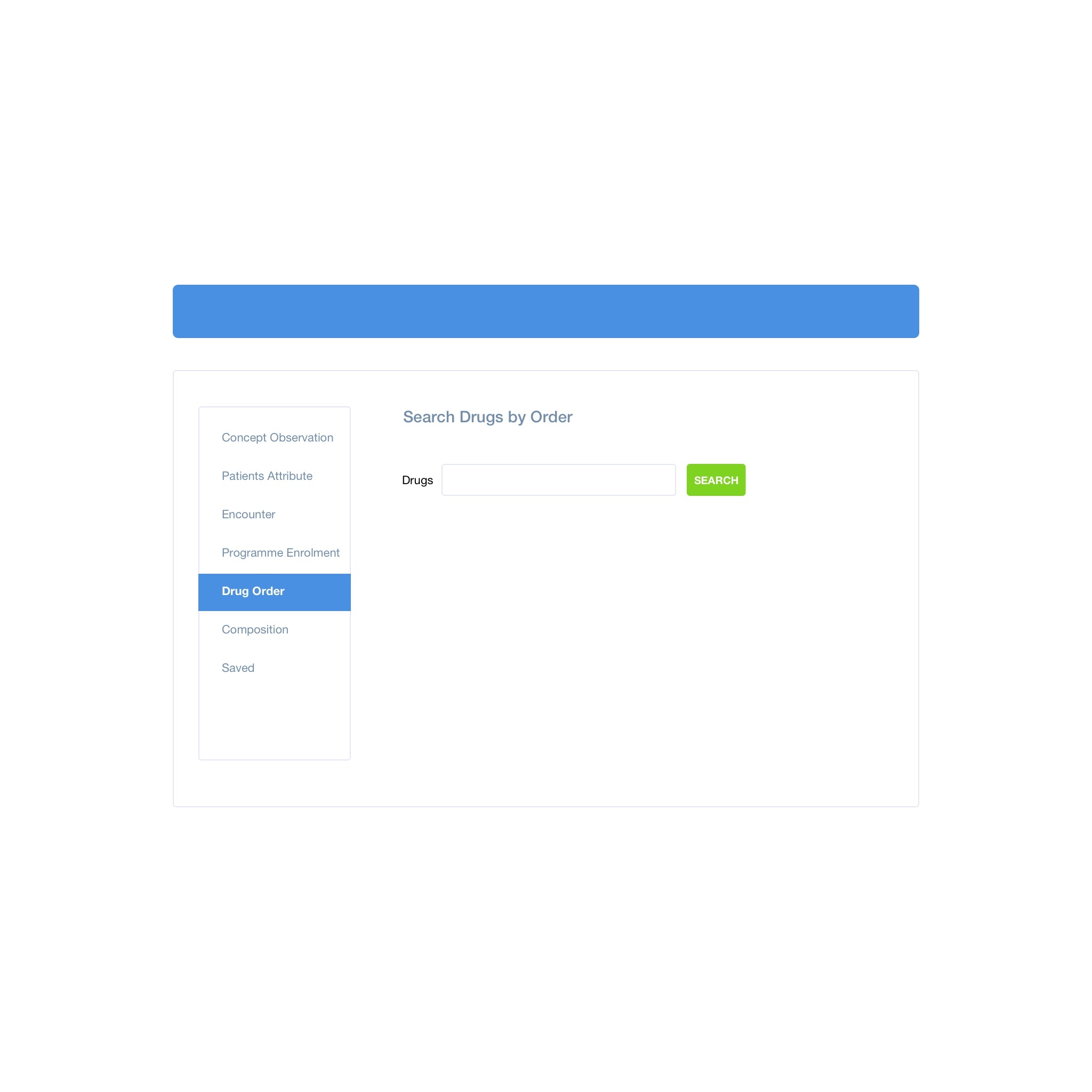
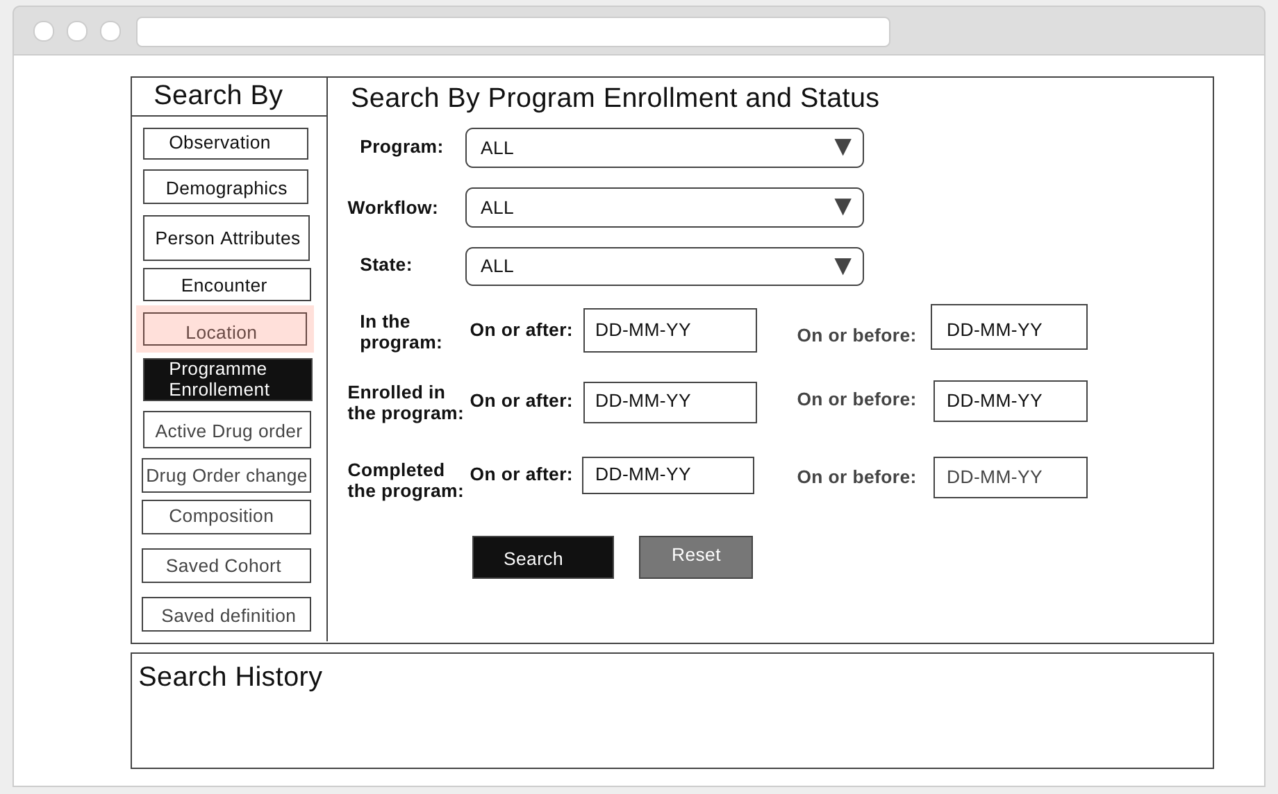
What do you think about this? Note: The history is not show here, it’s still part of the page but I just mocked the part of the navigation excluding the search history
Amazing! Good design @kingisaac95
I would want to see a (low-fi) mockup of the entire flow, i.e. we’re not really talking about “design the search widget” but rather “design the experience of doing a search on the cohort builder main page”.
I was expecting to see 10+ possible searches, so I’d want to know just how big they flow vertically, and whether the results end up visible on the first screen or not.
One approach might be to have the normal screen just show the Search History widget, and there’s a big “+ Another Search” button which slides in the vertical tab widget.


@darius The team has created a (low-fi) mockup of the entire flow. Please what feedbacks do you have on the mockups above.