Hi everyone, I have been selected for GSoC 2022 under the project “Microfrontend the OCL Module and Reduce Backend Dependencies”. Therefore, I’ll be using this thread for the discussions and updates on the project.
Project Name: Microfrontend the OCL Module and Reduce Backend Dependencies Student:@piumal1999 Mentors:@ibacher@hadijah315
So glad you are working on this Piumal. Can’t wait to have this work done so we can officially remove the OWA Module from our RefApp 3.x baseline modules list Yay for removing dependencies!
Project update | Community bonding period 2022-05-19T18:30:00Z→2022-06-11T18:30:00Z
I had the initial call with my mentors on 2022-05-31T18:30:00Z and discussed about the project plan and the timeline. Also discussed about the following things.
How the users can access the ocl microfrontend from O3 home?
Suggestion: We can link the module as an external link on the navbar app menu
The existing OCL subscription module (OWA) doesn’t handle the errors properly. It directly prints the java stack trace as the error.
Suggestion: Identify the common failures and find a way to display error messages which are easy to understand.
Suggestion: Consider the tab view when developing
The existing esm-admin-tools repository is a bit old, so mind the versions when developing. Also, there’s some ongoing migration on micro frontends. (Index – O3 Docs)
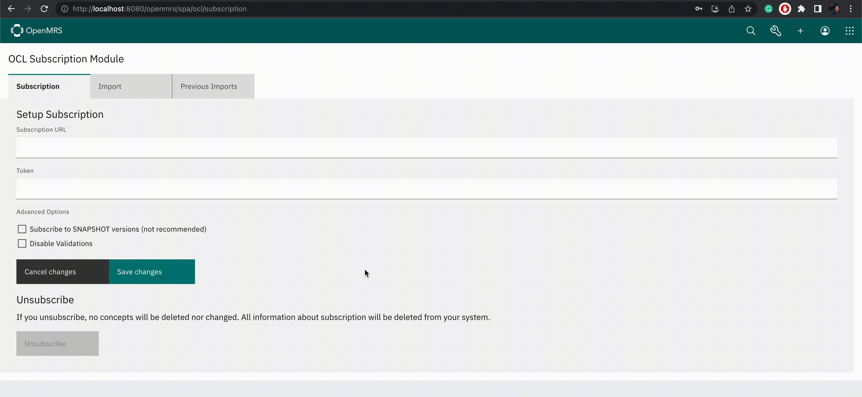
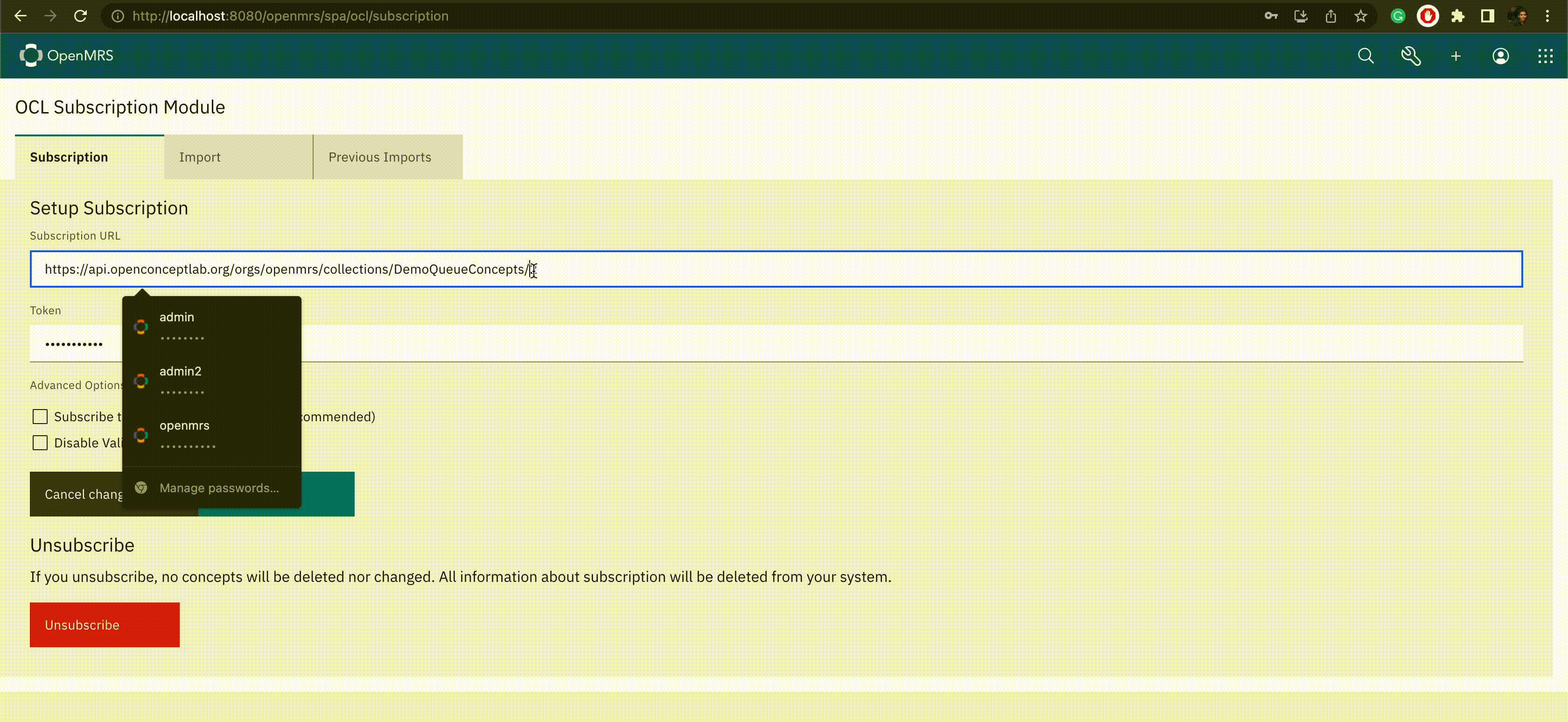
I was able to create the initial layout of the Setup Subscription component according to the UI mockups. Also added the functionalities for saving a subscription and removing a subscription.
Saving a subscription:
Removing a subscription:
This is not the final UI of the component and there are some UX issues in this as well. I hope to fix those within the next 2 days. Feel free to provide your feedback.
Hi @piumal1999, sorry that I missed responding sooner while I was out sick. These are great updates!! Keep it up, I really enjoyed reading these today. I like how you use dates and bullet points and visuals; that makes this thread easy to read.
That is awesome and excellent that you demo’d your work on the OCL Squad call!! That’s exactly the kind of thing we were hoping would happen from this year’s GSOC folks, that they would be sharing their work w/ relevant squads and receiving feedback. Also huge thanks to @suruchi for watching this project as well and giving feedback; I was just thinking “it would be great for Suruchi to know about all this” and of course she’s already doing that
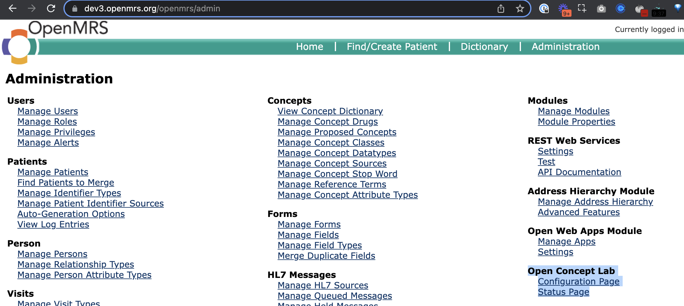
Maybe I misunderstand the vision here, but just to be totally clear: We don’t want it to be easier for folks to find the OCL functionality, because we have had at least 2 stakeholders approach us with concerns about a user accidentally wiping-out concept content by accidentally subscribing to the wrong subscription or at the wrong time. So I think it’s fine for the user navigation to the module to be through the usual Admin UI, i.e. like this:
And, the user must be an admin to be able to see this (this is a requirement always, because it could be catastrophic for an end-user without admin privileges to have access to concept management).
Oh right. What I previously thought was using this feature to create a shortcut to the module in the app menu. Now I see that it can only be done by the implementor and it totally depends on his/her requirement.
Anyway, the module link will be accessible from the usual admin UI.
During the last week, I worked on the Import component, and I sent the Pull request for it today. This UI allows the user to trigger an Import by using the OCL subscription or a zip file. I included 2 previews of the UI in the Pull Request.
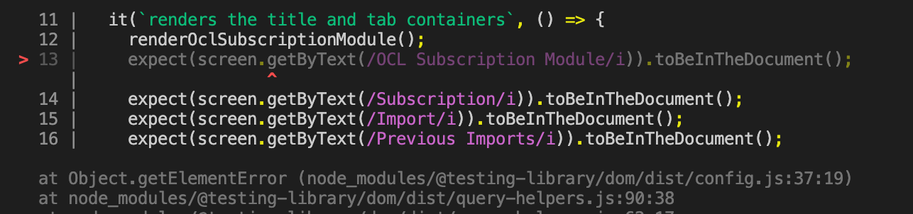
I am working on the unit tests of the Subscription component, but I’m having a blocker due to some trouble setting up the jest configuration.
All these tests are failing due to a reacti8next translation issue. When running the tests, it just takes the keys of the translations instead of the translated values (Even after mocking reacti8next). Maybe there’s something wrong with the mock function I used.
Nice updates Piumal Did you find out the cause of the reacti8next translation issue?
I’m very curious to see how things look when you get to the part that involves the error messages. These have been a major user pain-point. I believe for a time @suruchi was looking in to how we could improve the text string messages to make them less terrifying for end-users (see sample screenshot below):
This said, I know that the scope of this GSOC project is to remove the OWA dependency, so if you’re able to work with @suruchi to improve this error message UI/UX, that would be a nice-to-have (well, great-to-have) CC @pauladams
Yeah. The problem was with the mock function I used. It was written only for returning the key of the translation. Ian suggested me a way to check the actual translations instead of keys if want to do so. Also he said that it ok to check only the translation keys because these are unit tests. (link)
Of course. That would be a very useful feature.
This is the initial layout I designed for this component.
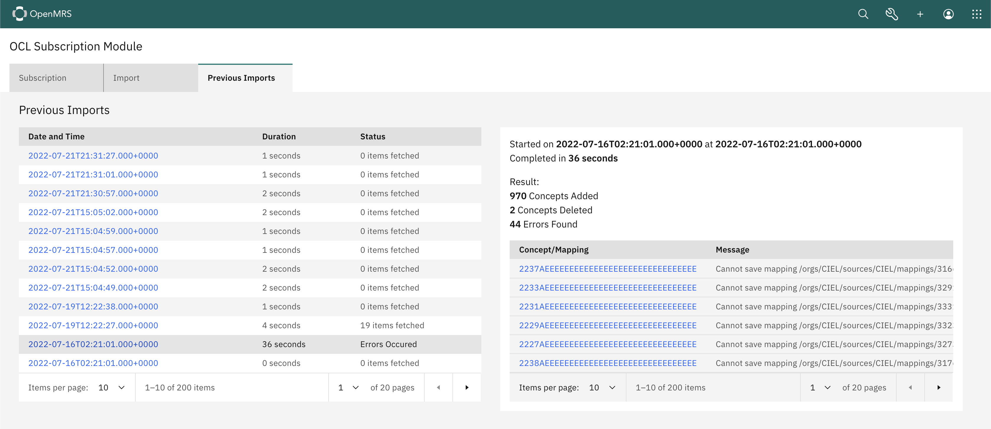
Previous Imports:
When the user clicks on an import, it shows the details of that import:
However I realized that this may not be the optimal solution when it comes to real implementation. Because there can be hundreds of failed concepts due to these errors. So I’ll be redesigning a wireframe for this component during this week.
Yeah, I’ll work on this as well. I’ll try to gather the details of the most common errors occur with these imports. @suruchi do you have any previous findings on this?
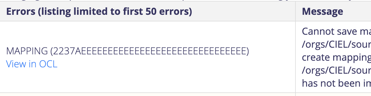
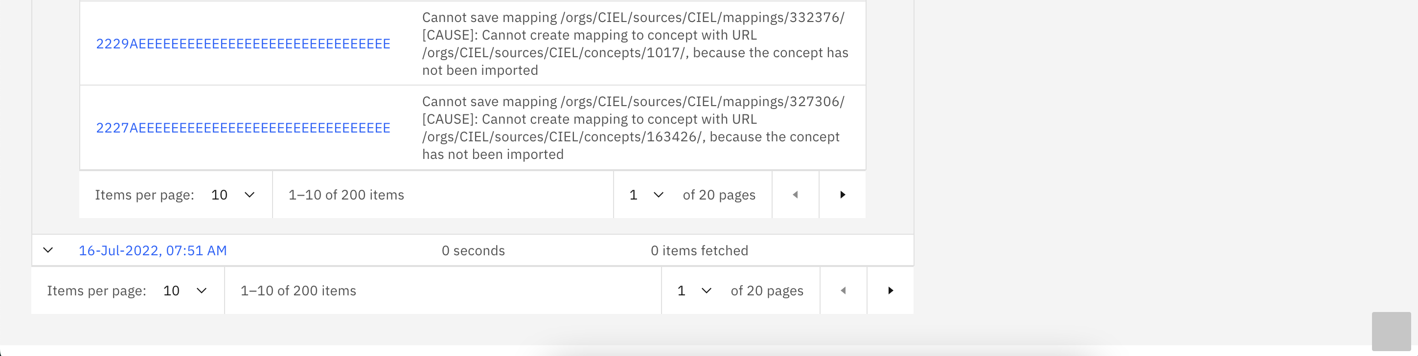
@piumal1999, thanks for working on the error message. There are few different unclear error messages like:
Cannot save mapping /orgs/CIEL/sources/CIEL/mappings/316629/ [CAUSE]: Cannot create mapping to concept with URL /orgs/CIEL/sources/CIEL/concepts/851/, because the concept has not been imported.
I created a rough layout for the Previous Imports component according to the wireframes. In here, when the user clicks on an import, it displays the import details on the right side of the screen.
So, while I’m not a designer, a few notes. First, we do have some pretty standardised formatting for dates and times in the existing designs, so see if you can get those to match.
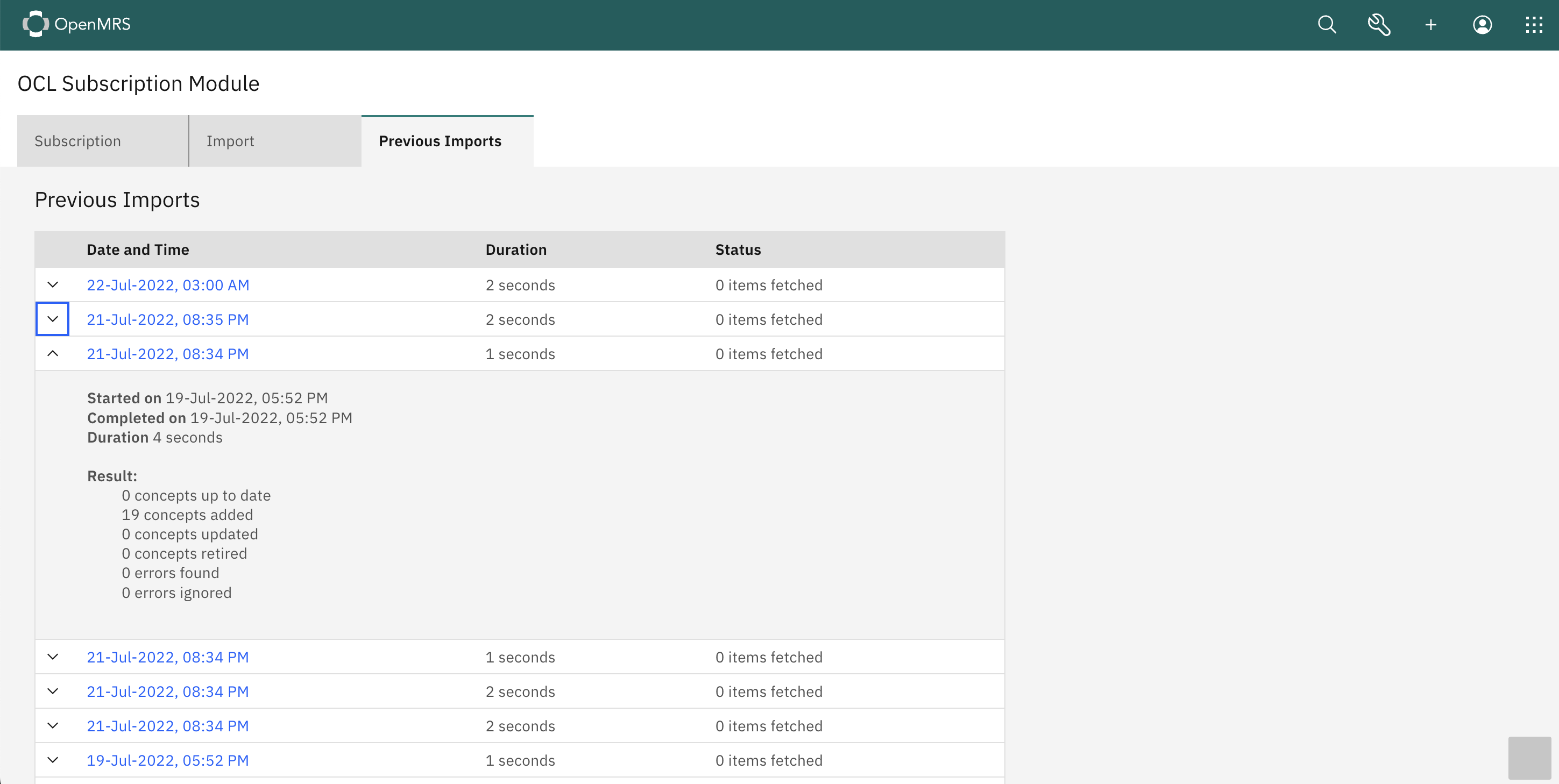
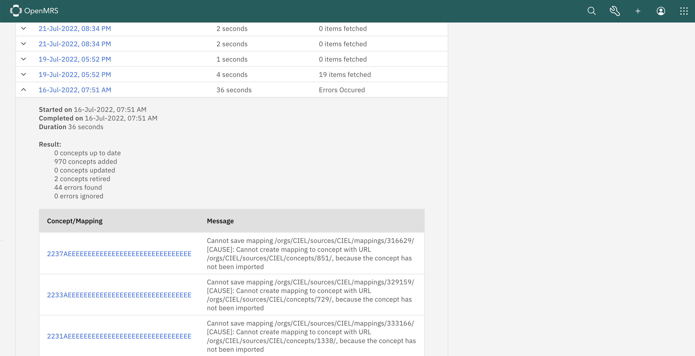
I think instead of expanding to the right, we’ve tended to use patterns like this one for extended information. The nice part is that this scales reasonably well to desktop or tablet.
For status, it seems like it would be good to do something that made errors stand out a bit. Maybe something like the pills we use elsewhere?
What, in your design, does the blue text on the “Concept/Mapping” header do? Is it interactive? If so, what happens when I click on it?