2. We have decided to move all results displaying components into a single component and differentiate them using tabs as can be also seen in the image above.
3. We have also decided to show all patients in a result set, when the user clicks the view button, in a separate component using one of the yet to be decided options shown in the mock-ups below:
a. Remove all components and show only the patients result set as shown below:
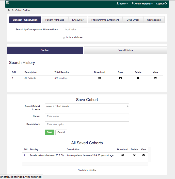
We would like your opinions on this and which is preferred between 3a & 3b above. Also, the current state of the Cohort Builder can be found here for comparison, and here is a screenshot:
@aolaniran, thanks for putting together these mockups! We discussed this on today’s design forum, and I’m summarizing our feedback.
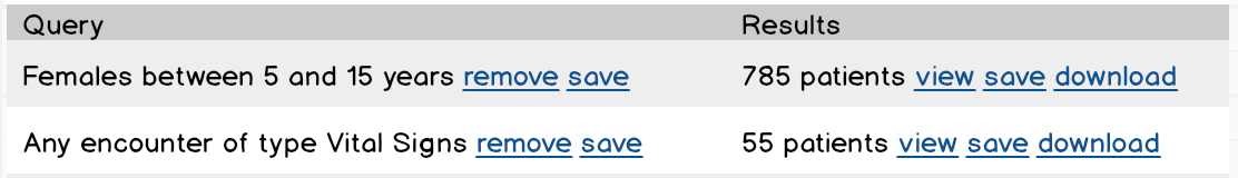
Several different comments about the first mockup:
Each row in the search result table should have its columns grouped logically so that the columns on the left are about the query and the columns on the right are about the results, and there are separate groups of actions that apply to query, versus that apply to results. Something like this:
“save” on the left means to save the query definition
“save” on the right means to save the specific list of patients
indicate this difference via tooltips
The tabbed box on the top has the different kinds of queries that you can execute. Therefore it doesn’t make sense for one of those tabs to be different, and have a save action.
Instead the new tab you add should be “Saved”, and it should allow you to load something that was saved before.
Its content could look something like this:
Or maybe we combine these into a single searchable list where each one is labeled as either [query] or [cohort].
Get rid of the 3 tabs in the middle that you have labeled “Different results tabs”. We should simplify things for the end-user such that there is one place where they do queries and one place where the see the results of those queries. And “load a saved query” or “load a saved cohort” behave as just another way of doing a query.
So, if the user picks a saved query or cohort from the Saved tab, mentioned in point 2, then it would add another row in the search results section.
For your point #3 we like option A.
It’s clearer and more understandable if you have two distinct modes, one for queries and one for viewing results. In option B you’re blurring the line and it would be more confusing.
Do we really need a “view” link? Why not make the result count itself a link? i.e., “785 patients”. After all, that is the primary purpose of the hyperlink, isn’t it?


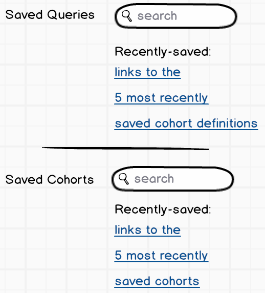 Or maybe we combine these into a single searchable list where each one is labeled as either [query] or [cohort].
 we will work based on them.