I agree DD-MMM-YYYY is probably the most universal, non-ambiguous format and a good choice for a default convention.
I’m assuming this is the general convention for date display and not a universal rule. There are contexts where information last for days or weeks at most. For example, if I’m signing an order or reviewing a lab that was done two days ago. In those cases, it’s unnecessary (add valueless noise) to show the year.
I’ve seen this convention used in some countries. Does it work well in all countries? Are there any countries that wouldn’t work well with capitalization of family names? For example, I would think it could do fine with long or hyphenated names (like those commonly seen in Latin America), but would it work okay in countries that often have multi-case names (e.g., Irish) or accented characters?
They said that in the case of the Family Name prefix (e.g. “von” "Mc” or “de la”) lower case or mixed cased is acceptable there. Otherwise ICAO promotes full uppercase for names.
Based on your experience as an OpenMRS implementor
Are these the right categories of personas to collect at first?
Is this the right information on each persona to collect?
Having a clear user user personas in mind, is an essential step in designing things that actually work.
This slide deck is designed to make it easier for groups to participate in collecting user personas based on their real world data. This will contribute to the design of OpenMRS Flow.
Please suggest updates to it before we circulate it among implementations.
I’m usually interested in the patient’s age and DOB is only needed when verifying the patient’s identity. Putting age in parentheses (as secondary info) feels backwards to me.
FYI - we also have many cases where ages are estimated (e.g., we only have a year of birth): “~42y (born 1977)”
In theory, this makes sense. In practice, when institutions have a single medical record number used throughout the care process, the label has less value and just adds noise to the UI. In my practice, the medical record number is always presented unlabeled next to the name and I’ve never seen anyone confused by it.
In implementations using multiple identifiers, I’d agree labels are important, though we might have to be creative, since our identifier types have names that can be long and I don’t think they have abbreviations or short names out of the box. Even in those cases, if there’s a preferred identifier, the label may be more clutter than benefit.
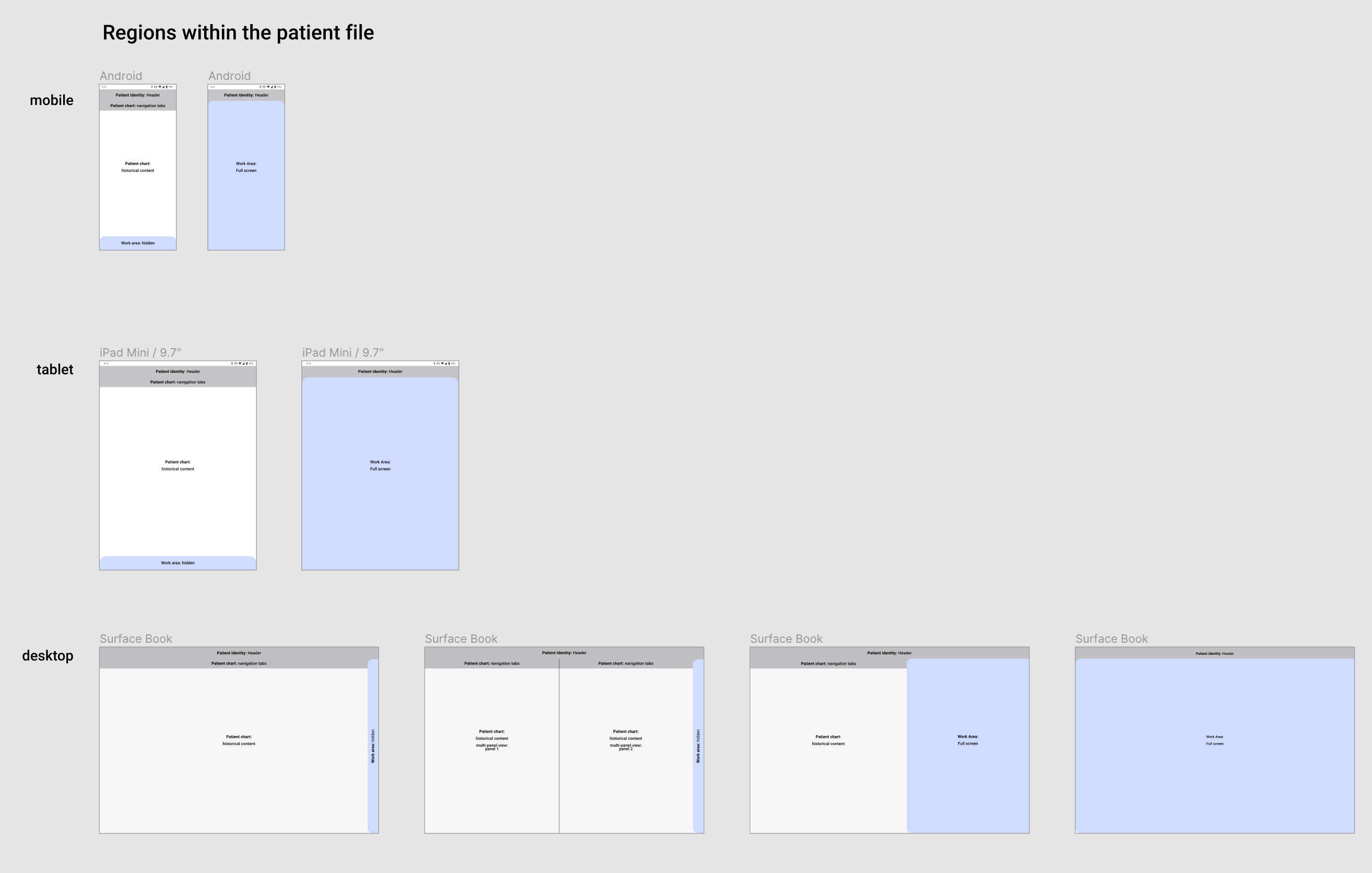
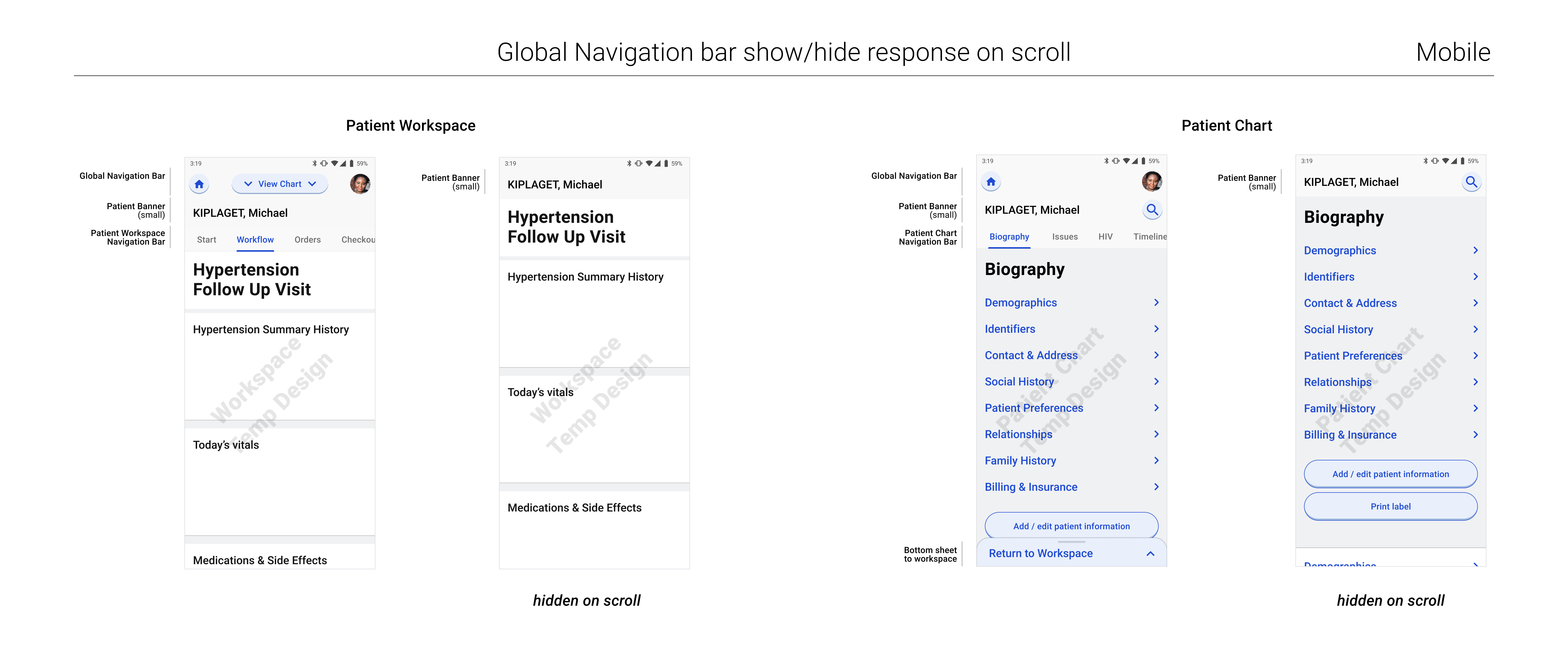
I don’t have an interactive prototype yet. But its the general idea with the screen split in two. Left side is Chart. Right side is Workspace. And either half can be made full screen.
Oh, very good point - the labels would need “short names”. Perhaps a work around could be to use the existing ID label field, but encourage groups to enter the ID label as a short form, rather than a long form?
Stacked is fine. If on one line, I’d favor parentheses over a comma when on one line – e.g., 36yr (16-Jun-1983).
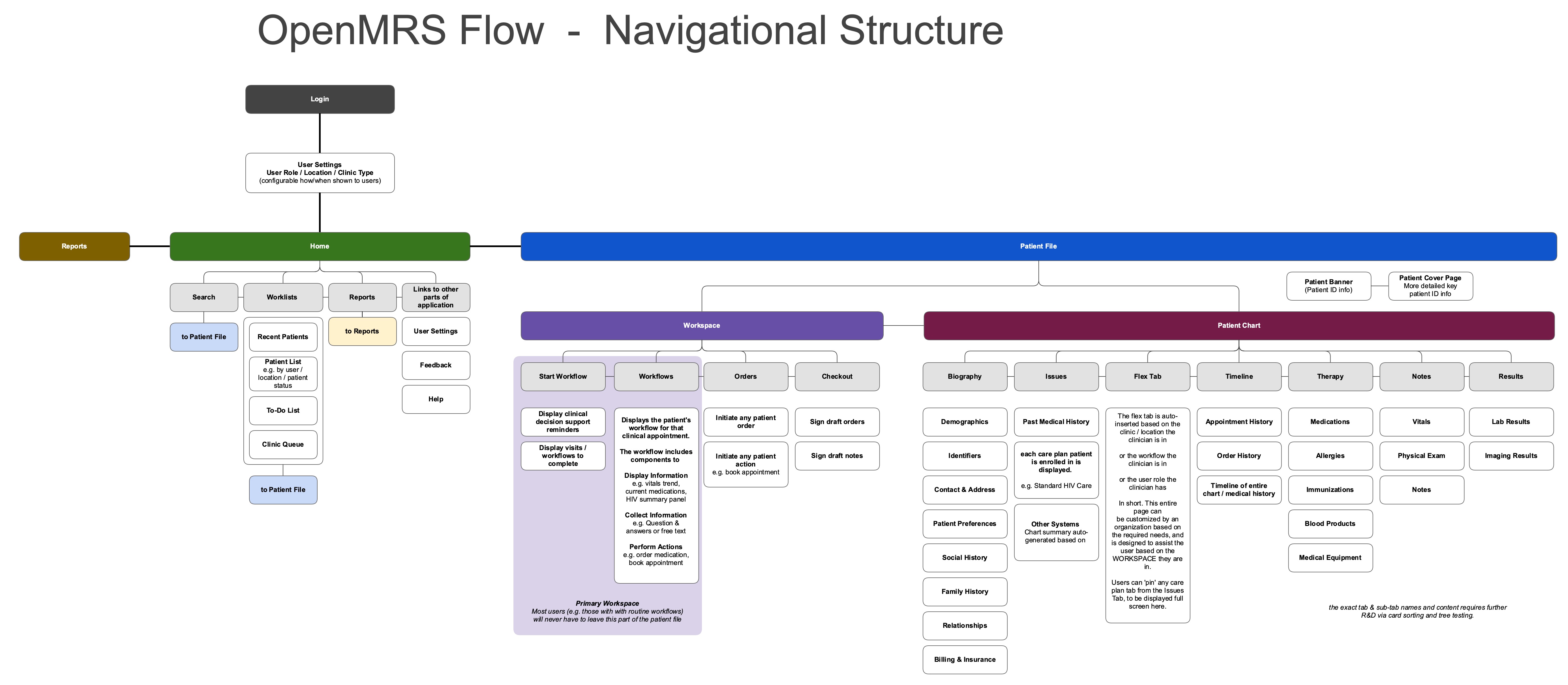
We will need to get these patient identifier names from the API (database). Since we have name and description, we could use name for the label. Implementations could shorten their patient identifier type names and clear up ambiguity (e.g., spell out any abbreviations) in the description. But be prepared for long names for identifier types. If long names “break” the UI, the UI will be broken for most implementations.
These demos are awesome @gschmidt! The experience for going from patient chart to workflow and back makes a lot more sense to me when I see it in motion like this. Looking forward to talking further about getting some of these screens in front of users and getting their input.