can you attch a screen shot , giving more explanatons ??
looking at that snipet you dropped,instead of having the black color it has to be green checkout https://demo.openmrs.org.i e that background color you see as black on the snippet it has to be green
2 Likes
Hi @mozzy
Nope, it should be the same color. If there is a color change then I have to work on it 
1 Like
yes @ayesh , go ahead , well done Mr fix it 
Hi @mozzy
I pushed the change to the same PR.
Am not quite sure about it since am not good at seeing the difference of the two colors above if some one can test and let me know it would be great.
1 Like
i think its right ?? wel done
well , i think as far as we stand , we have done some good UI testing , and @ayesh has done a very good job of fixing all the issuses that have risen form the tests we have done , i no longer see any Blocker for us moving towards an Alpha release now
cc @dkayiwa @ssmusoke @ayesh @c.antwi @jennifer @christine @mksd
Why just some but not all? We need to manually test each and every bit of the reference application and properly document the results on the wiki. That is when we shall feel confident that we have come out of the rabbit hole that we have been in with the bootstrap changes.
1 Like
@ayesh hope you have seen @dkayiwa comments.@mozzy thats the conclusion we came up with during the pm call.
This server is down even after resetting it @mozzy . I want to redo the UI testing as I document the outcome.
1 Like
@irenyak1 , me i can acces the server , is it fine for you now ??
Yes @mozzy it has worked. I think i have been having connection issues.
1 Like
I get you @dkayiwa on this! Can we attach some screenshots where possible, especially if there is a discrepancy?
Yes that will be great if you can attach and let know how to reproduce the issue so can attend the issues soon
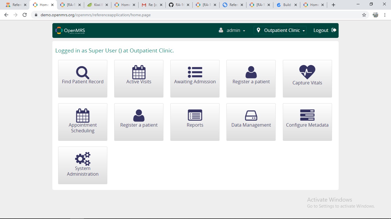
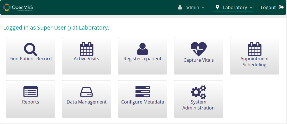
The very first one I have found is on the home page. The word ’ Find Patient Record’ occupies two lines in this RA UI as opposed to one line in the main UI. This is for RA 2.10SNAPSHOT. The icons look a slightly smaller than those in the usual UI, May be this explains why the words “Find Patient Record” flow to the second line.
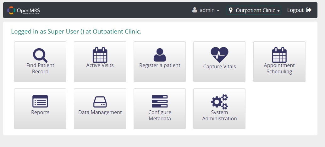
Below is the usual wording for the Find Patient Record icon
Second is there RA 2.10-SNAPSHOT
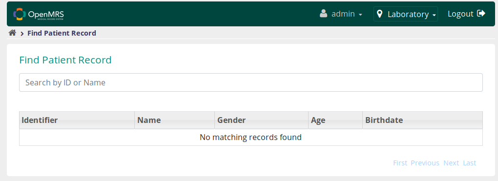
In the one above, the search bar looks incomplete without the cancel icon in it and also there’s a big space between the search bar and the table where the search results are displayed. You may want to reduce that space.
As compared to our usual UI

@irenyak1 this is awesome! 
@mozzy do you now see why it is important to fully test the entire reference application?
3 Likes
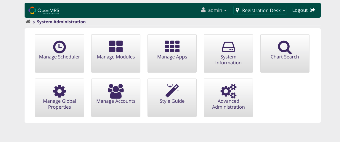
RA 2.10 SNAPSHOT. This section seems to be lacking the Search field and the filters on the extreme right seem to be so close to the result table, I think they are occupying the place for the search field. You may want to edit this. Also even if this shows no results for the active visits, if you are keen you will realize that the word none spans through 4 coloumns. Please edit so that each table header has a clear column for it’s table data like it is in the Usual UI image .
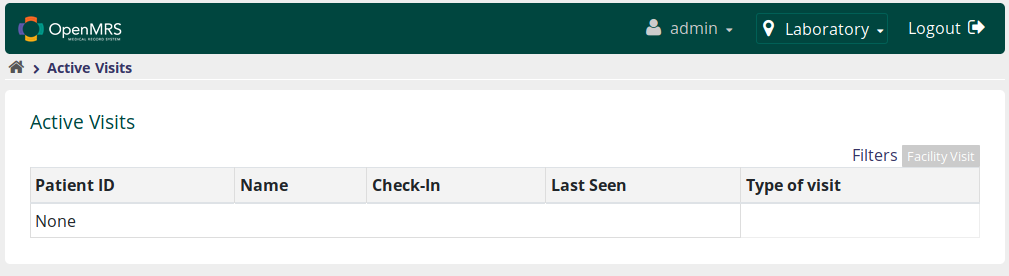
Our usual UI
