Second is there RA 2.10-SNAPSHOT
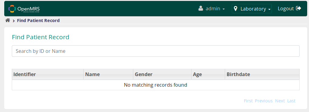
In the one above, the search bar looks incomplete without the cancel icon in it and also there’s a big space between the search bar and the table where the search results are displayed. You may want to reduce that space.
As compared to our usual UI
