Hello Everyone, we are looking to redesign the reference application landing page from its current look to a more updated look. We would love your views and suggestion on the design we have. I have created a mock up for the suggested new look please give me your suggestions. here are the images
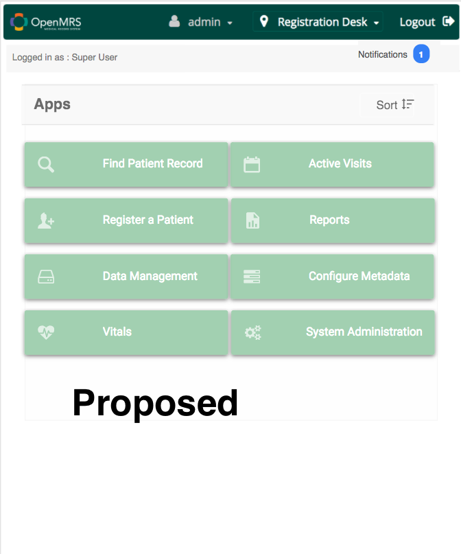
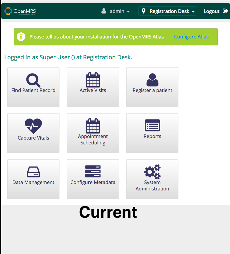
Great job implementing a new landing page, here are a few things you could take note of
- The text and the logo are kind of blurred
- The x distance between the logo and the first character are wide apart, could you reduce it
What I like:
- The new logged in user information display
- The sorting option may be nice if the page content exceeds a certain amount
What needs work
- I think the pale green colour selection for the tiles feels off. You can refer to the style guide for more inspiration
- Better sizing of the tiles. Conform to either lists or grid format. They currently feel somewhere in between
- Provide an image of what the notification panel looks like when selected
The test and the logo being will not reflect on the implementation of design.
A few thoughts:
- The “Apps” title is unnecessary.
- How will it handle a user with 20 apps?
- How does it look on a tablet or phone? Let’s not change the landing page and then realize it’s not responsive.
- Consider how badges will be handled (for an app that needs attention or has a counter).
- Have we included a way to switch locale? If not, can we use this opportunity to get it back into the default layout?
@justmesam I think I like the old app design which makes the buttons easier to click on - the new page looks more like a list view …
On second thoughts instead of designing a brand new landing page, why not provide different views just like Windows Explorer.
- The tiles view (current design)
- list view (new design proposed design)
- details view (which just has a tabular list) with which extension point, the actual url, etc
I like the sorting functionality, which can be by app name, by title and by date added (is interesting). You can also try to group the apps by extension point types, apps, links etc
It would also be good to store the options as user properties so that the changes are persisted across multiple sessions
Apologies for the chaotic and random thoughts - but I like where you are going with this.
Last one: I would like to suggest that the HTML for these changes match Twitter Bootstrap components so that when that foundation is put in place, this page does not need to be redesigned
i dont get the distance you are talking about
@burke Progress on the new Reference Application redesign. you can look on this and give me your thoughts…
@ssmusoke i tried most of your suggestions, give me your thoughts on it, Progress on the new Reference Application redesign.