Hi, I’m interested in Re-designing the Home Screen dashboard. Let’s collect some modern designs and discuss which suits best. Ideas and designs are welcome
Project wiki page - GSoC 2021: OpenMRS Android Client
Hi, I’m interested in Re-designing the Home Screen dashboard. Let’s collect some modern designs and discuss which suits best. Ideas and designs are welcome
Project wiki page - GSoC 2021: OpenMRS Android Client
Great initiative mate. 

Hi @sahuadarsh0, that’s a great step. You can start by giving your proposal and tagging the mentors concerned with the project.
Hi @sahuadarsh0, that’s a great step. You can start by giving your proposal and tagging the mentors concerned with the project.
Thank you @ujjwaltyagi355, @joachimjunior … I am looking forward to
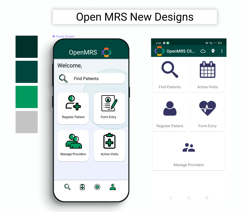
Here is a sample design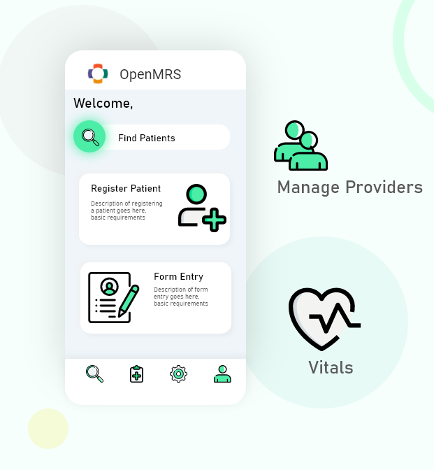
Not a final one please keep providing ideas and feedback on what can be improved or further added. I am also trying other Alternative designs for Fresh Look and Feel.
@sahuadarsh0 that’s some great design. I think you should tag those directly concerned with the project in your next post, like the project mentors. They are best placed to tell you how to advance. Thanks.
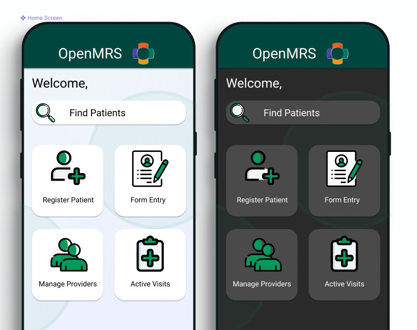
Hey @saurabh , @rishabh997 , I am working on fresh material designs for home screen, please add your suggestions and check if I am going in right direction
@sahuadarsh0 looks really good, but if we design the home screen this way then it wont blend with the whole app theme so maybe we could alter the theme of this home page a bit to blend with the other screens as well.
you can add the figma link to the Issue you already created in JIRA  .
.
You will find the links to old figma page in UI redesign ticket from last year where you can find mocks of other screens as well, that might be a help for you
let me paste it here https://issues.openmrs.org/browse/AC-762
Then Let’s design the whole app gradually into a new UI I am creating a new Figma link for the entire walkthrough. I’m used to Adobe XD and little new to Figma, will take some time to adjust
@saurabh Tried a little bit to blend with existing
Looks good @sahuadarsh0, maybe those colors in the icons can be the same hue as the title bar so as to blend more. I will make the Issue ready you can start working on it
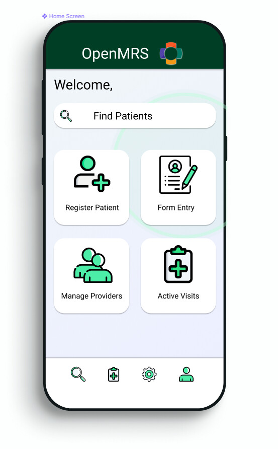
Made it @saurabh
I like this nice UI! 

is anyone here using this app in production?
as mentioned here by @dkayiwa , the app isn’t deployed anywhere right now
is this project part of GSoC projects @mozzy @grace Do we need to bring it on again if it’s not used anywhere!
So I did hear that it might be being used by NigeriaMRS. I need to confirm. But I haven’t heard of others recently. In fact I learned that UgandaEMR ended up making their own bespoke app.
@sahuadarsh0, beautiful redesign. I have a few questions:
Please specify the why. Why do a UI redesign? To make it look more modern? Does it give our users any new features, or make things easier to use, e.g. was there a particular usability issue? Understanding this shapes the feedback I’d give you.
Why not use Carbon Design System? Is this possible? This is both the style guide and design system that OpenMRS 3.0 is recommending moving forward. We are using it for the tablet and desktop UX for what will become the 3.0 RefApp. You can learn more about why we’re doing this here: Why did we choose Carbon Design System over our previous Style Guides? - Documentation - OpenMRS Wiki This could be a good experience for you to try implementing, and also gives you a skill set (experience using Carbon and a design system). This would also help future-proof your work, since this is the UI we’ll be using moving forward, and since with products you typically want to have consistency of UX and visuals between the WebApp and the Mobile App, so that the user can identify “ah yes, this is what OpenMRS looks like”.