Hi @bistenes, thank you so much for this post! @mksrom brought this up on last week’s design call, and myself, @veronica, @fanderson and Dr Ray Simkus were in attendance and had thoughts. All agreed this is a solid idea for a new reusable component. Basically - I’m thinking, it would be awesome for this to be effectively another re-useable widget just like this guy: openmrs-esm-patient-chart/packages/esm-generic-patient-widgets-app at main · openmrs/openmrs-esm-patient-chart · GitHub
Re. Real-world use cases:
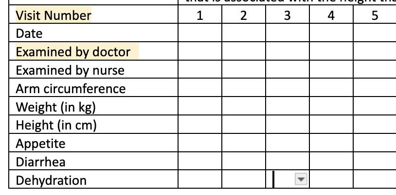
PIH ANC: Fiona immediately brought up this similar real-world example: PIH has a similar form for ANC visits:
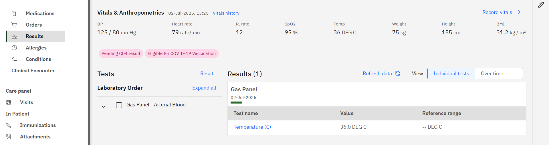
Clinical Views: What came to mind for me and Vero was the Clinical Views summary cards - not just the ones shown in this screen (which have way too much white space in our opinion - we’d/I’d strongly like to see more information density in the app, especially in specialty-specific views), but also in other possible applications of the table component you’re proposing.
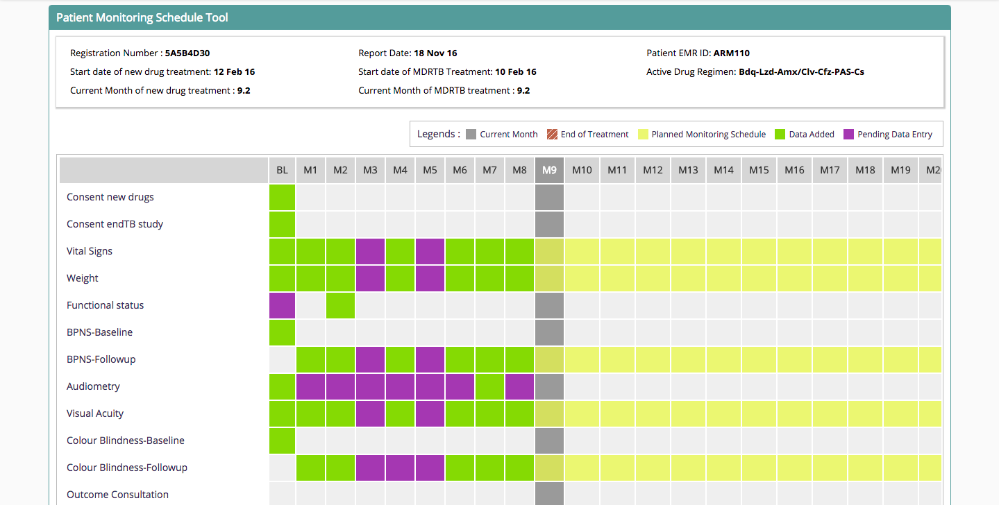
Checklists/Workflows/Careplans: Another item that came to mind was the clinical concept (not the FHIR one) of careplans, or care checklists. E.g. if a patient is in an artificial limb program, there’s quite a complicated set of checklist items that need to be done over the course of several visits. This component could really help track such checklists over time.
Answering Some Questions
Re. @mherman22 's question above - this also came up on the call. No, please don’t re-use or re-place or closely emulate the Test Results app. The reason I feel this way is because the Test Results viewer is so specialized, and also still quite imperfect so subject to many changes in the near future, and I think you want to keep all of that nuance separated from this re-useable table component.
Re. @mksrom 's Q’s above:
Q: What if multiple obs of a given concept are available recorded in the encounter? (maybe concatenate the answers?)
- Yes, concatenate sounds good; so long as you use some kind of obvious separator. I’d recommend not only using commas, because we are now properly using commas for French numeric values with decimals, so a lab test with a result of e.g. 4.3 in French is 4,3.
Q: What if a text obs is too long? (maybe hoover to see full text?)
- With the exception of help-text, I’m generally suspicious of hovering, because (a) most clinicians in our contexts are too busy to hover or think of doing so, and (b) it’s not great on tablet (and as I’ve said before it’s reasonable to assume a third of our clinical users are using tablets). We’d have to see the examples
Q: Should this table be only one column (full chart width) or should it support 2 columns view in the patient chart?
- Yes, it should ideally support the 2 columns view, for smaller sets. Though I’d say this is a nice-to-have, not an immediate must. Here’s why: (1) opportunity to increase information density (though at the cost of likely fewer encounters over the horizontal time axis), and (2) an example I’m thinking of: We know that NCD clinics are rapidly on the rise. In an NCD clinic’s Clinical View page, for example, you may want multiple tables: One showing diabetes/blood-glucose-related issues and lab tests; and a separate one for Cardiac measures/items. Would be nice to be able to see those both side by side. But I’m just inventing things here, so 1 column is very okay to start.
Q: How to handle horizontal scrolling if any?
- This is a great question. My main ask is: please no disappearing horizontal scroll bar. If the table needs to horizontally scroll, then the scroll bar should always be there. The reason: The vast, vast, vast majority of our clinical users have never used a device like a newer Mac that has the disappearing/intuitive trackpad feel. Therefore they’re highly likely to never notice that there is a tiny grey horizontal scroll bar upon hovering. The laptops in use are unlikely to have good horizontal scrolling trackpad experience built into the trackpad hardware other than the usual click-drag. (Brought up the same issue just recently with the new Immunization History View.)
Hope this helps, super super interested to see this progress and as always very happy to discuss further. Thank you very much @bistenes and @mksrom for pushing this forward!