Designing a results viewer as a micro frontend

We saw a proposed design for a results view concept for micro frontends on today’s Squad Showcase:

While there are some nice ideas here (e.g., pinning a column while browsing tabular data), there are several issues as well (using only bold for abnormals, focused on numeric results, extra clicks & popups for graphs & detail, etc.). While I dumped some feedback into the #mf-test-results-viewer channel on Slack, where it can fall into the void of never-to-be-seen-again Slack chat history, I thought it was worth some more design discussion, so I’m bringing here to our community forum (aka mailing list).

At Regenstrief, I led an effort to create a tool called “Chart Search” that took an approach to results review combining two goals:

  1. Let me “google” the patient’s chart
  2. When a user selects a result, show them everything they might want/need to know about that result.

We used Lucene to index the patients chart, which provided instant results, counts for matches by result type, and support for synonyms & context-highlighting within text. Our chart search windows comprised (1) search & filtering, (2) a list of results, and (3) a detail pane to show detail for the currently selected result. I’ll share some screen shots…

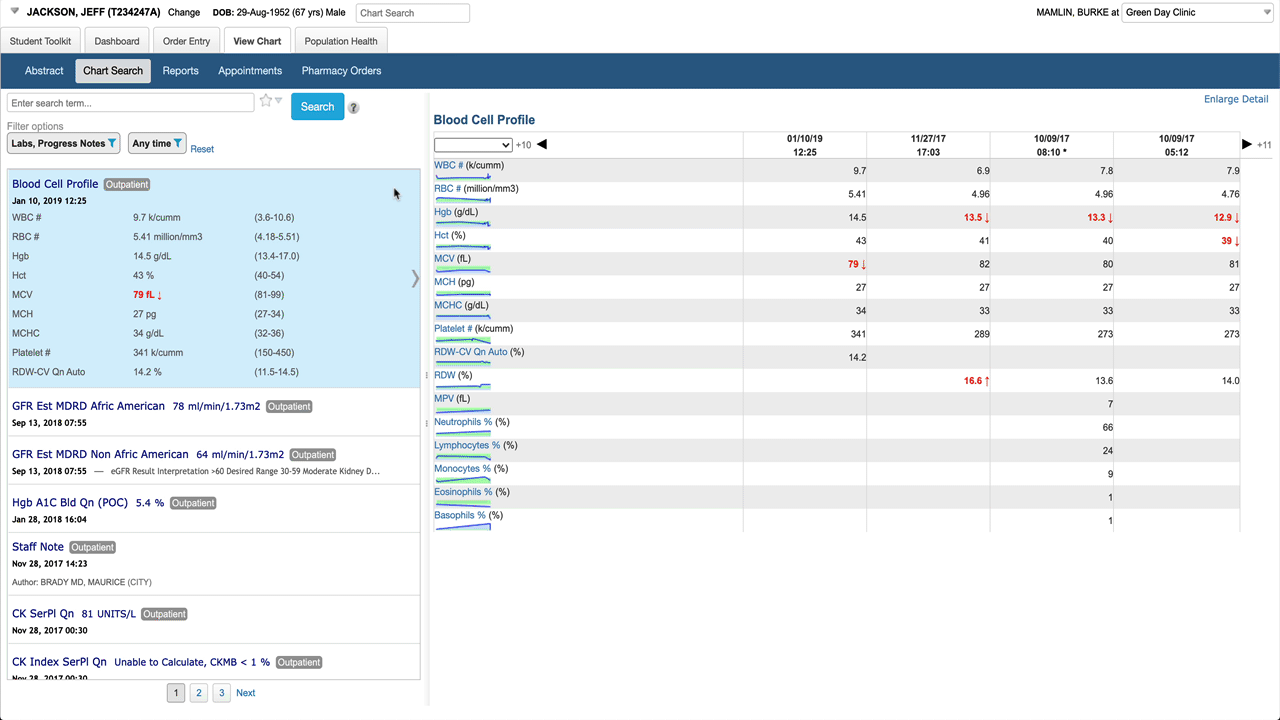
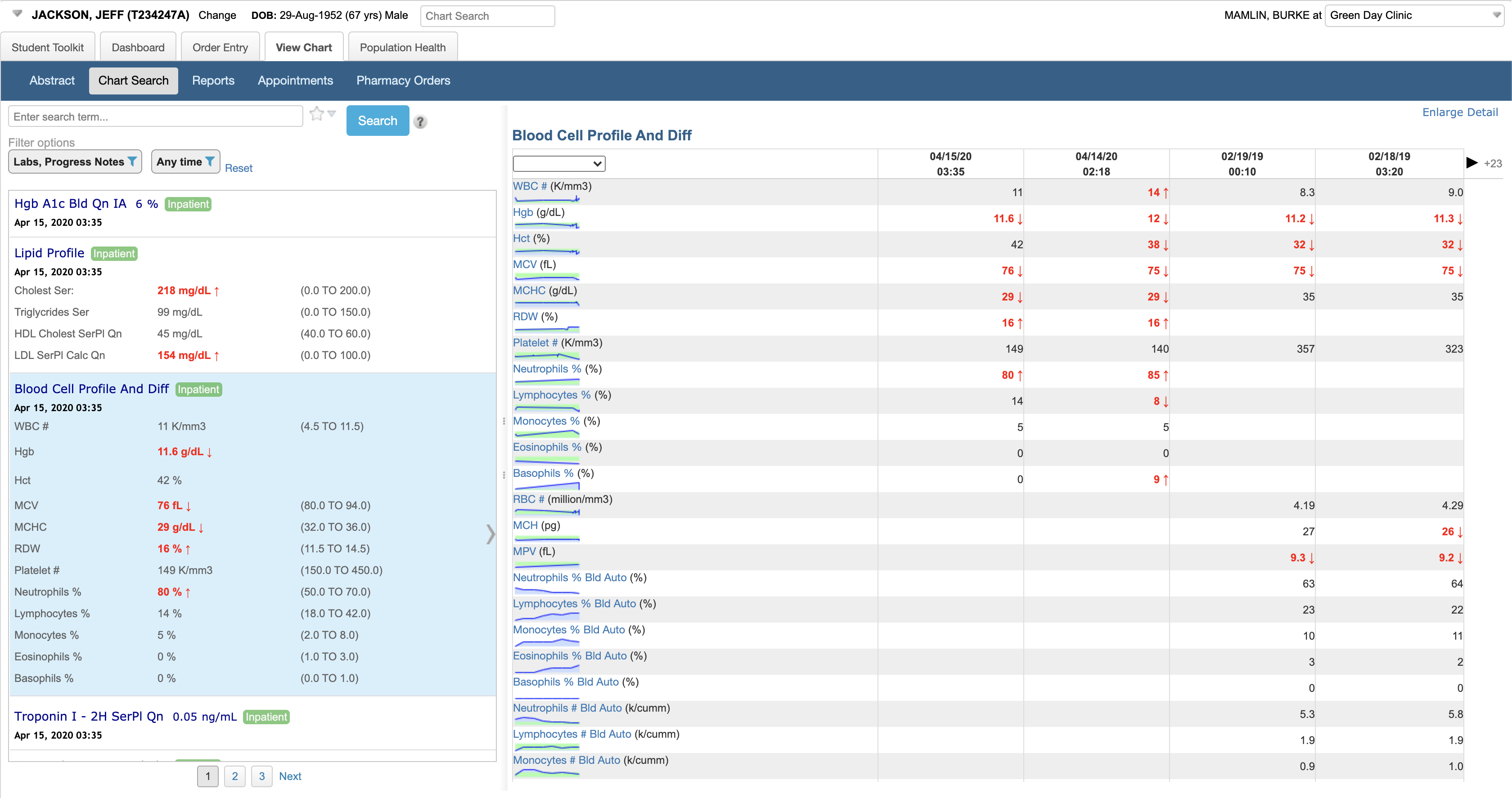
Here’s the basic layout. When a battery (lab result with multiple components) is selected in the result list, the detail pane shows a table by default. Note abnormals use more than just bold/color to be more accessible, spark lines give a preview of a graph for each result. Clicking on any result in the table shows detail about that specific component.

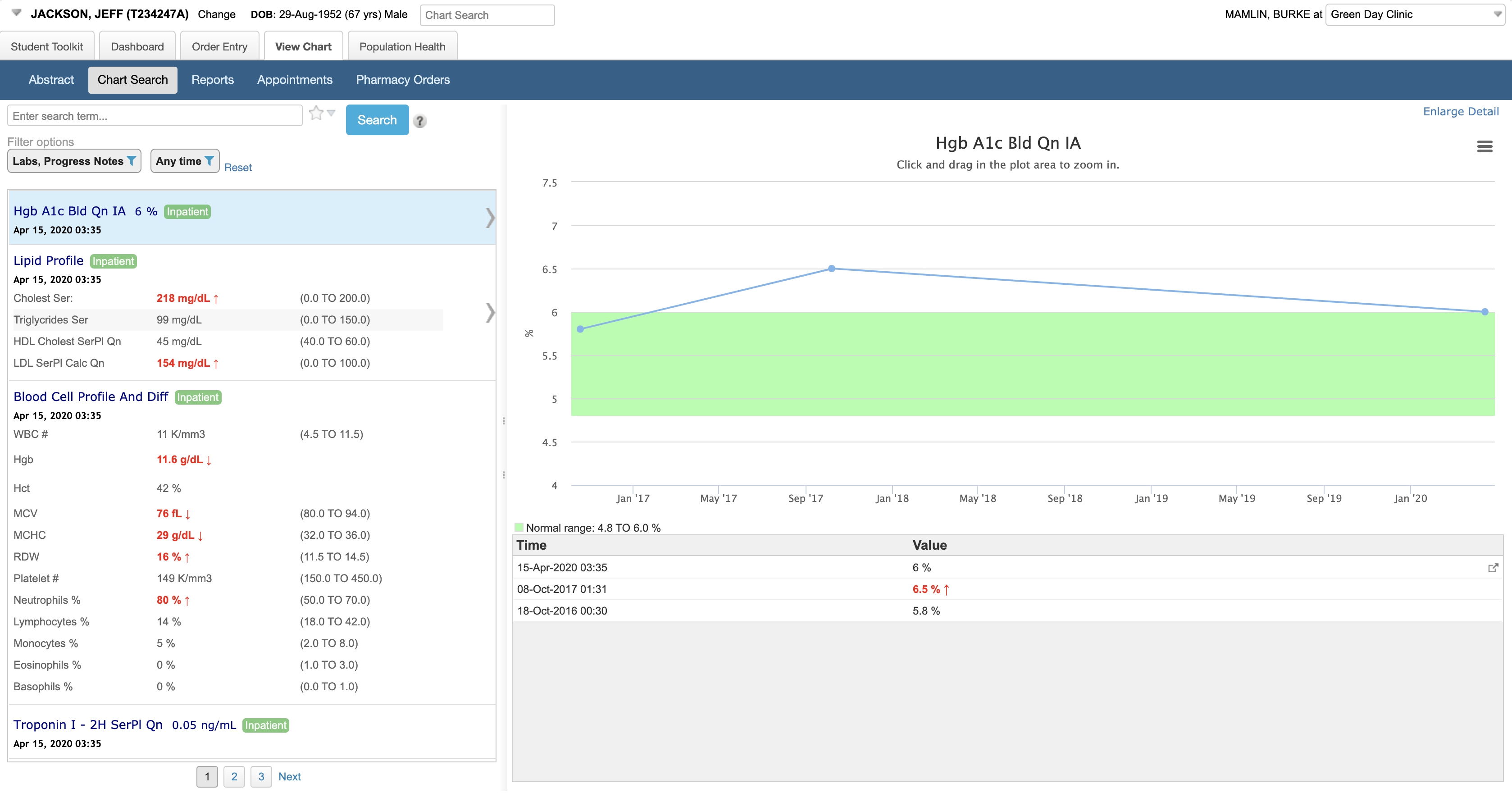
Selecting an individual numeric result shows a graph and a list of values in the detail pane.

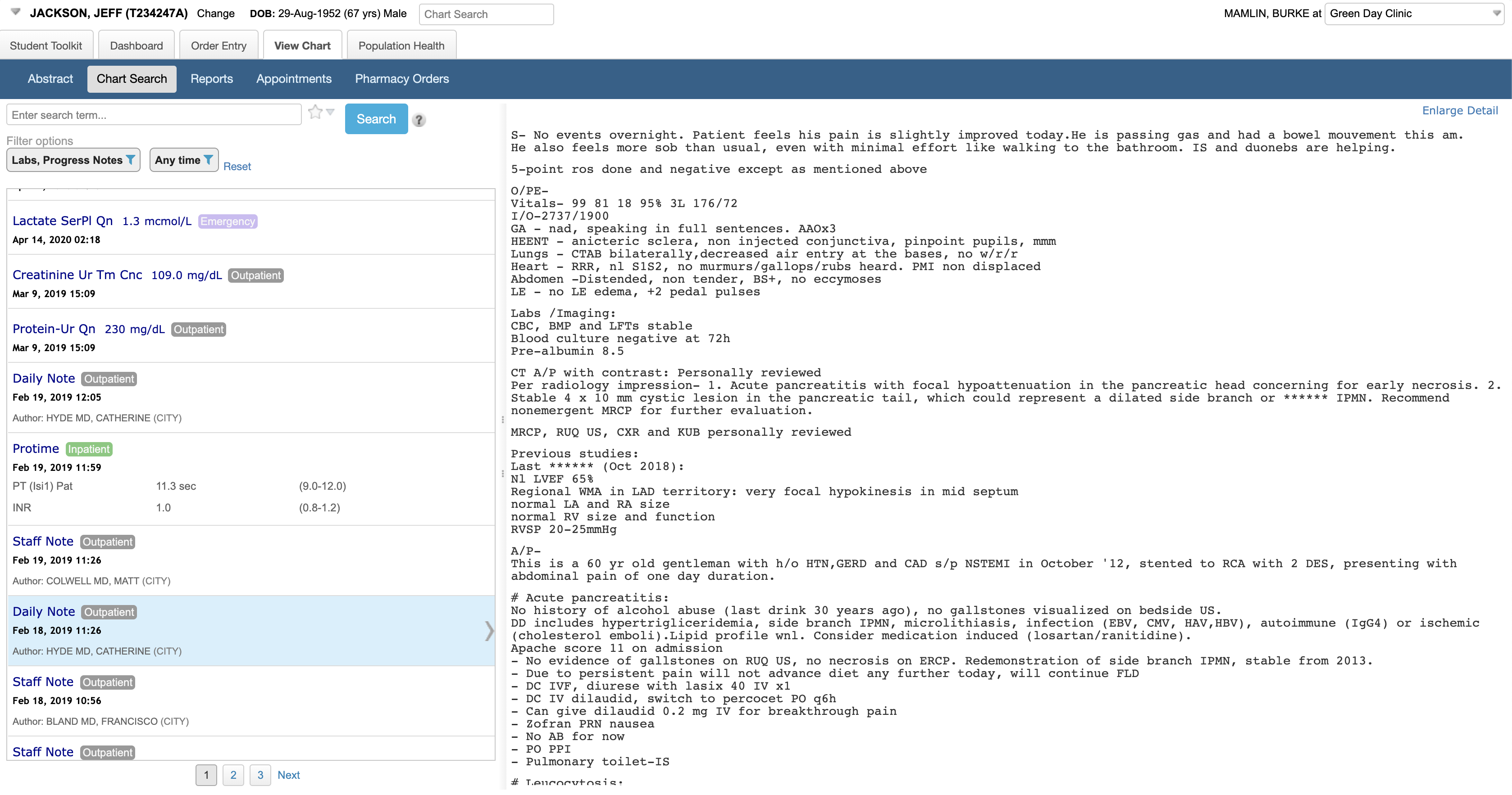
Results are not limited to labs or just numeric data. You are effectively googling the patient’s chart.

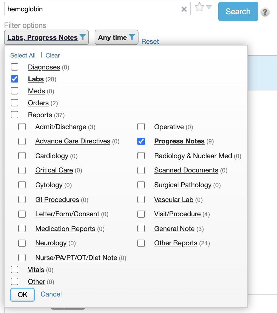
This example shows a search for “hemoglobin” with support for synonyms and context highlighting in text:

You can quickly filter and know where the data are – e.g., in this example I know there are 28 labs, 3 admit/discharge notes, and no cardiology reports mentioning hemoglobin before I make any filter selections. I can randomly select multiple with checkboxes or instantly narrow to one by clicking on its name. I can also save my default set of filters. In a different version of Chart Search, we let you save specific filter settings as quick links.

@k.joseph did a valiant effort of introducing a Chart Search module for the Reference Application; however, we never got it refined enough to be useful for implementation for wide adoption.

/cc @jdick @grace

5 Likes

FYI All: We will be having an open Test Results Design/Feedback session on this coming Monday August 17 at 9:30pm IST | 7pm Nairobi | 6pm Cape Town | 4pm UTC | 12pm Boston | 9am Seattle. http://www.uberconference.com/openmrs

Ajay Brar is going to walk us through these designs and we’ll open things up for feedback and discussion.

See you there!

FYI @pradiptakundu @angshuonline @mksd @ddesimone @ball

1 Like

Burke I’ll be really interested on Monday to talk more about the graph visualization. I love these visualizations and the movement to even paper visual representations of Vital Signs in the last few decades is a good reference point for how powerful a visual can be at showing trends/changes.

I primarily worked with Meditech as a clinician, and to this day I was the only nurse I knew who used the graphing functionality - because others didn’t know about it, or it was a few clicks away which was too much added regular work.

So two questions:

  1. In the dataplot example above, does this pop-out automatically when you click that lab value type (Hgb A1c above)? Or did you have to click in a few places to get the chart to generate?

  2. If it does require a few clicks, how often do you see clinicians using the graphing functionality?

I think it would be really cool if our visualization tool was only 1 click away (e.g. by clicking on the A1C row I immediately see a chart, or maybe by clicking on a graph button next to the value label).

One can also imagine this being very, very handy for patient education: “Look at how your viral load has been trending!”

The detail pane (on the right) shows detail for whatever result is selected on the left. The first result is selected by default. If the result is a panel (multiple results together like a chemistry panel), graphs are shown as a small sparkline and you have to click it if you want to see that graph expanded to fill the detail pane. When you select a numeric result on the left, the graph is shown instantly in the detail pane without any additional clicks.

chart-search

The idea of the detail pane is to take advantage of knowing the user is interested in the chosen result for the patient and show relevant information. A graph & table are low hanging fruit for numeric results, but could be enhanced with related results, meds, links to knowledge, etc. A handful of detail panes can serve most results (numeric, panels, text, images) and could adapted for context-specific views (e.g., based on user specialty).

1 Like

Wow that is a beautiful interaction! The way the line loads is quite nice.

The idea of the detail pane is to take advantage of knowing the user is interested in the chosen result for the patient and show relevant information.

Yes!

could be enhanced with related results, meds, links to knowledge, etc.

To link related results or meds - wouldn’t we need to integrate with some kind of DB that stores all the knowledge of how different things are connected? This seems like largely a knowledge/linking problem.

Correct. The fun technical challenges in implementing chart search like this are implementing Apache Lucene (e.g., ElasticSearch) for instant search results with counts, context in text results, etc.; designing the UI such that loading of results & the detail pane content never blocks or delays user interaction with filters & search settings; and, designing simple & effective result & detail views of data that can handle reference ranges & abnormal flags across a variety of data types. But the real magic (as you’ve identified) comes from having the necessary metadata to make it clinically relevant, including rich synonyms for searching, when data should be shown in a panel vs. individually, the sequence of components in panels, and the classification of content into useful & meaningful categories (as seen in the filter choices) including the ability to distinguish signal from noise in the data. For example, in the common use case of encounter forms in OpenMRS, it would probably be better to see these data sorted within panels rather than as individual results in a random order or interwoven with lab results.

1 Like