It will be an amazing improvement to the Reference application
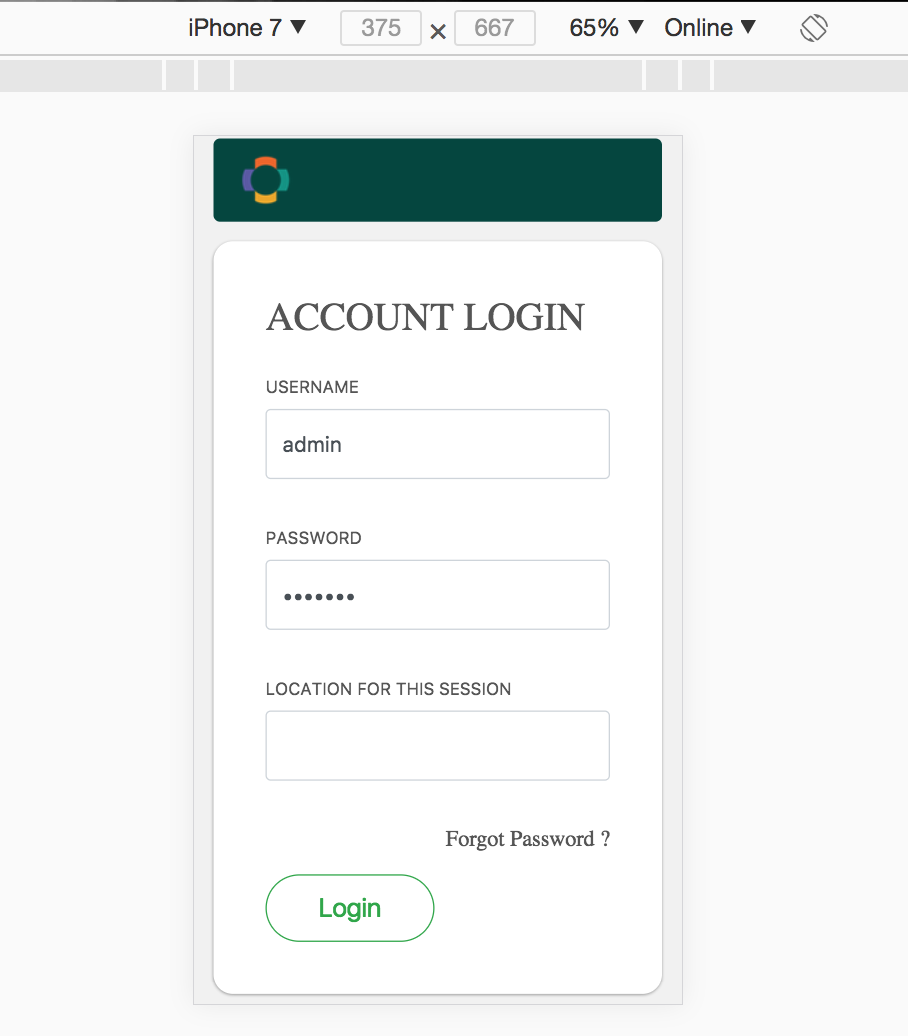
But It felt, we are missing the fixed width of the body part(white area) for the PC view . Shall we keep that width of the PC view body part as usual to maintain the consistency? (I think, We can change the width of the body using some JS scripts based on the user device)
Other than that, the Mobile view is a good one according to the design.
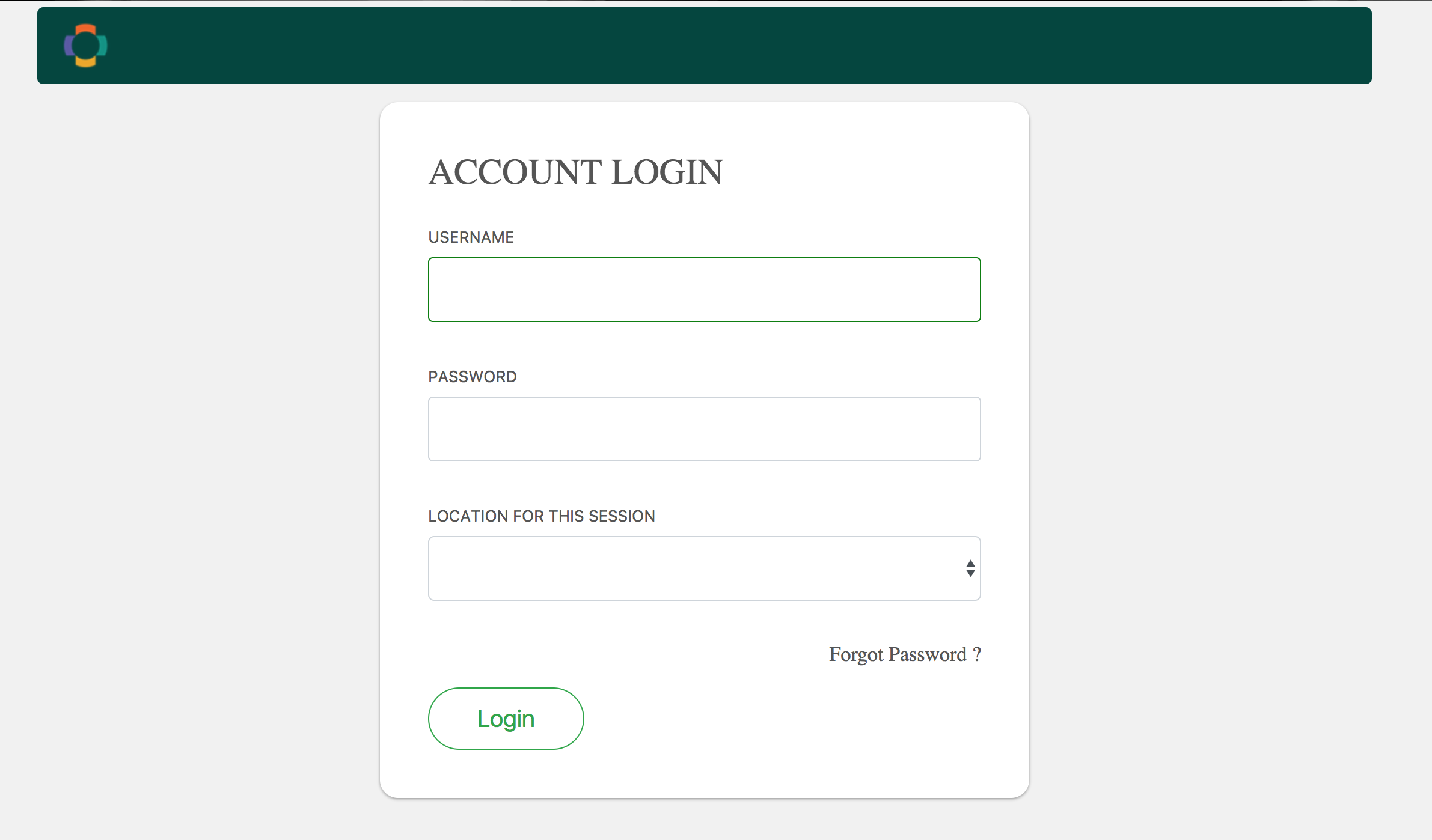
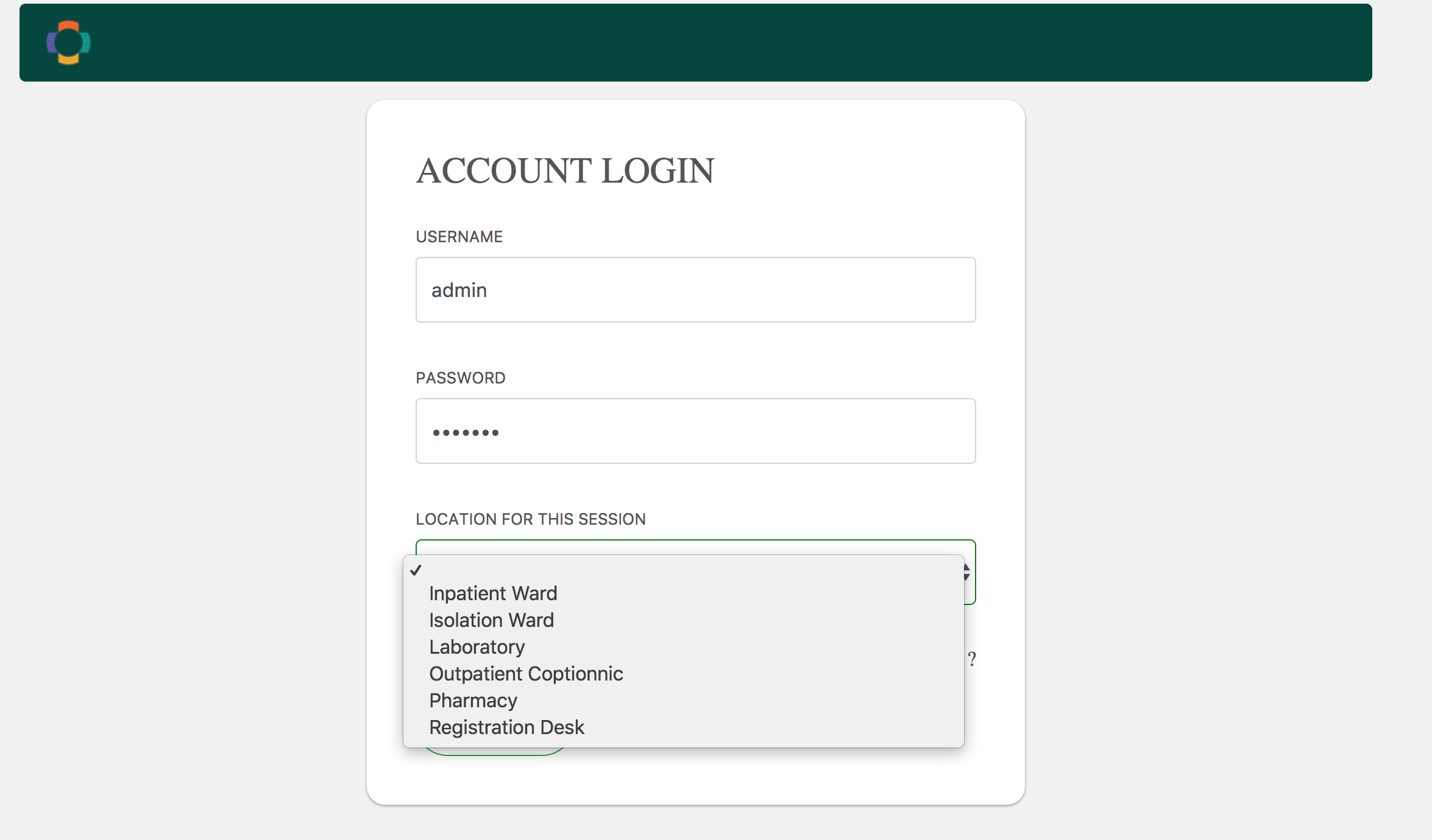
Keep the Login button to right margin align for PC view and keep the Login button to the center margin for Mobile view
Better to follow the default buttons styles for OpenMRS refrence application
Use Twitter Bootstrap 4.0 as a foundation for the UI components
Build a RefApp theme which mimics the look and feel of the current RefApp even if not pixel-by-pixel which will be the basis of other OWAs.
This way everything that is done will provide a foundation that all other OWAs will congregate to.
@darius@wyclif@burke@dkayiwa Please help me confirm if this approach is consistent with the discussions on the design call… I am hoping that one OWA is done as the “reference” sooner than later
@ebuka Apologies for sounding like a broken record, but are the designs based on Twitter Boostrap as the lowest foundation for widget designs and responsiveness?
@burke 's suggestions is brilliant in the context of space utilization ,it’s simple and straight forward for the user.I have loved it, coupled with the default theme of RefApp @ssmusoke 's observation would make it great.
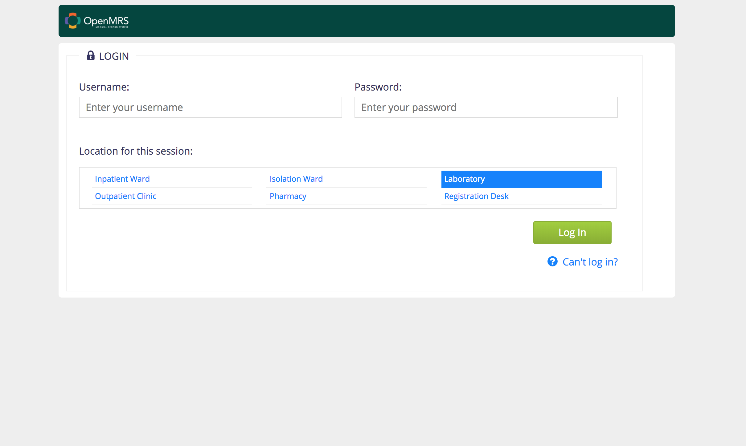
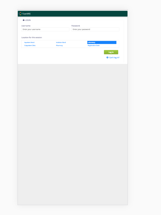

 . Shall we keep that width of the PC view body part as usual to maintain the consistency? (I think, We can change the width of the body using some JS scripts based on the user device)
Other than that, the Mobile view is a good one according to the design.
. Shall we keep that width of the PC view body part as usual to maintain the consistency? (I think, We can change the width of the body using some JS scripts based on the user device)
Other than that, the Mobile view is a good one according to the design.