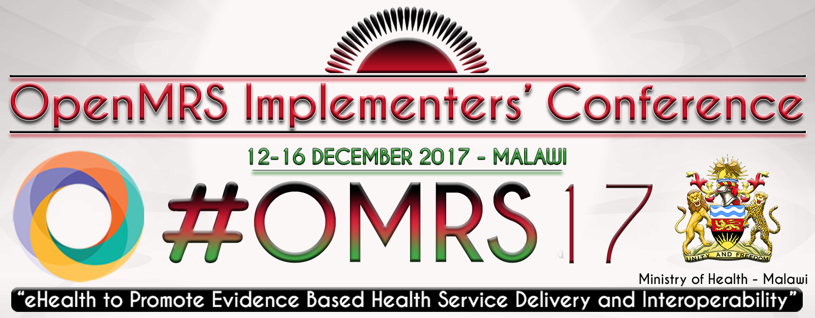
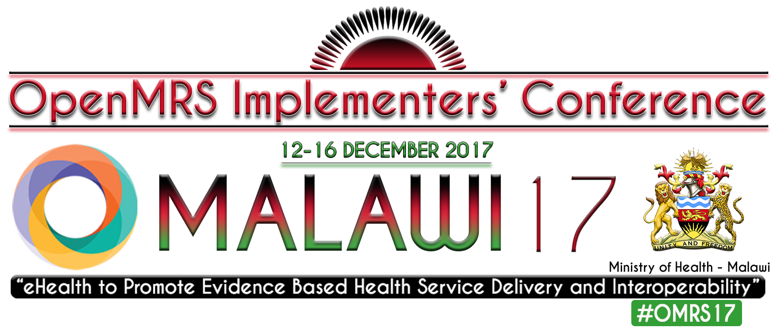
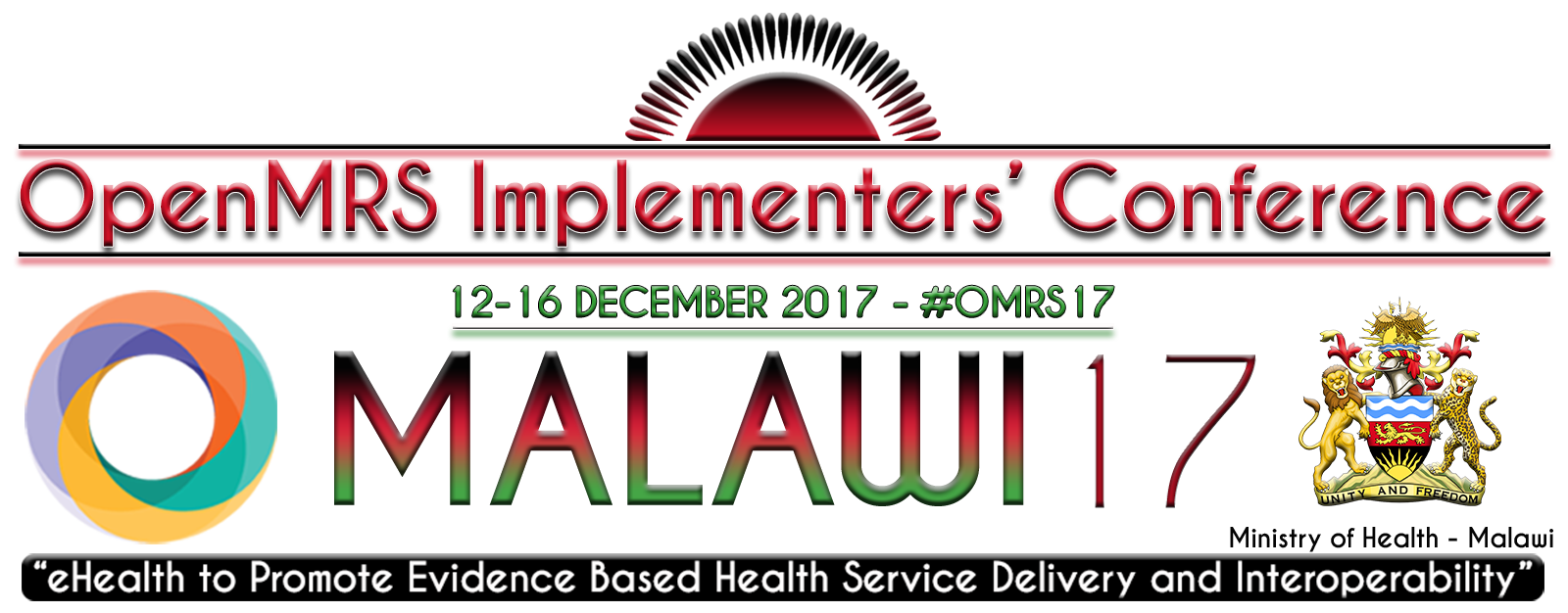
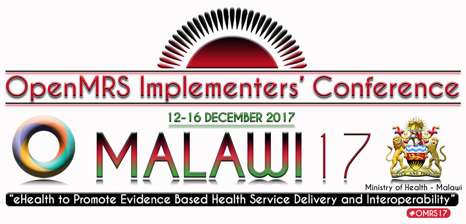
We received our OMRS17 banner/logo designs and wanted to present them to be voted on! Some minor changes need to be made to the text, but the designs are right where we want them to be.
Please cast your vote by replying here with either ‘1,’ ‘2,’ or ‘3.’ Thanks to everyone that submitted their designs; its up to the community to decide now!
Edit: I realized that my export of the originals with adjusted dates messed up the font… These are the originals, but please ignore the dates as they’ll be corrected!
I’d have to say 1. Where would these be placed by the way? Picture 1 seems to me like an official logo for the event and 2+3 seem to be like postcard/info card graphics to remind people of the event. All of these are great designs though.
I like #1 as well but we’d need to use the proper OpenMRS logo and not the circle. Also agree about the larger hashtag, but do think the plume/sun at the top is nice.
The OpenMRS cross (as per our logo policy) would be appropriate for any OpenMRS branding; but, the wheel is the “official” logo for the summit (aka our annual global OpenMRS event). See the wheel for OMRS15 and OMRS16. Though, we should probably stick with the same wheel rather than doing 3D effects on it.
#1 is what I go for
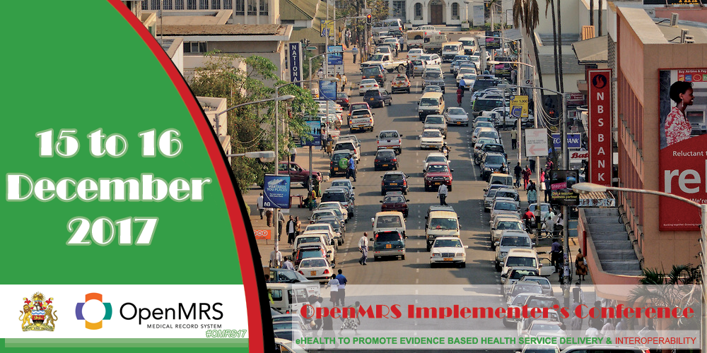
The theme colors blend into the national flag of Malawi and the rising sun on top represents the dawn of freedom and hope on the African continent just as it is on the Flag.
OpenMRS gives hope to improving Health.
Is it possible to use a solid white background (or transparent) instead of the gradient grey-to-white background, so that it works on all types of marketing materials?
I said this before I read through all the thread. The new designs look good, the circle in these versions make it more OpenMRS-like unlike the first one.
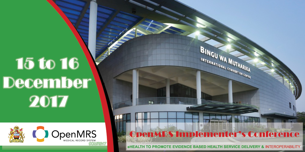
 The theme colors blend into the national flag of Malawi and the rising sun on top represents the dawn of freedom and hope on the African continent just as it is on the Flag.
OpenMRS gives hope to improving Health.
The theme colors blend into the national flag of Malawi and the rising sun on top represents the dawn of freedom and hope on the African continent just as it is on the Flag.
OpenMRS gives hope to improving Health.