Hello all,
The hospital administration in one of our implementations are relatively old - ~55 years and are facing aesthetic issues with appointments module. We wanted to recommend some of the following changes:
-
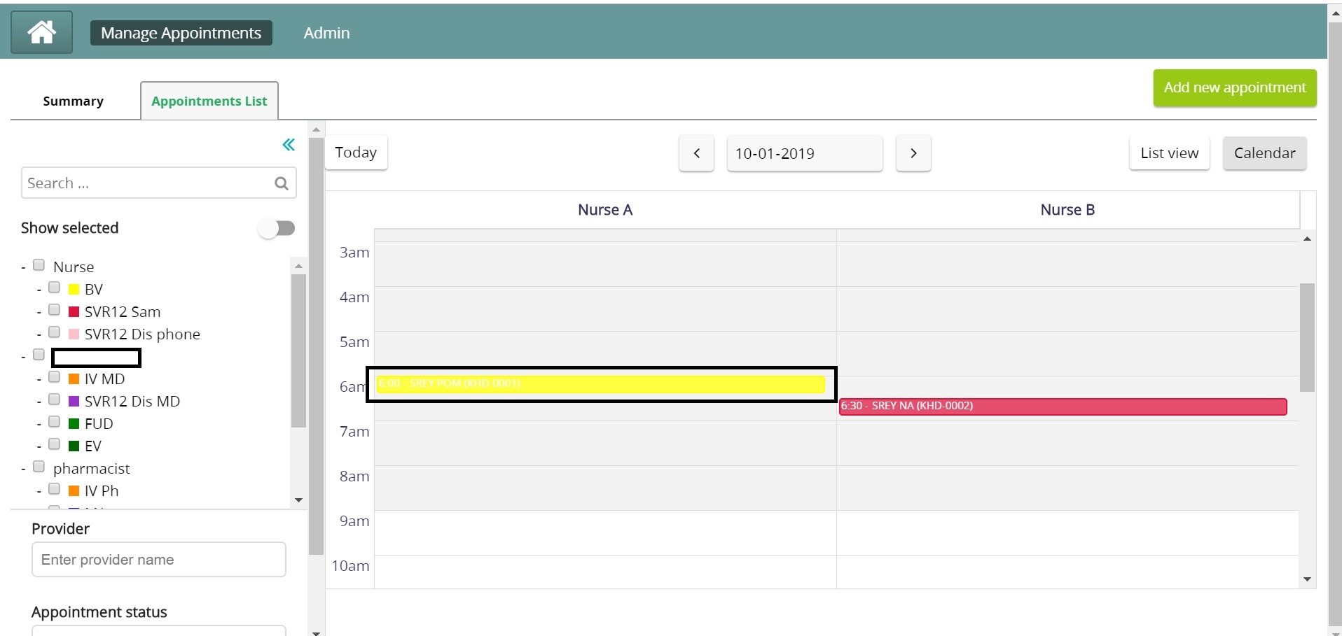
Ability to configure the colours for services: Currently, the text on the yellow colour is invisible (see attached)
-
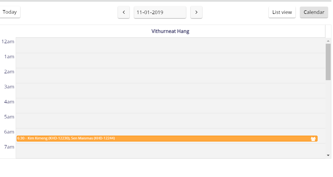
Separation between multiple patients in the same time slot: As in the attachement, there is only a comma separation between multiple patients. This makes it harder to distinguish between two patients if the user has visual problems. Also, in case there are multiple patients (>10), it’s difficult to distinguish between the two. Can we use more space or a boldened bar “|” to help distinguish between the different names?
-
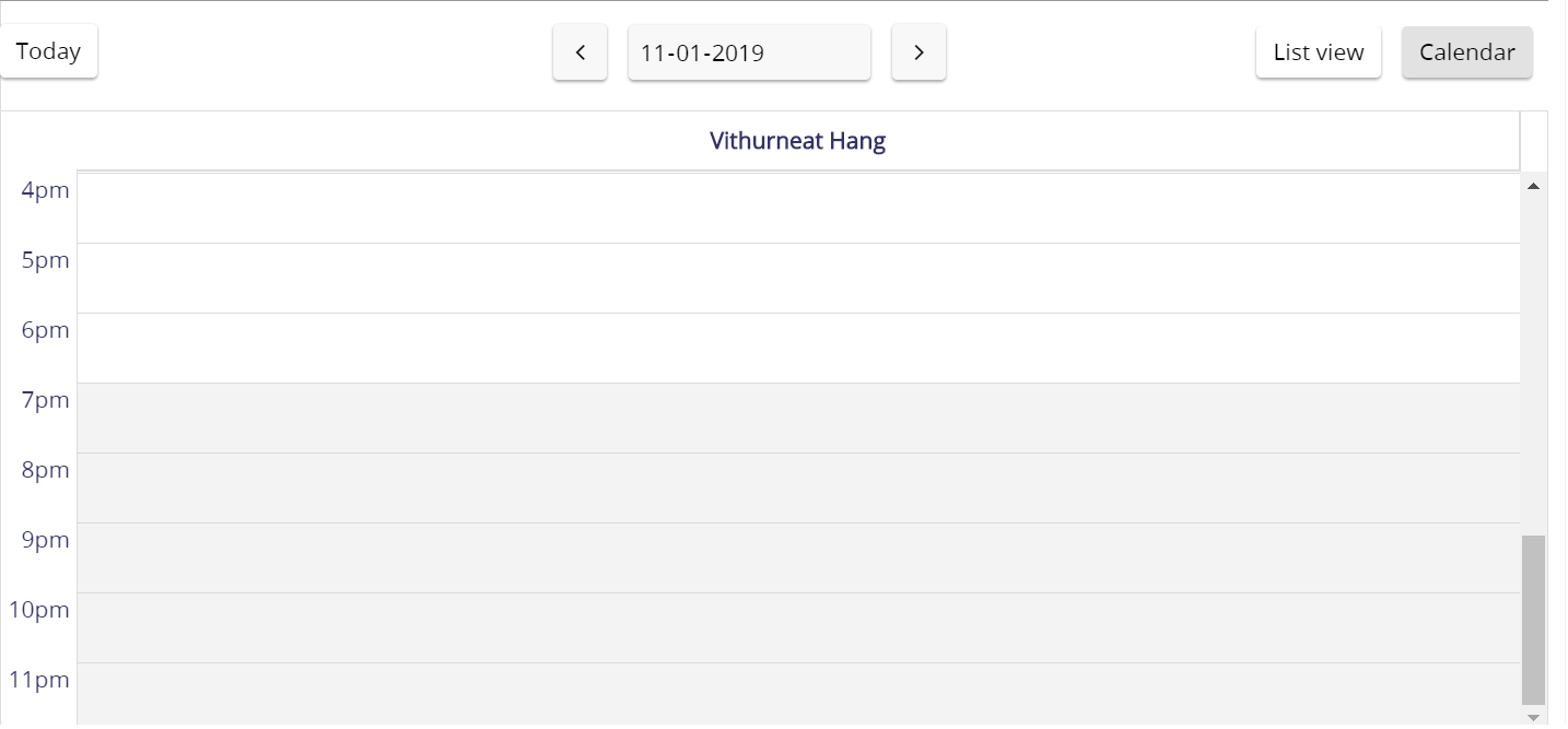
Viewing only working hours on calendar: The calendar view currently includes all hours (as attached). Can we configure only the working hours to avoid the need for scrolling
-
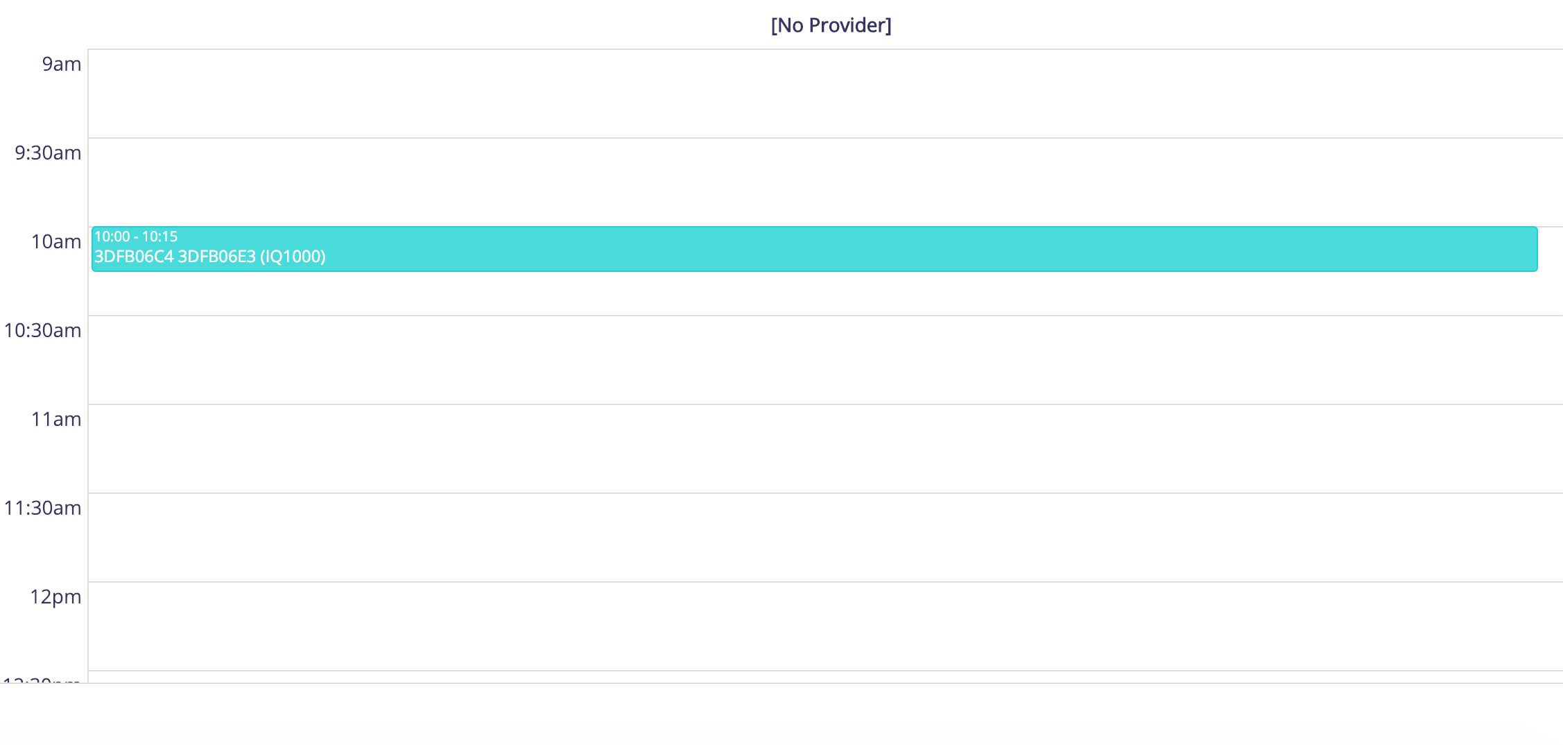
Increasing width of each appointment in calendar view: As the appointment is a 15 mins appointment, it appears like a thin line and difficult to view in the calendar mode. Can we either increase the width between each slot or create 15 mins/ 30 mins slot i.e. instead of 2 pm, 3 pm, 4 pm - create 2 pm, 2 30 pm, 3 pm and so on, on the Y axis. This will increase the width of each appointment created and become easier to view.
Please do share your inputs and do let us know if anyone is currently working on any of these features.
CC: @abhinavpc, @vmalini, @pramidat