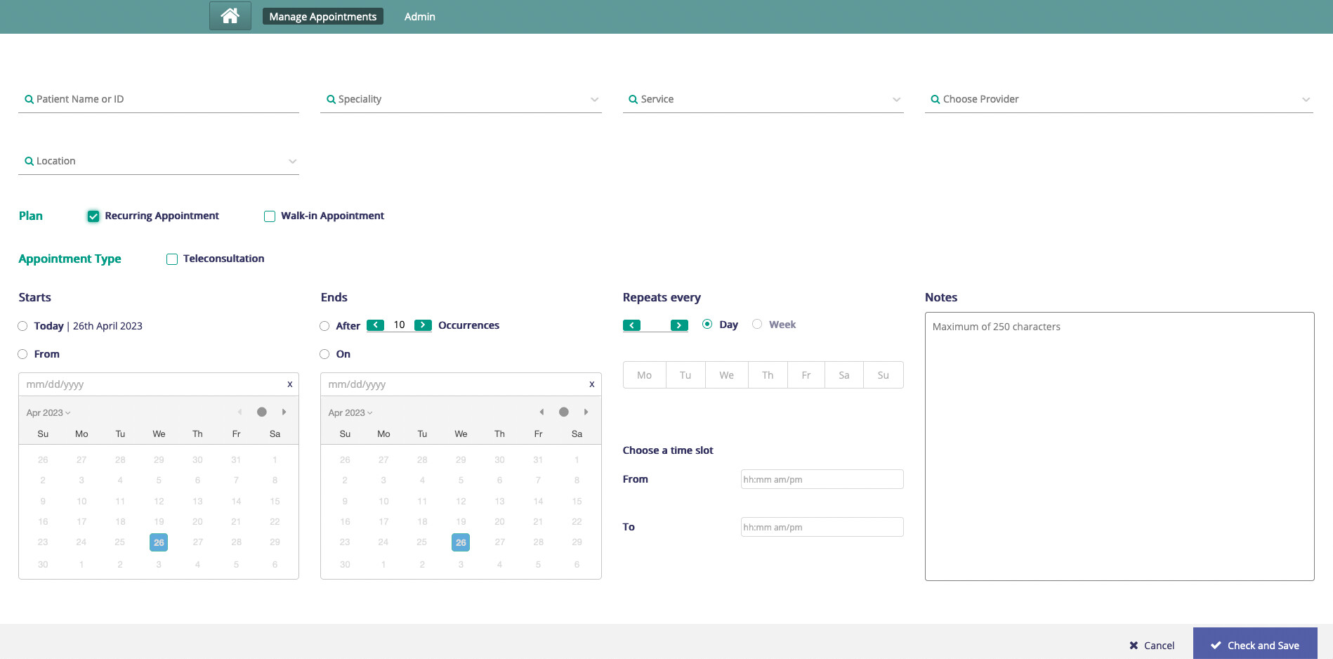
Team, As part of a client engagement, we have an oppotunity to improve the UI/UX for create appointment. The new design isn’t a large overhaul hence most of the functionality remains the same except for a appointment category drop down. More about appointment category here.
Proposed changes are as follows:
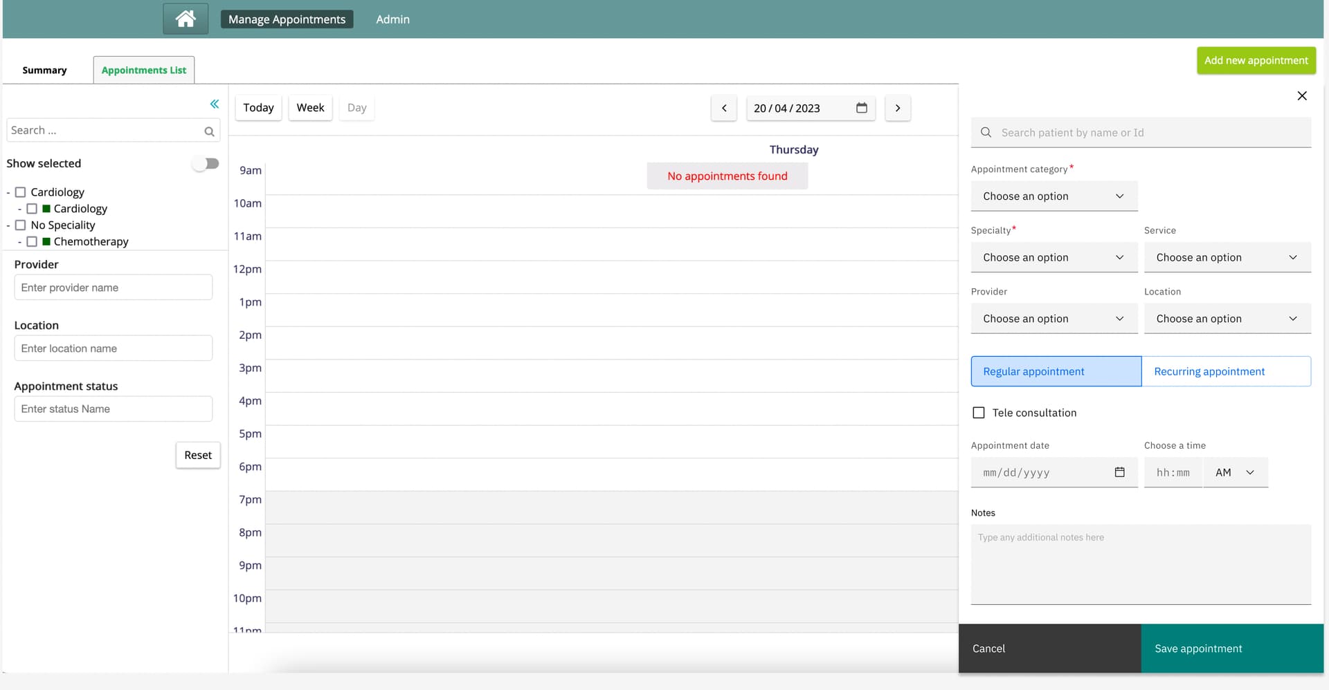
- Use of carbon UI for a cleaner and newer look.
- Unlike earlier, the new design now affords a split screen. This allows the user to maintain context while adding new appointments.
- Tele consultation is available for both, regular as well as recurring appointment types.
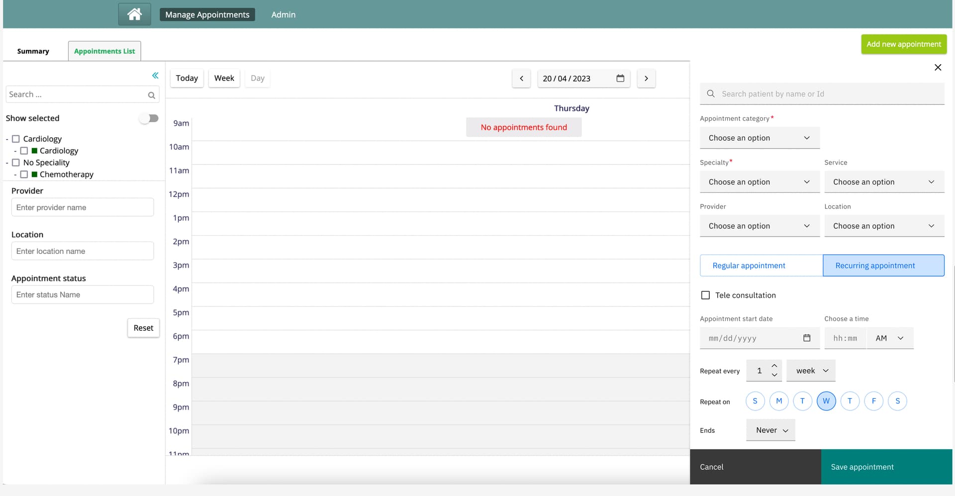
- We now have a much simpler and cleaner recurring appointment UI.
- This section is inspired from the familier google calendar’s recurring meetings.