This is a video of a review of UgandaEMR form which is consistent with the design approaches for OpenMRS 3.x based micro-frontends but which can be used to improve the overall flow of existing implementations
Do leave your comments on the video as a way of sharing what you have learnt through the process
Thanks for sharing this @ssmusoke! Very much agreed with the UX pointers he shares throughout the video. It’s wonderful to be having more discussions in OMRS around good UX - so, thank you!!
Agreed as well re. the overlap with many goals and themes in 3.x. e.g. The single column layout in forms, for example. Here’s some additional thoughts FWIW:
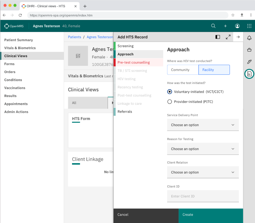
Reminds me of the nice forms design work coming together from the UCSF OHRI team & MF Squad (see all designs here in Zeplin, or at this link here for those who don’t have/need Zeplin access); screenshot below for quick reference) - notice the single column view, and left side form navigation.
I see the history of this initiative in this twitter thread here: https://twitter.com/vponamariov/status/1404526258768207876 If Victor’s interested in contributing to our design work, let me know and I can onboard him to some of our UX/Product processes