Context
Queue workflows are split between two audiences that currently share one screen. Clinic administrators need to monitor any queue in a clinic; normal queue users sit in a single queue location watching one or more services. Today /home/service-queues only serves the second group, so an administrator asking “which queue is backing up?” changes dropdowns one combination at a time and holds the comparison in their head.
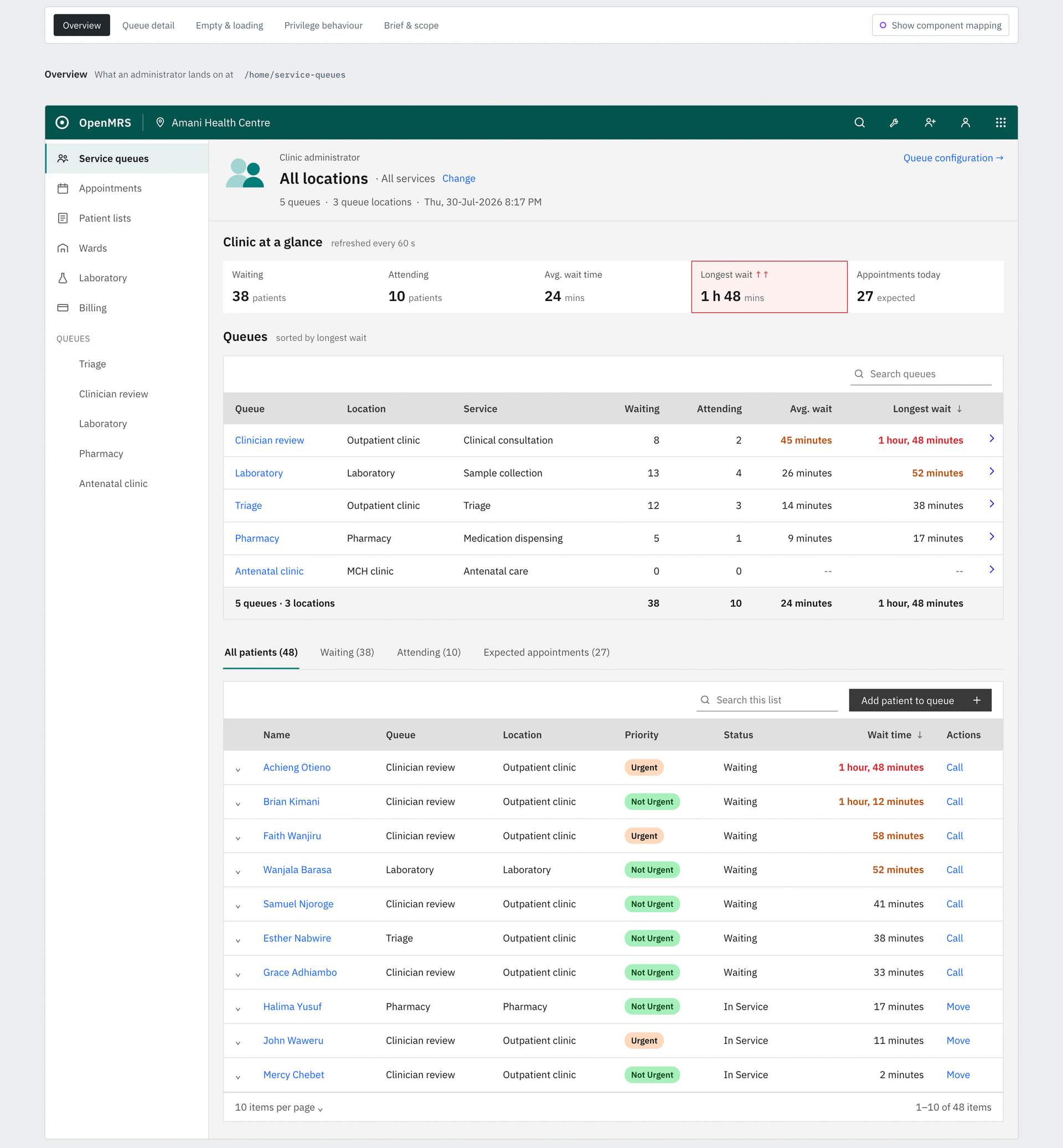
O3-5770 asks for a dedicated monitoring screen, styled like the bed-management / billing-administration screens, shown in place of the normal view when the user holds App: Service Queues Clinic Administrator.
Mockup:
The design
Same URL, /home/service-queues, privilege-swapped. Top to bottom:
- Clinic at a glance — a flat strip: Waiting · Attending · Avg. wait · Longest wait · Appointments today.
- Queues — one row per queue: Queue · Location · Service · Waiting · Attending · Avg. wait · Longest wait, sorted by longest wait descending, with a totals row. Each row drills into that queue.
- Tabbed patient list — All patients / Waiting / Attending / Expected appointments, clinic-wide, with Queue, Location and Status columns.
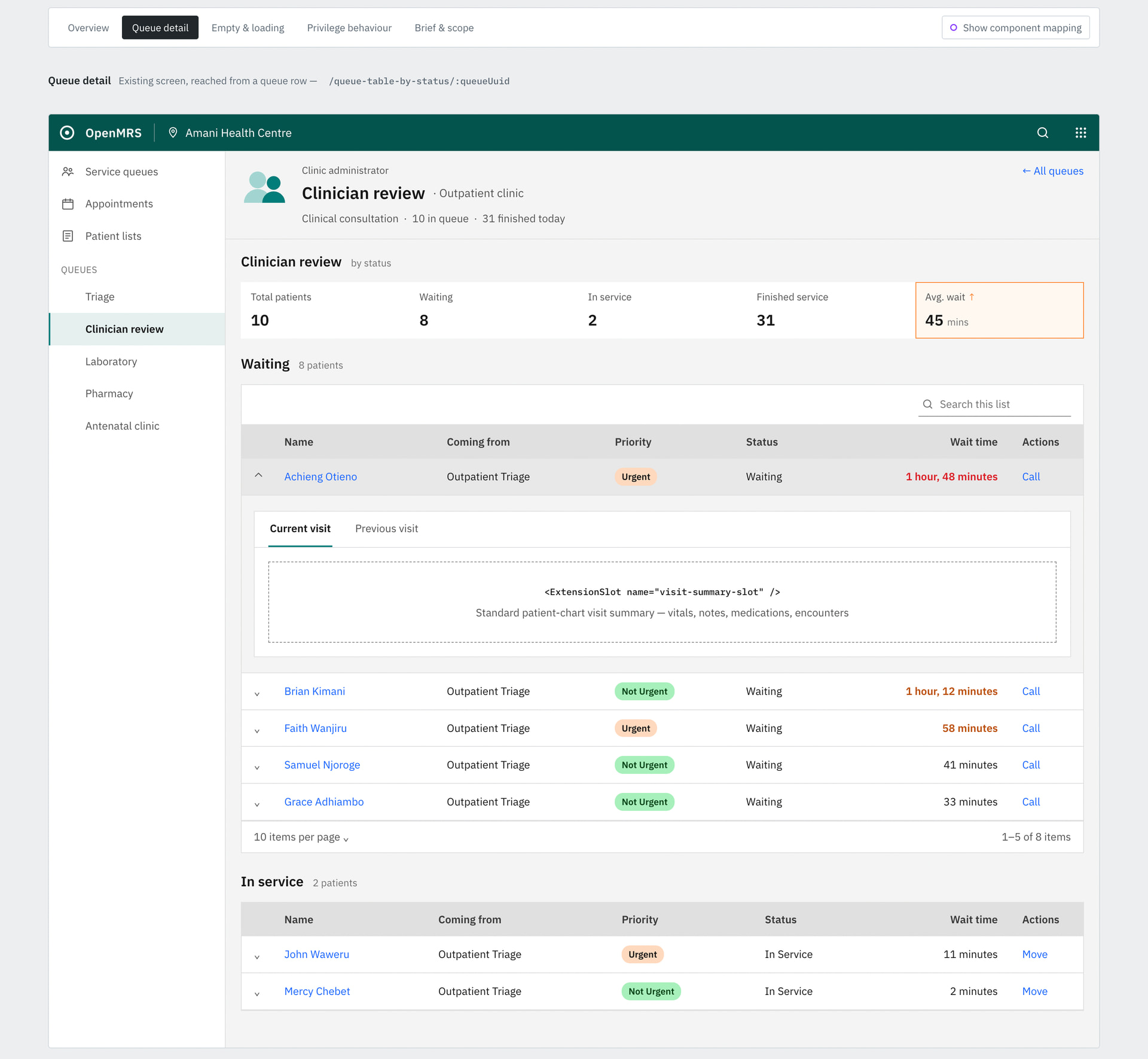
Drilling into a queue lands on the existing per-queue screen, unchanged, so the row actions (call, transition, move, edit, remove) already work.
Things that may not be obvious
- The default tab is All patients, not Waiting. Per the brief, an administrator should see every status while a clerk or clinician sees waiting. So, the privilege drives the default and not just the screen choice.
- A patient’s name links to Edit patient, not the chart, since the administrator privilege is not the clinician one.
- The alert styling is borrowed from the patient chart’s vitals strip — a tinted fill and coloured border on the out-of-range value. A backed-up clinic reads the same way an abnormal temperature does, rather than introducing new vocabulary.
I’d appreciate any feedback you may have.