Let me briefly break down the tasks I handled in the 6 weeks. Feel free to reply with a question or a doubt or rather a thank you if this work pleases.
In these weeks I majorly focused on the Patient Chart, since I saw I had most of the designs ready for work and it had most of its features at hand. I decided to kick off with it as I grasp more knowledge concerning responsiveness in OpenMRS.
I noticed 13 issues and managed to push 12 pull requests for the tasks. Let’s break them down
Tables
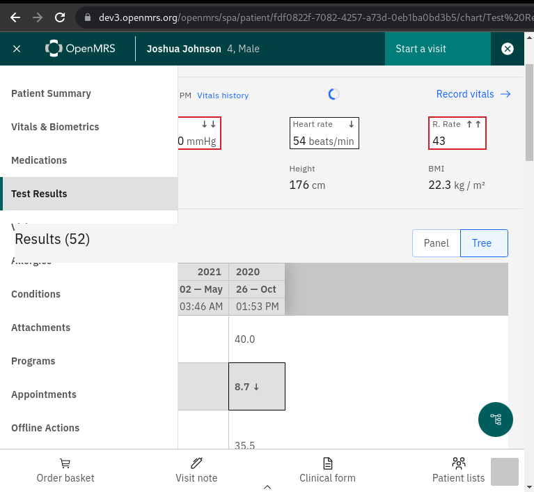
From the designs, I noticed that each table row has to have a height of 48px and 32px in tablet and desktop respectively.
This wasn’t responsive in the patient chart since the height for the rows was overridden to 2rem. This limited the expected behavior from desktop to tablet. Removing this override from our style-guide fixed the issue.
>> PR
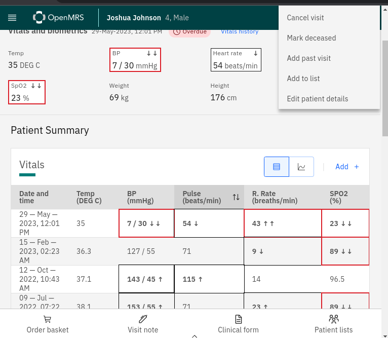
Banner Actions
I also noticed that each action menu item in the action-overflow-menu inside the patient banner has to have a height of 48px and 32px in tablet and desktop respectively.
We are creating a custom overflow-menu-list since we want to append the Actions word onto the menu, so I only had to append the large class ‘cds–overflow-menu-options–lg’
from carbon design every time we switch to tablet. Extended this further to the Medications table too.
>>PR
Patient Banner: Contact details section
In the contact details section, I fixed and implemented a few features. We were having an issue where the address keys were not displayed in the address column. To fix this, I changed the useCustomAdressFields configuration by appending and enabled boolean that will enable and disable this setting. Check with the test config below. cc @dkibet
Further on this, I added the patient list section that is responsible for showing lists to which a patient is already added. This shows at most 3 lists and clicking on one redirects to the list view where you can more patients on that list. It also provides you a ‘see n more lists’ link where n is the total lists to which the patient is added minus 3 (n = total-Lists - 3). Clicking on this link currently, redirects you to the patient list home.
Furthermore, we were having an issue where the Relationships section could not display the association relation just because of an endpoint error. I updated the request endpoint and added a regex to pull out the relationship name. Check out that PR below to more about this. How we handled responsiveness and stuff
>>PR
 "@openmrs/esm-patient-banner-app": {
   "useCustomAddressLabel": {
     "enabled": true,
     "customAddressLabel": {
       "address1":"New Adress1 name",
       "district": "County",
       "address4": "Ward",
       "state": "Sub county",
       "city": "Village",
       "postalCode": "Postal Address",
       "country": "Location",
       "address5": "Sub Location",
       "address2": "Landmark"
     }
   }
 }
}
App Bar/Bottom Nav/Side Nav
When on tablet, the patient header was given a z-index of 5 which is lower than that for the overflow menu. This made the overflows show on top of the patient header when scrolling through the page just because the carbon overflow menu component has a z-index of 6000. I aligned the z-indexes to 8000 for both the patient header and bottom nav and removed the override that was done to the patient banner. This fix in inconsistency also fixed the issue that happened on routing to the Test results dashboard. Where the Results title showed in the side-nav. But also later brought an issue that I will talk about in the post. See figure below
>>PR
Start VIsit/Allergies/Visit Note forms: Tablet design
This task was majorly focused on updating the Start visit, allergies, and visit notes forms to the new tablet design.
>>PR
Bug: Side scrolling
The start visit, visit note, and the allergies forms had side scrolling generally due to the patient info header section that was taking a width of 100% and then adding it up to a margin from left and right of 1rem, this increased the overall width of this element to more than 100% hence the side-scrolling.
>>PR
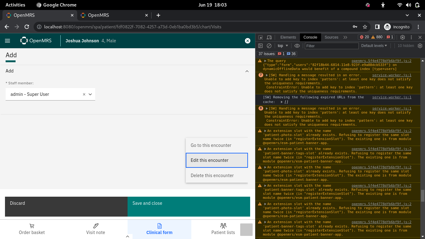
Bug: Overflomenu items should close on click
This is a follow-up issue I fixed after working on this PR where I introduced editing and deletion of encounters to be handled through permissions. Carbon overflow menu items expect an immediate parent as the OverflowMenu component, perhaps it’s the one handling the closing. I was wrapping the overflowMenuItems under a react fragment and it complained. See the figure below >>PR
…