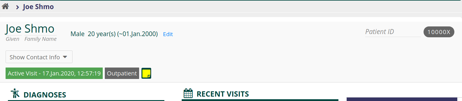
In the course of making the patient banner responsive, I’ve moved some things around and redesigned a little bit (based on @ddesimone’s designs). Please take a look at the screenshots in the PR and chime in if you have strong opinions.
1 Like
looks good ! well done
1 Like
@bistenes well done brandon on this, i have only a question around the drop down menu,i see it in the center but to my experience users always get the drop down at the extreme right,what do you think?