The current UI (non-legacy UI) of reference application 2.3 is web-responsive i.e. the elements on a page rearrange itself with change in window size.
But, the same behavior isn’t found when operating from small screen devices like mobile, tablet, etc.
On viewing a running instance from mobile browser the UI somehow fits inside the screen shrinking the original UI that is observed on web browser on desktop. The UI on mobile isn’t 100% responsive as the UI elements do not rearrange themselves to fit mobile screen. Instead due to shrinking behavior the UI appears really tiny leading to uneasiness in operating from small screen devices.
Is there a way I can accommodate the element-rearrangement behavior observed on desktop browser to mobile browsers too??
The UI was not actually designed to be responsive, so the fact that it
works with a shrinking window size is actually a lucky accident.
There isn’t an OpenMRS setting that would control this, because the
behavior is accidental. I presume that some small tweak to the CSS would
give the behavior you want on mobile browsers, but I don’t know what this
change is. Maybe there’s a CSS wizard who can look into this?
Want to try this out, and if it solves your problem on mobile without
introducing any side effects then send a pull request, adding this to one
of the scss files in uicommons?
The changes are needed to be made in AppUI, UICommons, and ReferenceApplication modules. You’ll have to place the meta tag inside all the gsp/jsp files containing <head> element.
The only issue with the responsive UI so generated after making changes in some of the modules is the tables.
Various tables related to search functionality like- find patient record, active visits, etc. are large and cannot be shrink or made responsive as then it shall make the UI poor.
I have just tried out your changes on my phone. The page no longer adjusts to fit the screen. So as a result, i can no longer see some of the page elements like the login button. So i think this makes things worse.
The problem may persist on some of the pages due to fixed values given for various css style properties like height, width, etc.
These changes are need to be done in the css files of specific page. CSS gets generated on building the modules. One needs to edit those files and replace the pixel units with something in percentage (%).
As I’m editing the CSS generated after build and rebuilding the modules, the changes won’t reflect on the code base.
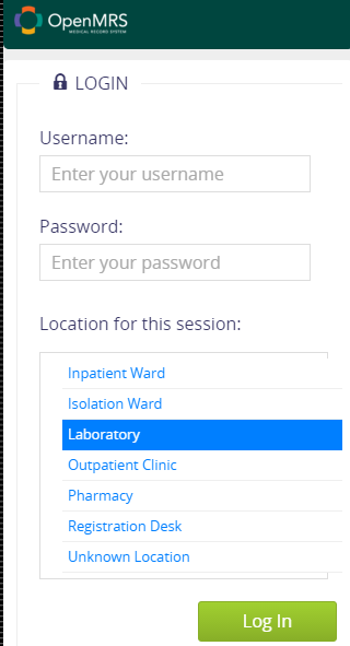
Here’re the screenshots of login screen after including meta tag and fixing few static(fixed) sizing values:
Portrait Mode: