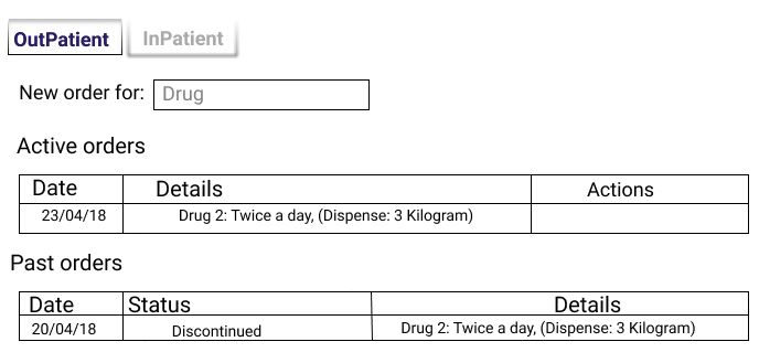
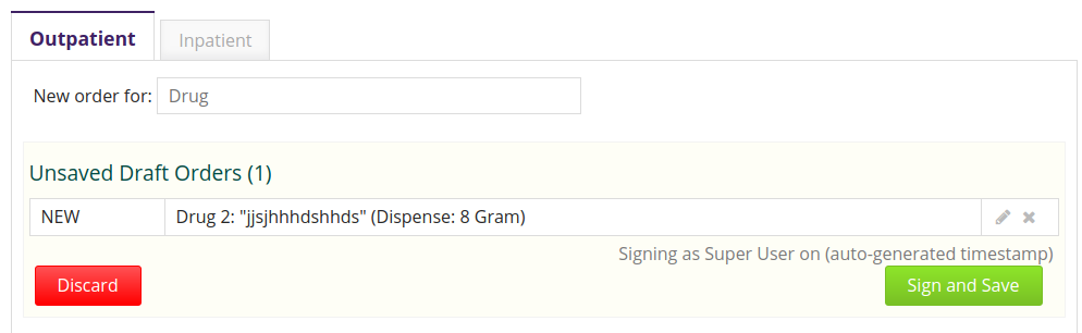
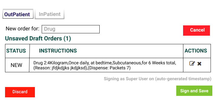
The current implementation of the order entry application allows a clinician to sign and save multiple new drug orders at once. In order to add a new drug order, the clinician should search for a drug using the ‘New order for field’ located above the draft table as shown below.
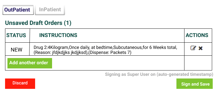
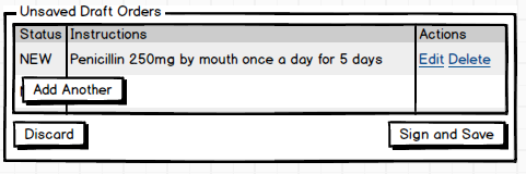
This feature allows a clinician to add more drug orders to the existing draft, but can easily be missed as it is not immediately visible to the user.
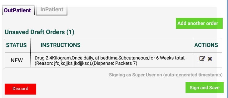
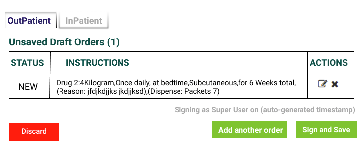
We propose a redesign of this user interface where a clinician will have to click on an ‘Add another order’ button, which, will then present the user with a new form to create a drug order. We believe that this button will make the functionality more visible to the clinician when interacting with the application. Attached is a mock-up of the proposed redesign.
I think the button/widget should be in the same place for placing the first order or the second, and the Add another order button you’re proposing is in the wrong place (for the first order).
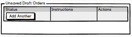
One alternative would be to incorporate a button into the draft orders table:
Then I would expect a pop up dialog for placing the order, which could be helpful in that it allows a multi-screen flow (e.g. first you’re shown some common options).
Another advantage is that we could eventually have separate buttons for Drug Order, Lab Test, etc.
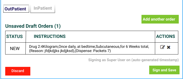
After you’ve added the order it would look like this:
According to the current implementation, the draft table is not visible until one has filled in an order form and clicked submit. Therefore, the table is only visible when there is one or more draft orders. That is why there is no mockup for an empty table,
According to the current implementation, the draft table is not visible until one has filled in an order form and clicked submit. Therefore, the table is only visible when there is one or more draft orders. That is why there is no mockup for an empty table.
Could you please shade more light on the common options and separate buttons?
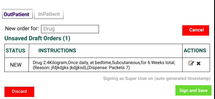
With regards to the positioning of the ‘Add another’ button, we were able to come up with an alternative implementation. Here, the button will appear in the top right corner.
In my alternate suggestion you’d need to always display the draft table, so that the button can always be there.
@flavia, can you please also share what things would look like in your proposal when the page is first loaded? That’s what Wyclif and I are asking.
Sure, I’m thinking of this as a possible future enhancement, not as something that I’m actually asking for now. But for example we could change the “select a drug” process to be more guided (these screens are from a tablet application we built for Ebola response):
=>
=> fill in drug order details
The other thing is that (later) we would like this tool to allow a doctor to place different kinds of orders, e.g. you can prescribe a drug, but you can also order lab tests, or xrays, or prescribe an entire “order set” (a preconfigured template of other orders). It would be possible to have all of these be searchable through a single search box, but it might be better to have separate buttons for ordering “Drug”, “Lab Test”, “Radiology Test”, and “Order Set”.
I expected the UI to look like @darius’s first mockup, the add button should be placed below the list of the drafts instead of the top because you don’t want the add button to drift further away as one adds more drafts.
@wyclif, If I understand this correctly, placing the add button at the top-right of drafts table moves it closer to where the user will start typing the drug name as more orders are added.
Initially, only the ‘Add Order’ button is shown. I believe there is no need to show the drafts table, since there are no drafts. Only a collapsed header for past orders.
When user clicks on ‘Add Order’, a field for capturing the drug name gets shown(as is happening currently). At the same time, a ‘Cancel’ button gets shown( as the ‘Add’ button is hidden, to prevent any further confusion). As the user types the names of the drug he/she would like to order, matching drugs get shown in a drop down list. The user then selects the desired drug and a form that allows the user to enter dozing details gets shown.
After the user has satisfactorily entered all the dozing details, s/he clicks on some ‘Add’/‘Add to Drafts’ button for the order to be added to the current drafts. At this point(if this was the first Draft Order), two things happen,
i) The form gets cleared and hidden
ii) the ‘Add another Order’ button gets shown and can be clicked should there be more orders to be added.
@flavia, I believe you can flesh out the mockups more to show the flow and make clear what you are suggesting
That’s my (probably uninformed) view. The jury is still out though.
That proposal is mostly similar to our initial/existing UI (e.g. the “select a drug to add it” text field is always there), though I think they have done a better job with placeholder text and button design to make it clear what’s happening.
a) When the application is first loaded, it will display a new drug field and 2 tables. The first table containing the active orders and the second table containing the past drug orders. The clinician can use this new drug field to search for the drug he/she would like to order.
b) When the drug is found, a form prompting the clinician for more details on the drug order is displayed. Once the clinician has filled in these details and clicked on the Add button, that is when he/she is directed to the page described in section c.
c) The page will now have three tables, one for the draft orders, another one for the active orders and finally one for past orders. It will also contain a button for Add another in the top right corner. With this button, the user can add more orders that can be signed and saved at once.
d) When the user clicks on the Add another button, a field for capturing the new drug name is shown where the user can search for the drug going back to the form described in section b above.
I believe that having the Add another button below the list of drafts will make it less visible as the list grows longer. Also having a clinician scroll through an entire list to add another order would be more cumbersome. Therefore, having this button at the top of the page would eliminate this continuous scrolling and at the same time keeping it closer to where the new order field is displayed once its clicked. The clinician would have to scroll only to sign and save the orders.
I think inorder to allow a doctor to place different kinds of orders, we shall need an extra layer of interaction where the doctor selects the kind of order they would like to add. I will be sharing mock ups soon of our attempt on this.
 =>
=>
 => fill in drug order details