@niccie, I have a conflict for the start of this hour but I hope to be able to join late.
I took a peek at the work you’ve done so far and it looks like it’s progressing fast!
I have some comments:
-
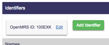
We want the user to be able to see as much as possible of the data in view mode when they open the patient screen. The current UI does not achieve this. For example looking at this patient I would expect it to look more like this (but even more space efficient):
-
On these data management screens we need to show pieces of data that are deleted (“voided” in the data model)
-
If I enter invalid data (e.g. I try to create an identifier of type Old Identifier but leave the location blank) the form is reset and I get a toast error message. Instead I should get an error message on the form itself, and the data I typed should stay there, so I have a chance to correct it.