Thanks to dedication from @DonaldKibet & @CynthiaKamau, we are getting close to finishing the O3 Service Queues feature.
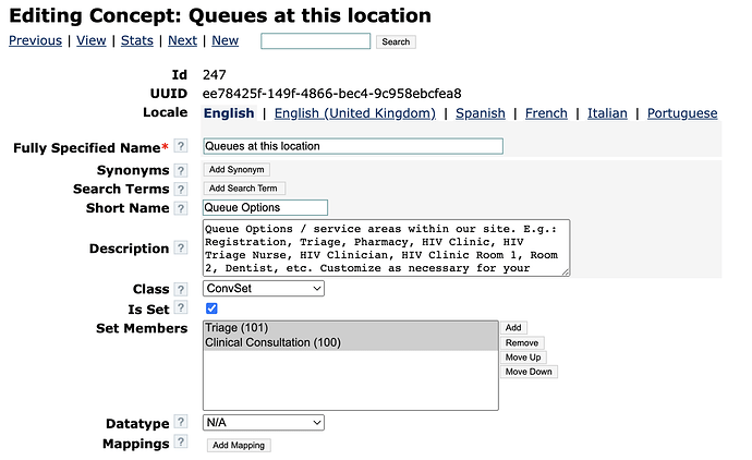
In current form, the new O3 Queues feature only focuses on one specific area/department at a time. What we need is, an easy way to transition patients between departments/areas in larger facilities. Writing about this here before our discussion on this in tomorrow’s Design call.
Caveat
We can’t just magically make this happen in O3 - we will need 1-2 groups to come forward to make this happen. (The current O3 Service Queues feature has been happening thanks to very hands-on collaboration btwn Ampath, Palladium, and Brown.)
Vision
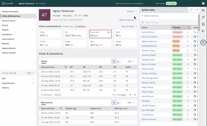
Users in a given area should be able to see all the patients waiting for their care, with most urgent at the top and those waiting longest at the top, so that patients can be seen in a timely manner. This means Users need a UX that helps them (1) SEE this patient queue, and (2) SEND a patient to their next “station” so the next team member doesn’t overlook any patient.
Imagine This Scenario
You show up with your sick child at a large health centre. There are many possible departments, staff, rooms, and stations. Fortunately, you can just go to the first place: Reception. From there you might need to go to Billing to pay a visit fee, or go directly to the Triage area. From there you might be directed to the General Outpatient Clinic waiting room, or to the Pharmacy for a quick medicine dose to reduce your child’s fever while you wait, or to a Specialized Department like Oncology, or even to the Emergency Department for serious treatment. Some areas have even further rooms - e.g. a Specialized Department might also have separate waiting queues to see a Doctor vs a Dentist vs maybe the Chemo section of the Oncology Clinic. (Real examples courtesy of UgandaEMR team.)
How does the EMR handle this scenario? How does each team know - without counting patients in the hallway - the number of people waiting for care in their specific area? How do the staff know who to see next? This is exactly the situation that @pauladams and I saw recently at a paediatric hospital in Kenya, and it’s also the reality at many UgandaEMR sites. And in fact, the UgandaEMR team walked us through the work they have already done to handle this use case (thank you @slubwama and @solemabrothers) - many UgandaEMR production sites are using their “Provider Queues” feature (GIF below).
Current state in UgandaEMR for reference:
When I search for a patient to check them in, the Check-In action modal includes a way to send the patient to the “Next Service Point”:
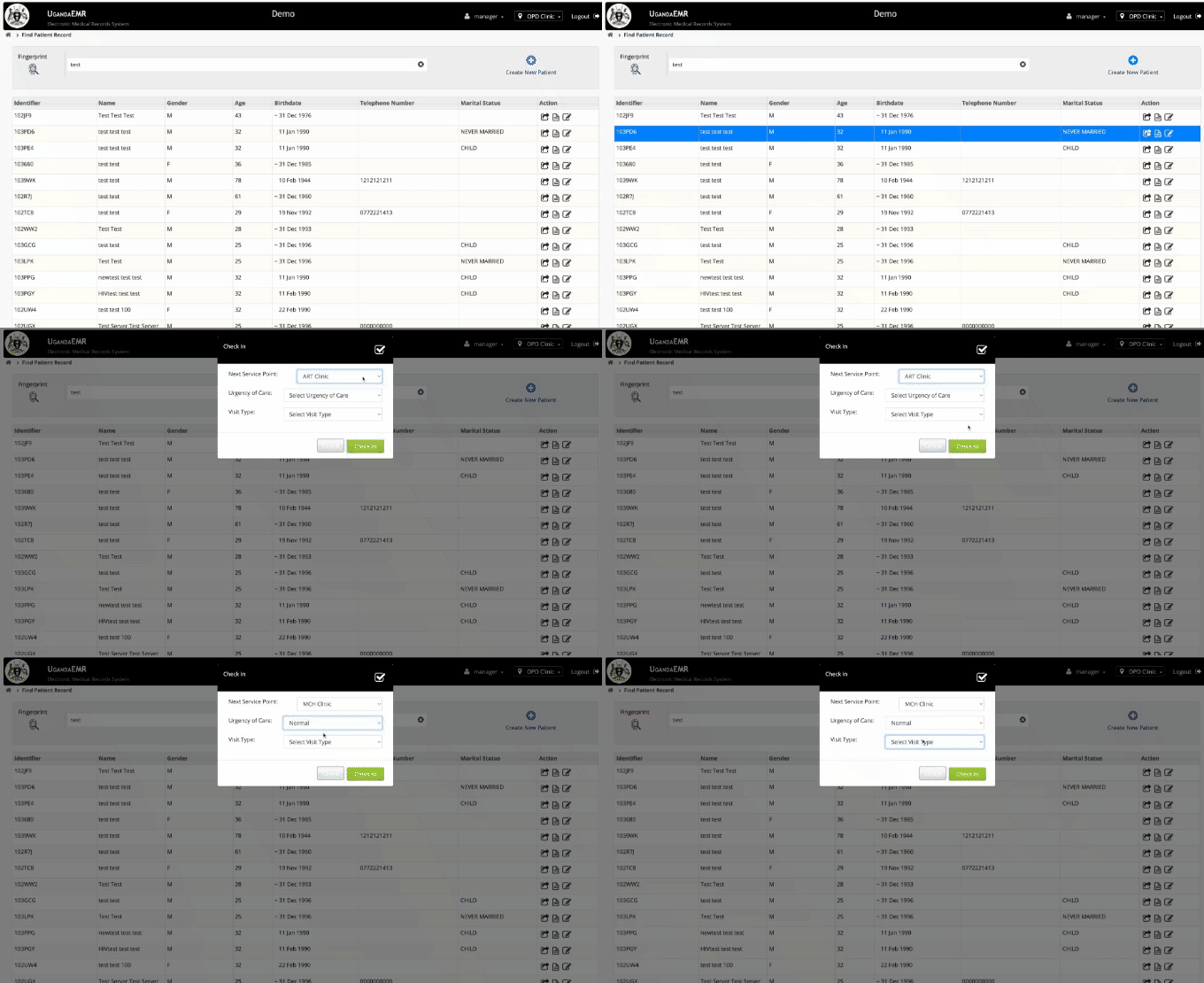
What We Need in O3
-
“Check-in and Go”: A fast way for the point-of-entry (the clerical or reception desk) to send patients to the next area at the same time as checking them in - so this can all be done in one quick workflow (the user doesn’t have to think about doing “2 tasks” because it should feel like part of the same check-in task)
-
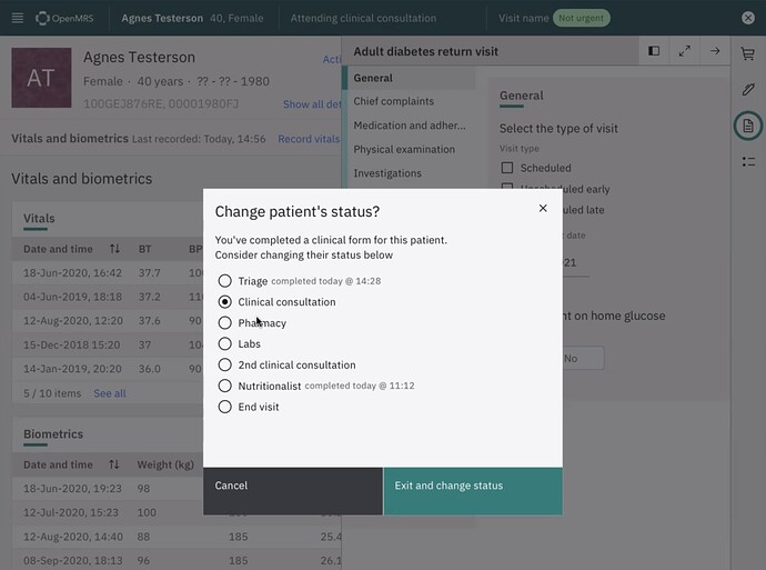
“Send To”: A fast way for users to move patients to a new queue/area, so that it’s obvious to other users exactly how many patients are waiting in their area, and who is either the highest priority or has been waiting the longest, so that patients get seen safely and fairly.
-
Queue start & end times. Departments need to track their own wait times. You can’t just tell a site “your patients are waiting 3 hours too long” - internal teams need to know where in the site the bottlenecks are happening, so that improvements can be made in the right area. So for example, we want to know the client’s total wait time, but also, how long she spent in Triage, with the Clinician, with the Dentist, etc. How: We should be able to log a timestamp when the next “Send to” action happens.
-
“Next Patient”: A fast way for users to switch to the next patient in the list, without having to click much around the EMR to switch from 1 patient to the next patient in line.
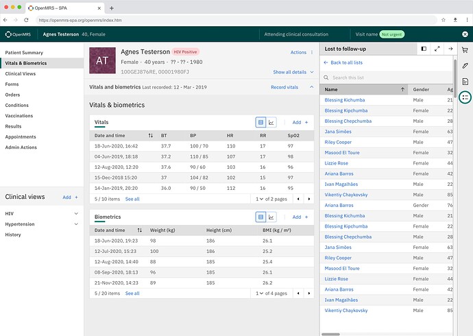
Good news: We already have a design for this, thanks to foresight from @cduffy. The user can open a list of interest (e.g. “ART Clinic”, or “Chemo Area”, or “LTFU”, etc), and use this to guide who to see next. (We need to update this design to show priority level and waiting time).
Pt Chart side panel/workspace
So: Does this resonate for others?
CC @slubwama @ddesimone @tanderson @aojwang @lousa @rubailly @ssmusoke @reagan @mksrom (& please CC others you think may be interested)


