I’m writing to say how much the O3 Growth Chart project for GSoC 2025 interests me.
I see how important this capability is for paediatric care inside the OpenMRS environment after looking over the requirements. I’m thrilled to take the lead on this and am totally dedicated to seeing this project through to completion.
I’ve already written a thorough project proposal and started integrating the Growth Chart app with the O3 Patient Chart to gain a jump start. My objective is to develop a solution that satisfies our implementers’ clinical demands.
Here is a screenshot of the implementation so far:
I have attached my project proposal below. I would be incredibly happy to receive your guidance, feedback, and inputs to ensure the design and timeline align with the community’s vision.
I look forward to arranging a meeting with the mentors to discuss the technical approach in more detail and start working on the next steps immediately.
It would be great to have an updated version included in the O3 framework! Have you checked out the SMART on FHIR version here: Growth Chart
I would think that @ball would want to comment on this, too. My only recommendation would be to use black for patient data as the colors on the graph are quite distracting. Viewing data both in raw form and percent/z-score would also be helpful, but leave that commentary to practicing pediatricians
Thanks for bringing this up. Partners In Health uses the growth chart with OpenMRS RefApp2 for Haiti, Sierra Leone and other implementations. This was written for iSantePlus by Kaweesi Joseph (may his memory be a blessing) and others. The code has been awesome, bug-free, and flexible. It allows for multiple CDC or WHO growth charts. It is an excellent example of code written by the community and shared with all. A great example to start the new year. And even better to get this implemented with O3.
Thank you both for the incredibly insightful feedback! @akanter@ball
It is really motivating to hear how important this functionality is for the community and its history in implementations.
@akanter — Thank you for sharing the SMART on FHIR reference. I will definitely study it to ensure we align with industry standards. Regarding your design feedback.
@ball — Thank you for the historical context. It is an honor to work on modernizing a tool that has been so reliable for the community. I will closely review the 2019 thread and the original RefApp2 code to ensure the O3 version retains that same level of flexibility and bug-free reliability.
Could you please review the Epic and its child work items and let me know if anything needs to be corrected, refined, or changed?
@dennis I would looking the guidance on the best approach for pushing the implementation to the main branch. I came up with 2 ideas.
Create a single feature branch (e.g: growth-chart) from main, implement each child work item incrementally in to that branch, and finally merge it into main.
Create a separate branch for each child work item from main and merge each one individually into main.
Could you kindly advise which approach would be preferred for this project?
I have started implementing this project and raised a few PRs for the work done so far. As @nethmi suggested during the PR review, I am now working to combine this work into a single PR.
I have two questions regarding this implementation.
Q1 - Feature flags
What is the recommended way to implement feature flags for patient chart features in O3?
Should this be done via the configuration framework / app config, or is there an existing feature flag utility or pattern I should follow?
Q2 - Backend
My initial implementation placed the WHO standard data as static JSON within the frontend module, but during PR review it was pointed out that embedding this data as static JSON in the frontend is not ideal, and that initializer/content packages would be preferable for configurability. However, I’m unsure how best to approach this since there’s currently no backend module managing this metadata.
Could you advise on the recommended way to handle this challenge, particularly whether introducing a backend module?
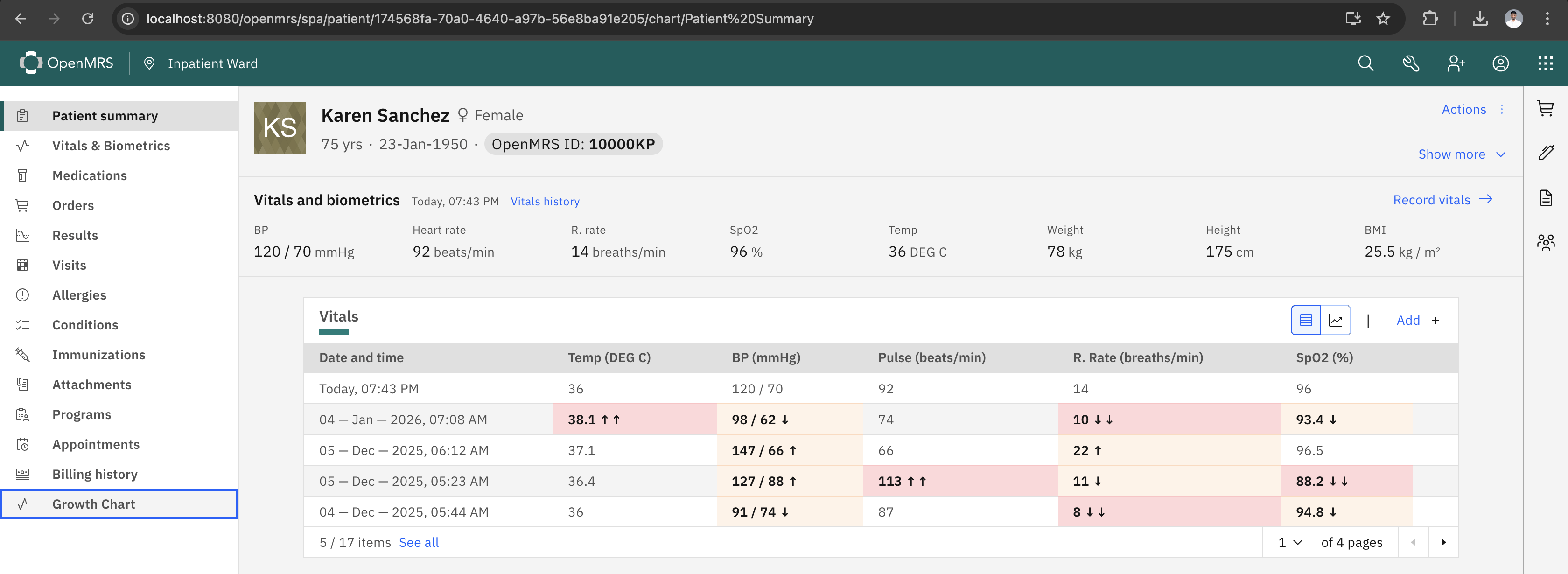
I wanted to share a quick update on my progress with the O3 Growth Chart.
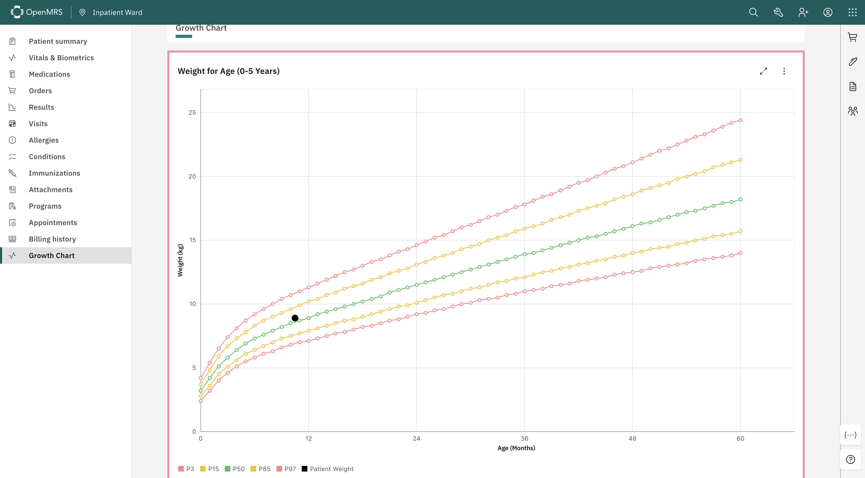
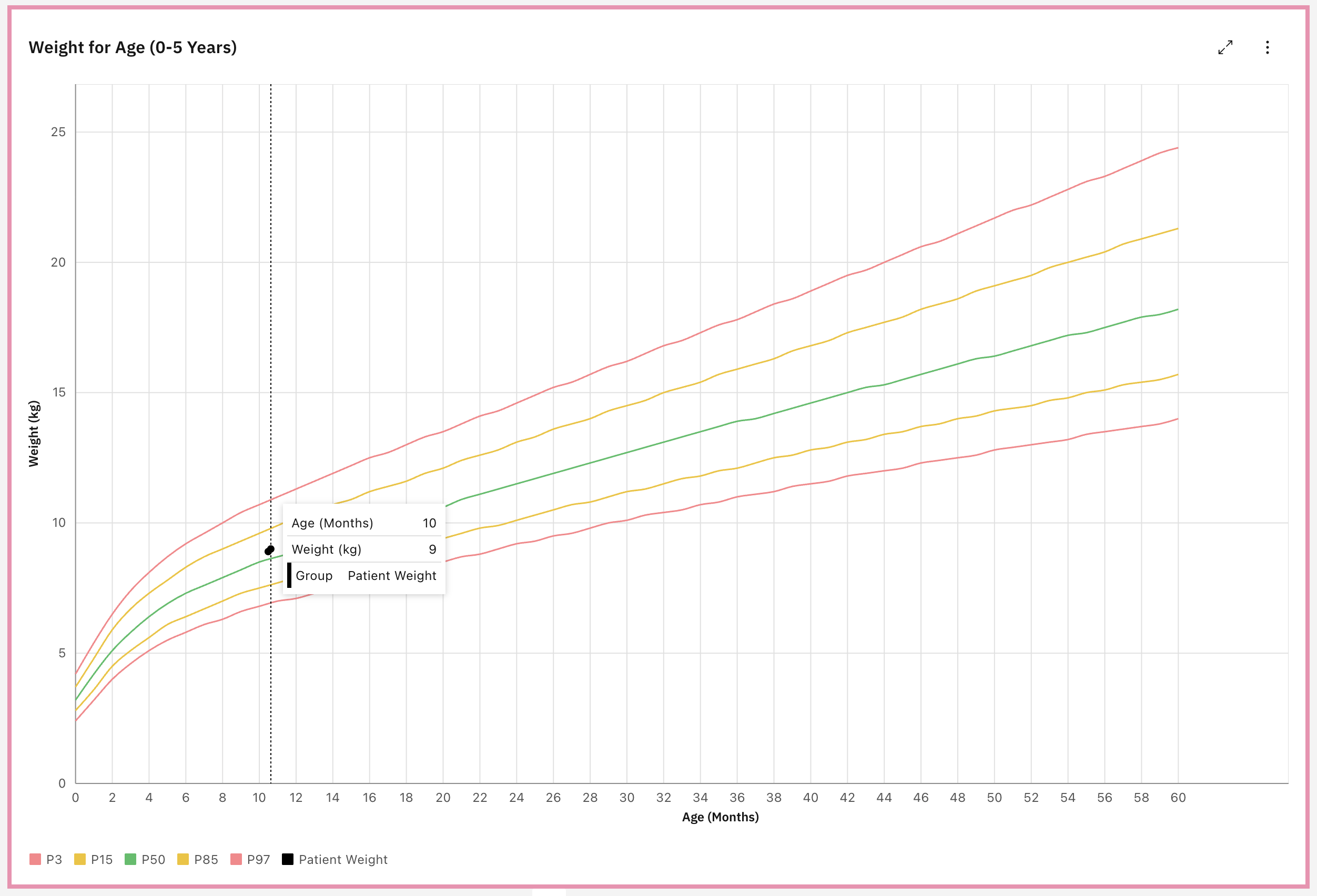
I’ve successfully implemented the Weight-for-Age chart (Birth to 5 Years). I’m using the official WHO standard data for the percentiles.
Link : Weight-for-age
I spent some time refining the UI to make it clinically useful:
Gender: I added a colored border around the chart, Pink for girls and Blue for boys, so the context is instantly recognizable.
Zones: For the reference lines (P3, P15, etc.), I used standard Green, Yellow, and Red dashed lines. This makes it much easier to spot if a child is in a “warning” or “alert” growth zone.
Patient Data: To make the patient’s actual data pop, I styled it as a solid black dots.
It also supports full screen mode and downloading the chart as a JPG/PNG.
Nice work @dilankavishka . This looks great. One small recommendation is to remove the circles from the 3%, 15%, 50%, 85%, and 97% lines. They don’t signify anything.
Where do you expect to switch between growth charts (ie. weight, length, head circumference, and BMI?)
I also think it looks good, and would agree with Ellen. Also, not sure why there is a total on the popup. It should show the patient’s weight along with the other info, but there is no “total”
Thanks @dilankavishka. This looks like a good initial pass. A few comments:
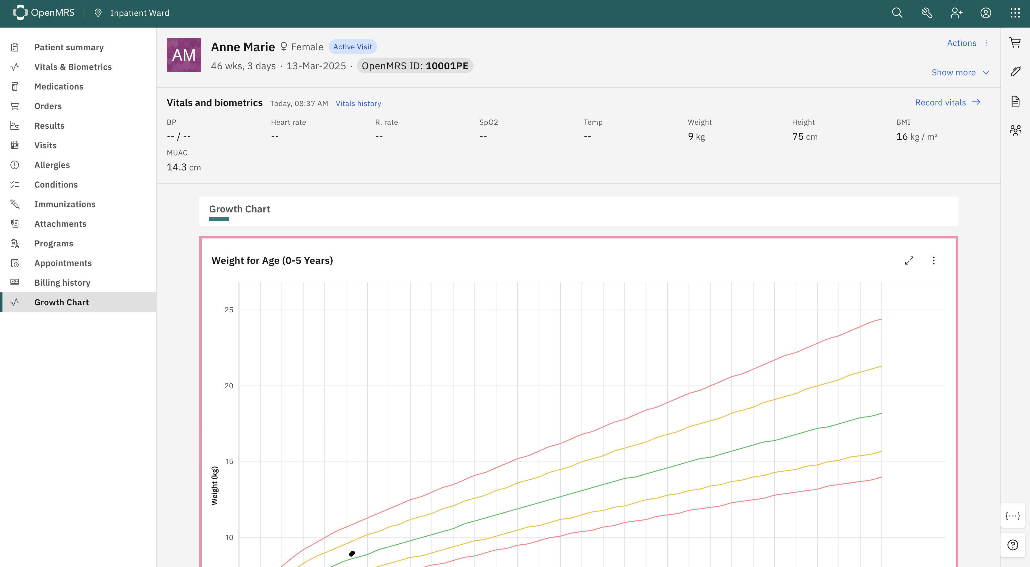
Rather than distinguishing gender by the border on a graph, it would be best to ensure that the standard patient header is still visible while rendering this (this is an important requirement for everything in the patient chart).
In the pop-up @akanter mentioned, it seems like it would be useful to show the point result, but I’m not really sure where or why that renders.
The graphs seem to have a lot of empty space on the right and top. It would be good to trim those down a bit. I also imagine that x-axis lines for either each month or each other month, especially under 24 months would be helpful.
Finally, the OpenMRS project lead, @paul is a pediatrician and might have some valuable input.
I’ve made the following updates based on the suggestions:
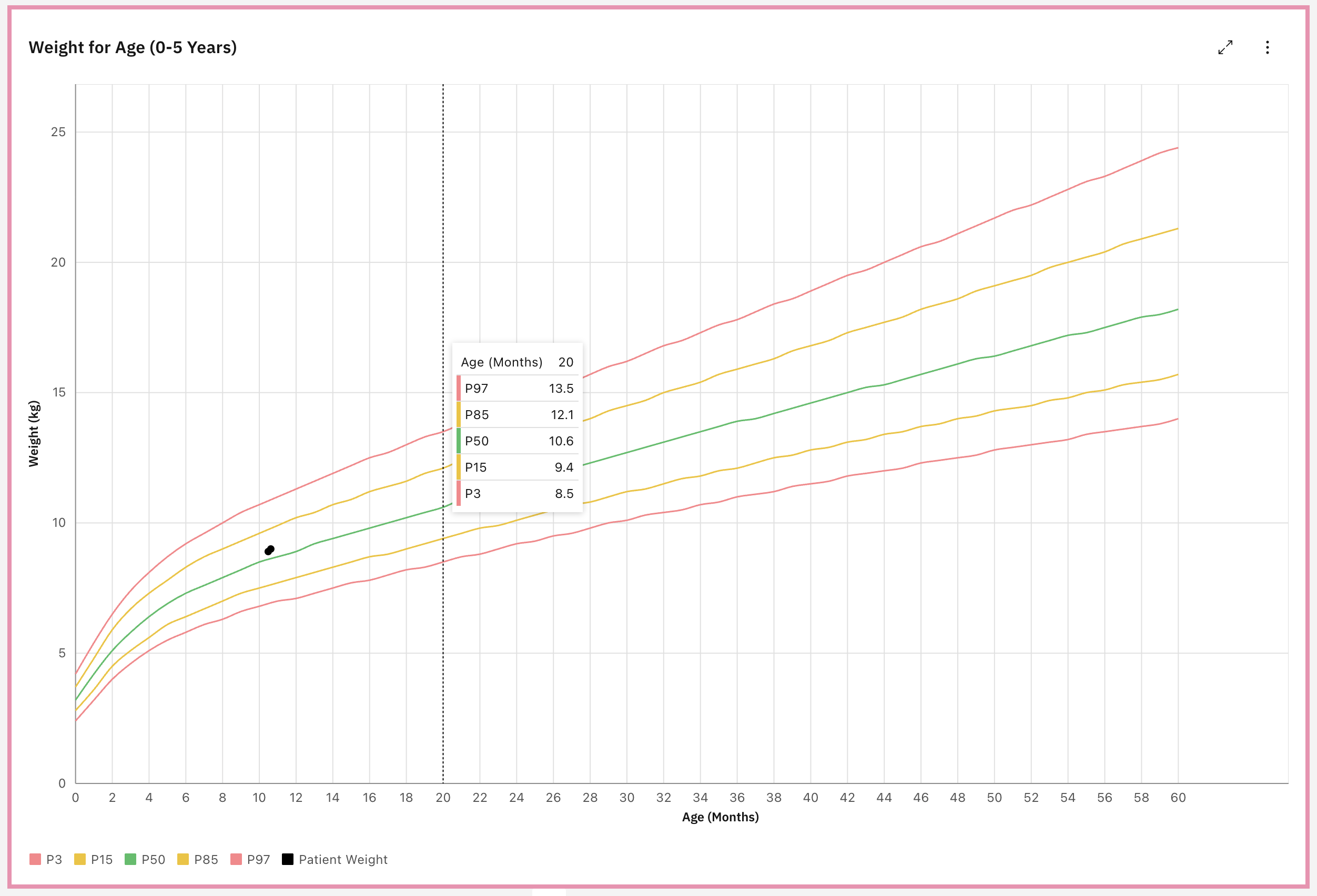
@ball I removed the circles for the reference lines and they are now rendered as smooth, continuous curves.
I have couple of ideas regarding the switching between charts :
Option A - Implement a Tab bar at the top of the chart widget. This will allow the clinician to single click between charts without reloading the page.
Option B - Place a Dropdown Selector in the top right corner of the chart header. I think this will helps scale to more chart types in the future.
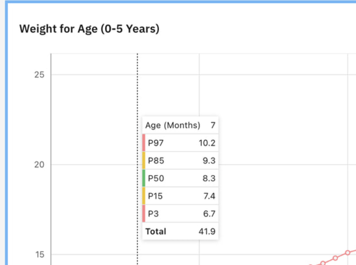
@akanter I removed the Total of those reference values and here is now it looks like when I hover the reference line.
And when I hover the patient data It shows the Age and Weight of the patient like this. (Here I’ve added 2 weights for the patient, then it shows two dots)
@ibacher The standard patient header is actually present. In my previous screenshots, I had cropped it out to focus on the chart details, but I have attached a full screen view here to show that the standard OpenMRS header remains visible above the chart.
As shown in the screenshots I have updated the x-axis to display grid lines every 2 months.
I completely agree that the gaps are unnecessary. I think it appears that the carbon charts library is overriding my configuration to enforce ‘nice’ spacing.
I’ve tried following fixes to solve this:
Strictly forcing the values array to end exactly at the max ([0…60] and [0…25]).
Disabling addSpaceOnEdges and forcing includeZero.
Attempting to use CSS overflow to clip the container.
Unfortunately, none of these resolved the issue.
I will invest more time to look on this.
Do you happen to know of a specific solution for this issue?
Again, thank you so much for the valuable feedback. It has been really helpful and is really helping me move this project forward.
Finally, I’d welcome any additional feedback or suggestions on these changes and the overall progress.
When you are hovering over the patient data, it seems like you want to show the relevant metadata, the patient data and it’s %. So Gender, Age, Weight, and %. Not sure what Group and Patient Weight means at the bottom.
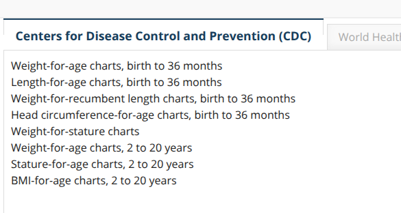
In the past, our clinical team wanted growth chart for patients younger than 5 years old BUT older than 5 years old too. The O2 growth charts showed CDC charts for ages x-y.