More Indepth Testing of the Reference Application 2.10 UI

Continuing from This Talk Thread , I would first Thank and appreciate @ayesh @herbert24 @irenyak1 for the Great work done so far done , in Testing the reff app2.10 UI. Because of the Bootsrap Intergration In reff App , it led to a number of UI parts breaking .

I would like to call upon more volunteers to have a more in depth testing of the Reference application 2.10 UI and we would want to take a more organised approach for testing .

Resources

  • Testing Guildlines here

  • Report all the breakages Discovered here to avoid repetitions in work.

  • Test Enviroment here

N.B . please ensure every Bug is reported in the tracking wiki page

cc @gcliff @sharif @christine @dev @odorajonathan @ayesh @herbert24 @irenyak1 @jwnasambu

according to the last pm call,we decided to have a sprint for this.And today we had a call with Christine and hope fully by tomorrow the testing sprint will be starting with a well organised document with the test scenarios.will keep you posted here! @mozzy cc @christine

3 Likes

Thanks @herbert24 . The sprint details can follow up on this talk thread

1 Like

sure they will,can i kindly get you on irc for a few mins @mozzy

1 Like

And @mozzy the reporting document is not just about bugs found, but a report about each bit of the user interface functionality tested and status of working or not working.

2 Likes

That’s fine @mozzy and @dkayiwa, I will take time off to document what I have found out, whether working or not working.

thanks.

@irenyak1 you will have to include this in the document containing the test scenarios which will be out tomorrow when the sprint is expected to start

1 Like

@herbert24 does that mean that before the document is out I can not document? how about the wiki page that @mozzy shared? Will it be rendered null and void?

1 Like

You can still document on the wiki , However the document the QA team came up with is more organised…

its not rendered void just that we are trying to gather up everything thing at one point for an easy follow up

1 Like

I would prefer a wiki page because it is searchable and provides a consolidated view of all our documentation.

2 Likes

I agree with @dkayiwa +1. @herbert24 is it a wiki page that you guys are organizing? You could think about making a wiki page for the enormous benefits it has over say a google doc .

its ok , the google doc will then just act as a guide for the testing

@mozzy does that mean we never populate it, or we do then it shall be migrated to the wiki page?

1 Like

well as @dkayiwa said , the first priority is the wikki page , though if we can populate both , its also fine

@mozzy so should I go ahead with updating @ayesh with the images of areas of concern or I just go ahead with the wiki page. Images have been easily pointing him to the errors though. :slight_smile:

1 Like

yes @irenyak1 go ahead, as long as you also document your findings

1 Like

@ayesh

Observation on Capture vitals The search field is extremely long and does not have a cancel icon in it. The border color effect also doesn’t match that of the usual UI.

compare with the usual UI

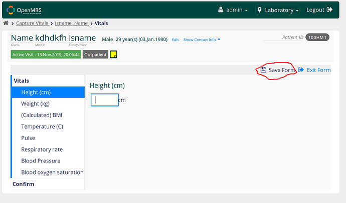
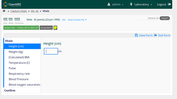
Observation on vitals The color for the icon and text “Save Form” does not match the usual UI color

Compare with the usual UI

Observation on appointment scheduling dashboard There’s big space at the right and left margins and also the wording for the “Daily Appointments” should be on one line. The spacing between icons is smaller than the usual.

usual UI

Hi @irenyak1

Sure will work on these

@mozzy PRs on the previous issues @irenyak1 mentioned were not merged yet :slightly_smiling_face: Can we merge them
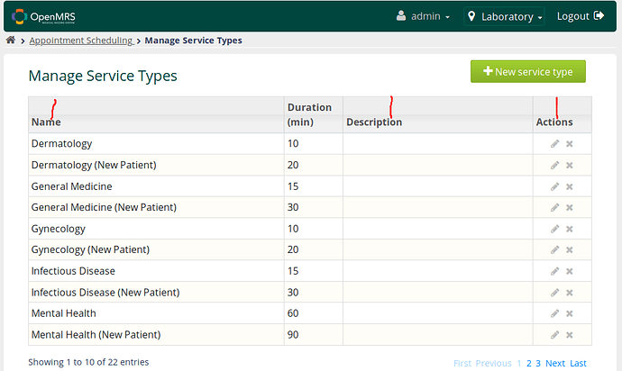
Observation on Manage Service Types

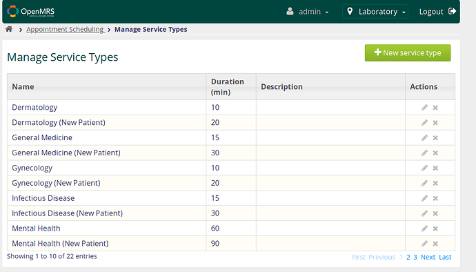
There’s a small discrepancy here especially on text alignment.

Compare with the usual UI

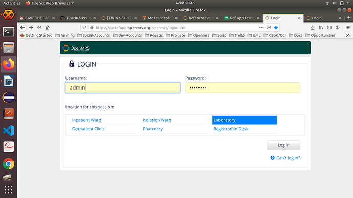
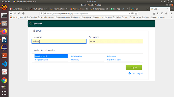
Observation on login page The border color effect on the active input does not exactly match that in usual UI. The inputs also are a bit wider than usual Their border radius also looks bigger The location text has a bigger font compared to the usual UI The login button color is gray while the in the usual UI it is green

Usual UI

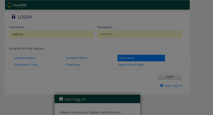
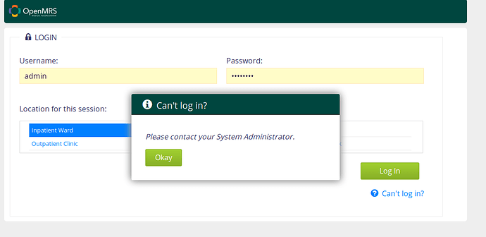
Observation when you click “Can’t log in”

This happens in the RA-2.10 SNAPSHOT, the screen gets blurred and the pop up can’t be fully accessed by the user.

This is how the usual one appears

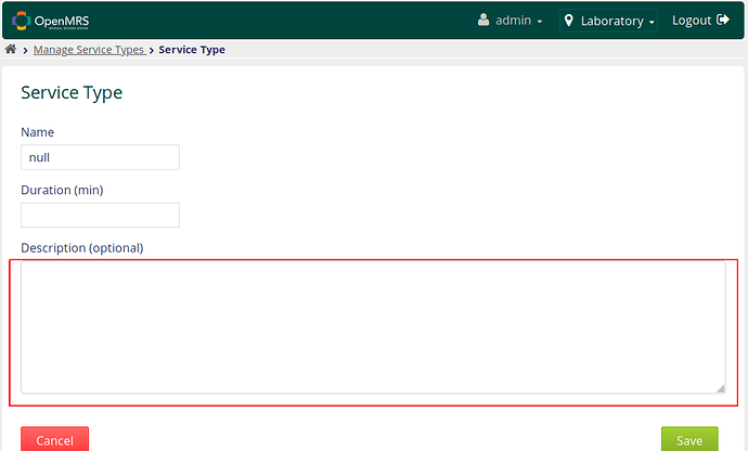
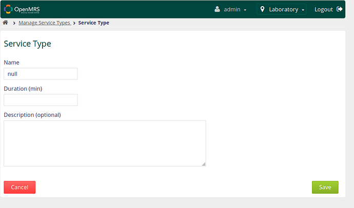
Observation for Service Type

In the RA-2.10 SNAPSHOT the text area for description is too wide

compare with the Usual UI

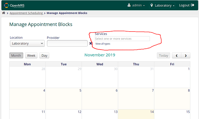
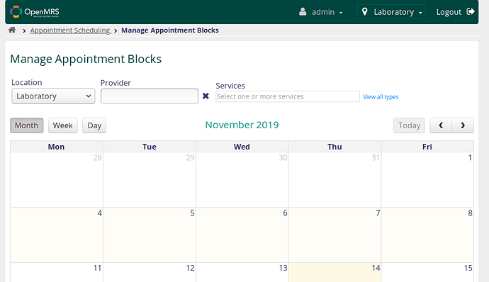
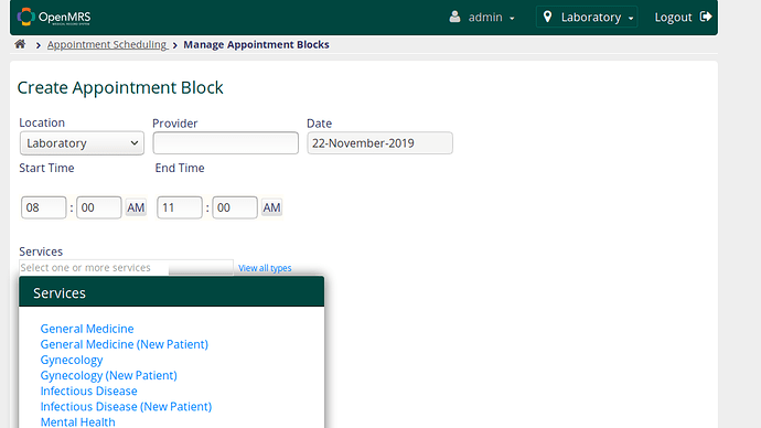
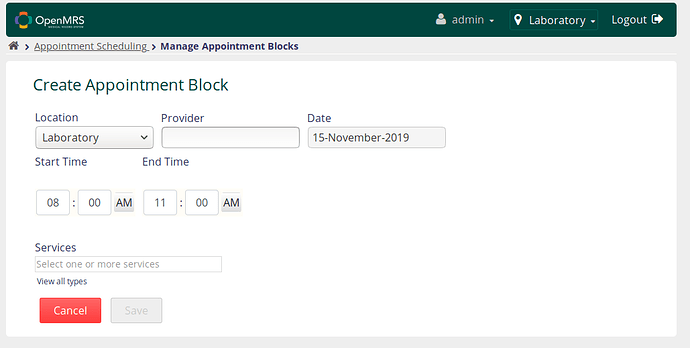
Observation on Manage Appointment Blocks

The alignment of these fields needs to be revised and also the text color for the words “view all types”

In the RA-2.10 SNAPSHOT UI

compared with the usual UI

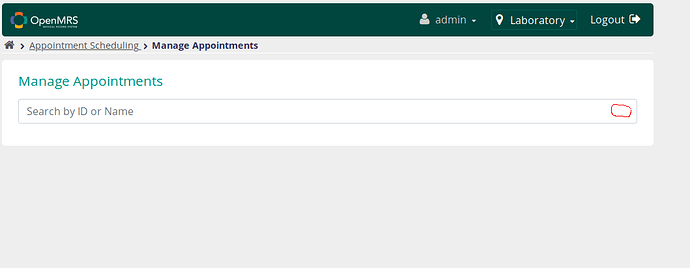
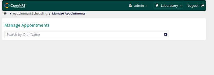
Observation on Manage Appointments

In the RA-2.10 SNAPSHOT UI the input field is too wide and has no cancel icon.

Compare with the usual UI

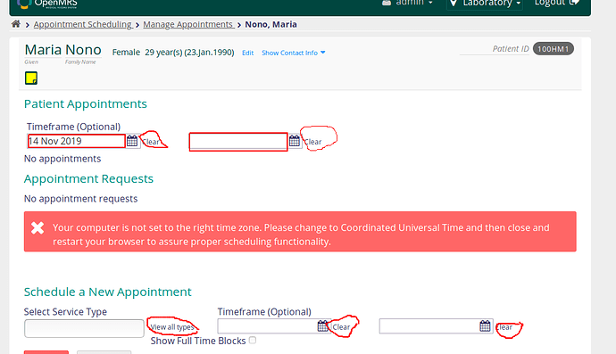
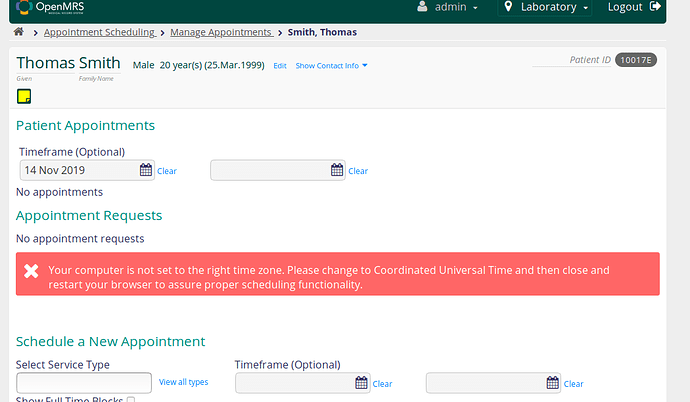
Observation on Manage Appointments of a given patient

In the RA-2.10 SNAPSHOT UI the color of the input fields is not exactly the same as that of the usual UI and also text color for the highlighted text needs to be changed.

compare with the usual UI

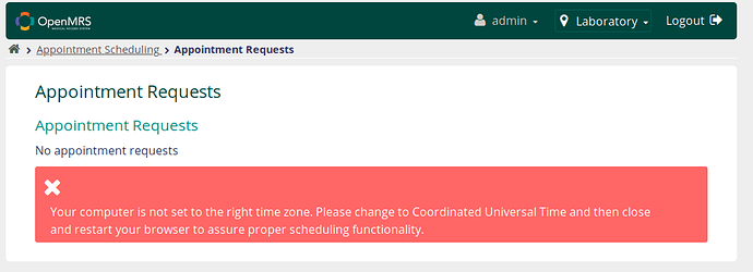
Hello @dkayiwa does this functionality only work with UTC time, Why is it that I get that error in red?

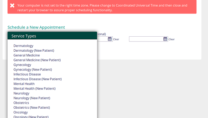
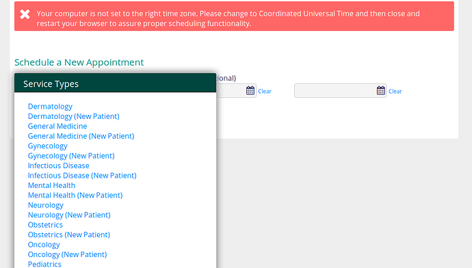
Observation on Manage Appointments, below Schedule a New Appointment, in "View all types

In the RA-2.10 SNAPSHOT UI the color of the text of the service types does not match that of the usual UI

compare with the Usual UI

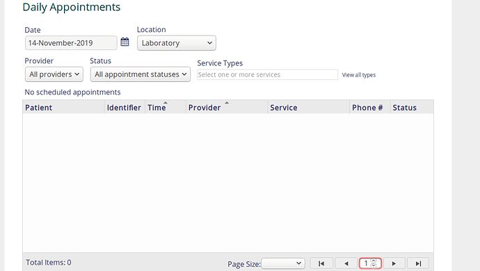
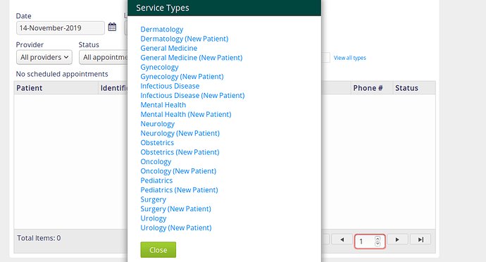
Observation on Daily appointments

Sorry my marking tool is misbehaving I am not able to point you to the error but check keenly on these images

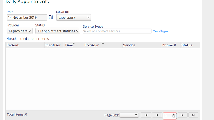
In the RA-2.10 SNAPSHOT UI the color of the words “View all types” should be changed and also the number input at the bottom is smaller compared to the usual one.

compare with with the usual one

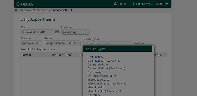
Observation on Daily appointments under view all types

In the RA-2.10 SNAPSHOT UI, the screen gets dimmed and the dropdown is in a fixed position which may not be possible for the user to access all the service types.Also the text color needs to be changed.

compare with the usual one

Observation on Appointment Requests

In the RA-2.10 SNAPSHOT UI the error message is not well aligned with the X button

compare with the usual one

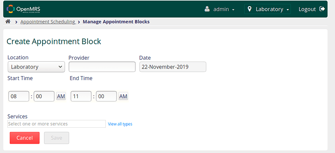
Observation under Appointment Scheduling>>Manage Provider Schedule>> under “Manage Appointment Blocks” , pick a date and then go to “Create Appointment Block” Edit the text color for “view all types” which is at the bottom

compare with this usual UI

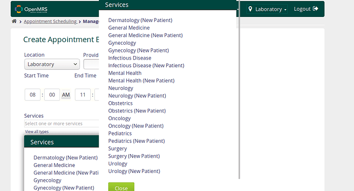
Still on the same page when you click view all types

In the RA-2.10 SNAPSHOT UI there are two displays of services which needs to be fixed and also the text color needs fixing.

compare with the Usual UI