Reviews please, @f4ww4z @vibhorchinda17
Reviews please, @f4ww4z @vibhorchinda17
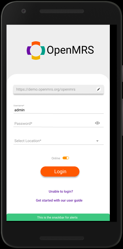
Good design  , I Have some comments, the size of the toggle button needs to be increased, also the login button elevation should be changed.
And don’t forget to center the text “Get Started with…”
, I Have some comments, the size of the toggle button needs to be increased, also the login button elevation should be changed.
And don’t forget to center the text “Get Started with…”
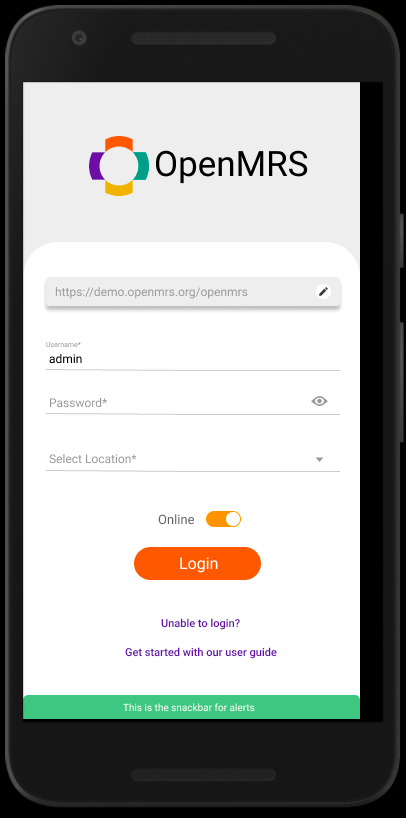
Design iteration 2.0
Just a query @gauravdewat why do we need that toggle button here ?
I have included every functionality that was present in the older design. Usability of any element can be altered during implementation. If there is a need to remove the toggle button than it can be done.
Yeah @gauravdewat 
Looks good @gauravdewat