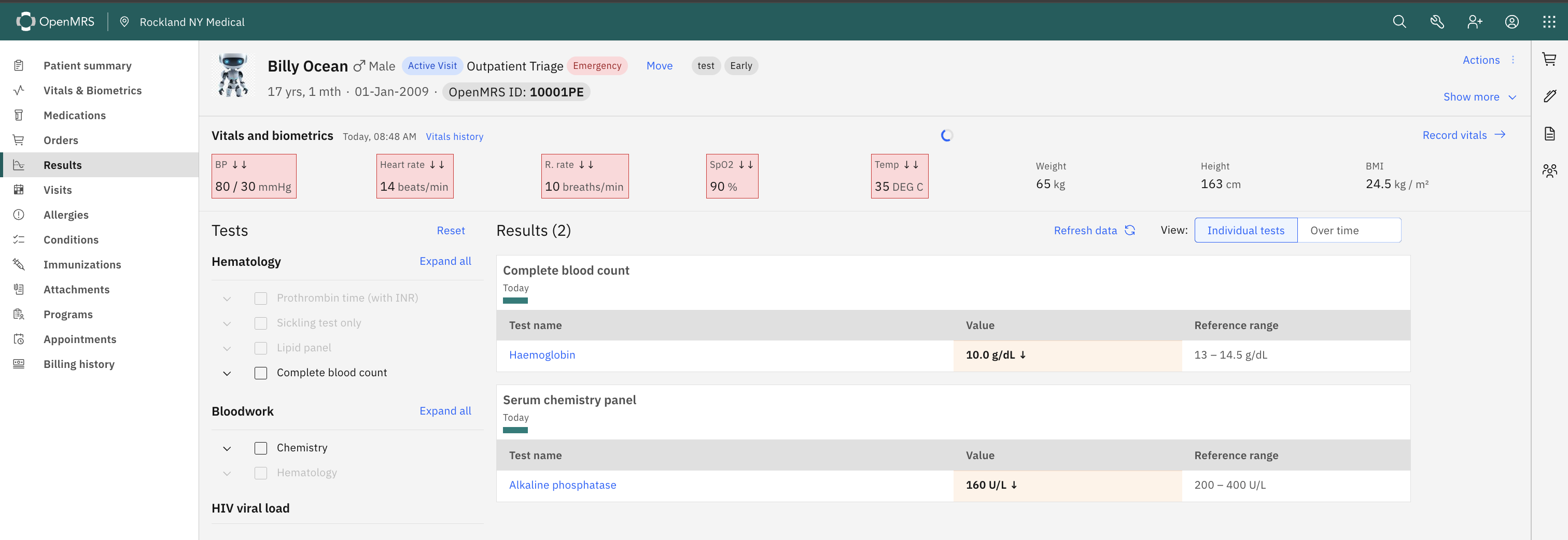
In the Results Viewer, every lab value is displayed alongside its reference range — so a clinician instantly sees both the measured value and what’s expected. For example: Haemoglobin: 10.0 g/dL appears next to Ref: 13.5–15.5 g/dL.
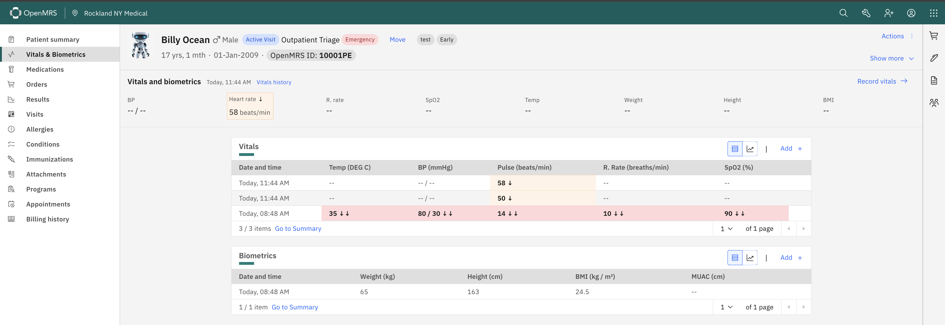
For Vitals, we have a value and an ↓ arrow - but no range on the UI. A clinician has to know the normal range to interpret how concerning the deviation is. A heart rate of 50 ↓ and a heart rate of 58 ↓ both get the same arrow, but they carry different clinical weight.
Question: Is it possible to surface the reference range when a user hovers or taps over any vital sign card ?
The answer to “is it possible” is usually yes. Is this something that’s been specifically requested? If, as in your example, 50 and 58 carry different “clinical weight” than that seems to be a short-coming in the reference range definition itself (e.g., one of those should be marked as critical).
The discussion of this during the squad call came out in favour of surfacing reference range information on vital sign cards — as long as it does not clutter the UI. A hover/tooltip (as suggested) will help the clinician with the context when needed — so … the information is there when it’s needed, and invisible when it’s not.