Dear OpenMRS Community,
The current results viewer is not fit for purpose. It combines a lot of complicated functionality that was never fully implemented. As the product has evolved, and even left the Beta stage, it’s now time to iterate and refine how lab test results are viewed and highlighted in OpenMRS.
@pauladams and I have recently concluded some work on this topic, and in this short slide deck you can view the problems with the current implementation in more detail, as well as our proposed solution. There’s a video at the end that outlines the proposed behaviour and interaction design too.
Proposed changes in summary
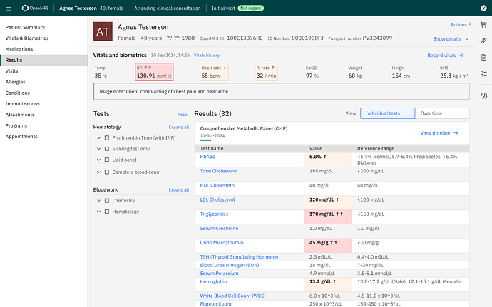
Improved views of abnormal and dangerous labs and vital signs
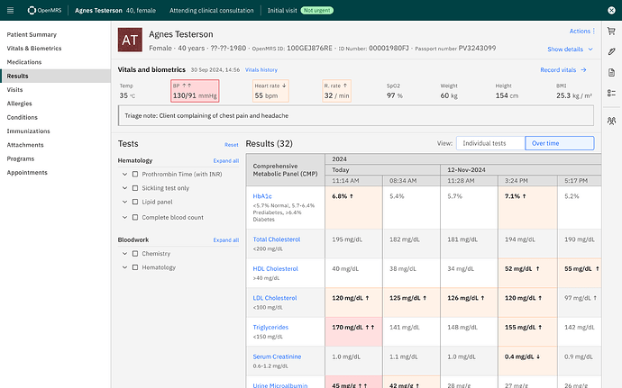
The proposed solution will see improvements to how abnormal and dangerous lab test results, as well as vital signs are displayed inside of the OMRS. This can be seen below in the vitals header as well as in the CMP panel result.Clearer navigation and hierarchies
As well improving how results are displayed, there are also navigational improvements by simplifying how lab results can be filtered, and using more intuitive language for changing between viewing individual tests to viewing tests on a timeline.Please view the slide deck and if you have any thoughts or additional input, we always appreciate feedback.
cc @Mekom @PIH @grace @ibacher @bistenes
Many thanks
Ciarán and Paul


