I’ve made an enhancement suggestion issue for improving the UI feedback for the Android client login screen.
My issue with the current implementation is that it is not super clear that you need to select a session location before being able to click the Login button, which I believe may lead to confusion for the user.
I’ve made some experiments having the button toggling between red and green depending on the login form validity and also presenting toast messages informing the user what is missing. You can see a screencap of it here.
Hey @henziger,
Nice work you are doing on that feature.
Also , to address your issue on making it clear that a user must select a location before being able to login. I believe that can easily be resolved by either using a placeholder for the field which relays information to the user, marking the field as required with the * and adding a text line informing the user that fields marked with the asterix(*) are *Required, and lastly, you can handle this by disabling the login button until all fields have been filled(You can create a toggle-button for this), and for good measure maybe add a Popup message, for when a user tries to click on the button guiding them as to what they did not fill on the form(just as you have done in the current implementation here ) Though I recommend you consider making the popup more central by placing it over the form or above.
Finally, I do get what you were going for with the colour toggling on the Login button, I however feel that from the screenshot shared in the ticket, the coloured button makes it so the UI seems to be a bit too noisy. I would recommend using dull colours or maybe just keep the original button but set it to disabled when not all the fields are validated. That is, in my opinion.
@henziger@dkayiwa how about using toast to give feedback to users whenever there is something wrong with the form data. I’ve decided to use Styleable Toast to make different messages/toast look different . It’ll make it easier for the user to identify exactly what has gone wrong.
@lwanjiru Thanks, great feedback! I agree with you on placing the notification above/higher up, at least so that it doesn’t overlap/interfere with the keyboard.
As for the style of the button, I’m a bit divided. I think the current style when the button is in the disabled state (gray) doesn’t convey that there’s something wrong with the form and since it is disabled the user gets no feedback when clicking it. But I do agree with you that the red style adds much noise.
I looked at some other login forms in popular apps (reddit) and they simply have the login button in a lighter shade when the form is invalid. After some experimentation, I realized that my issue with the current implementation is not necessarily the gray background color of the button, but rather the text color.
So, I think that having the text color pale when disabled (and only turning it dark purple when the form is valid) does a much better job at conveying the message that “Hey, this button isn’t clickable until you’ve correctly filled in the login form”.
Please have a look at my latest suggestion, recorded here. The background color for the disabled state is #DCEDC8 (very light green) and text color is #9D9FA2 (light gray instead of dark purple)
@affanahmad Yes, I think properly styled toasts can be very helpful. I’m not sure if adding StyleableToast as a dependency has some bad consequences, but do try it and if possible create some demo to share with us. Also, have a look at ToastUtil.java (openmrs-client/src/main/java/org/openmrs/mobile/utilities/ToastUtil.java) which gives some styling options, although it is probably not as fancy as StylableToast.
I just had a look at your latest implementation and I must admit I’m loving it. It has captured exactly what I had in mind, and also reduced the noise. Good work. Kudos!
Just one more recommendation, as I had stated earlier, I believe a line of instruction would work well alongside the implementation. Something like Please fill all the fields to login , something that guides a user as to why they are unable to access the login button when some fields are empty.
I think I’ve managed to get a nice solution with a “Required *” helper text according to your previous suggestions. I went for a style similar to what you’d see in Google Forms and also what is recommended according to the Material Design style guide. That is, a (red) asterisk hints that the field is required.
You can see my latest implementation here. I also changed the “Session Location” from being completely red to only having the asterisk red, as this makes the form much more consistent in style.
I’ve committed my code to a local personal branch here. I think it is getting ready for pull request to master, unless of course you (or anyone else) have any more suggestions.
Just to go into some implementation specifics: I had to do some tricks to get the hint texts behave nicely. In Android, the “floating” hint which automatically places itself above the textfield on user input uses the TextInputLayout type which does not support stylized text, e.g. black text with red asterisk, more on that here and here. Therefore, my implementation switches between setting the hint directly on the EditText (to get a red asterisk) or on the TextInputLayout (to get the floating hint effect). This takes some extra CPU power and the code would be cleaner if you skipped either the red asterisk or the floating hint effect, but I think having both is awesome from a UX perspective.
Let me know if you have any further comments or suggestions. Thanks!
Thanks for taking up this task. I can see that you did a really nice work there. By the way, I have made the issue ready-to-work and assigned it to you (check on jira).
I would like to suggest a couple of improvements:
It would be great if we can keep the color of login button greyish only. It would help us to keep the whole app consistent.
You did a great work with asterisk but personally I think so much effort is not required. Just showing a toast popup will serve the purpose. I guess, removing asterisks from hints won’t make much difference.
Thanks for the input and jira administration @shivtej
Just some feedback to your suggestions:
The green color of the login button is according to the button_apply.xml style, which is used for the other buttons (at least those using fragment_dialog_layout.xml) so it should be consistent with the rest of the app. Because we don’t want all those buttons to be grey right?
I think the approach using toast popups is actually more complex/requires more effort. You need to have logic for setting the correct toast message (is location, username or password missing?). The toast position needs to be set, which currently is not supported by ToastUtil:showToast(). And the current implementation of the app has the button disabled until the form is valid, and since it is disabled it won’t recognize clicks so that Toast messages can be triggered.
Of course, the toast approach is realizable, but I don’t think it will be as clear, from a UX perspective, as the “Required *” approach and I believe the implementation will, in code, be equally or more complex.
@henziger, I guess we can go ahead without toast message (you already implemented another way & the toast thing requires altogether new code) but I think we should keep the disable button color grey only. Light green doesn’t indicate the button is disabled.
Send in the PR whenever you’re done
Agin, kudos for the amazing work you are doing.
I also agree with @shivtej in regard to the consistency. The implementation here does seem a little too busy.
As for the hints and asterisks, I would recommend opting for one, that way, it doesn’t feel like there is too much going on on the page and also reduce the ‘clutter effect’.
I also really appreciate that you constantly reach out and share how you went about the implementation. Keep it up!
I think there has been progress with each feedback iteration so I enjoy working on this piece and see it improving, and it’s a great learning experience.
My idea now, to reduce the clutter effect, is to show the red asterisk only when the text field is empty and has to be filled in to make the form valid. When the user fills up the field, the asterisk is removed but we still keep the floating hint for showing context. I realize that this isn’t “opting for one”, but hopefully it’s a well working combination.
The red asterisk is a powerful signal to the user that something is missing in the form but when the form is filled in correctly the noise is low. I think this is at least the best version yet, so I’ll commit the code and update the screenshot in the issue. But keep your suggestions coming if you have any
I am new to Open MRS and I am very excited about the project. I’m trying to get started with the Android client and its been a bit frustrating.
downloaded the OpenMRS client from Github and imported it into Android studio v3 and i get the following error
Warning:Warning:One of the plugins you are using supports Java 8
language features. To try the support built into the Android plugin,
remove the following from your build. gradle:
apply plugin: ‘me. tatarka. retrolambda’
To learn more, go to
https: // d. android. com /r /tools /java-8-support-message .html
Error: Error: android-apt plugin is incompatible with the Android Gradle
plugin. Please use ‘annotationProcessor’ configuration instead.
I had expected that the code would compile right away but it seems that these plugins are legacy objects and should no longer be used.
am i using the right project I’d like any and all help
You probably want to create a new thread for your issue, so I would recommend doing so.
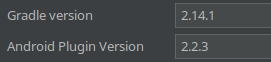
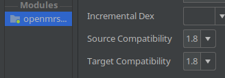
However, I do recall that I myself had some troubles at the beginning with getting the app to build which may or may not be related to your issues. If I remember correctly, Android Studio wanted me to upgrade to Gradle 3 but that broke the build.
So when you create a new thread for this, I think it would be good for you to apply some version information. I’ve attached images from my project, this information can be found under the File > Project Structure menu item.


