Hello,
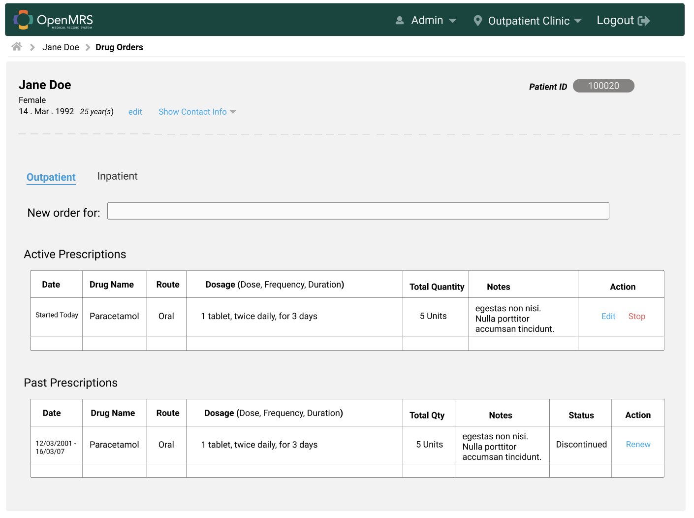
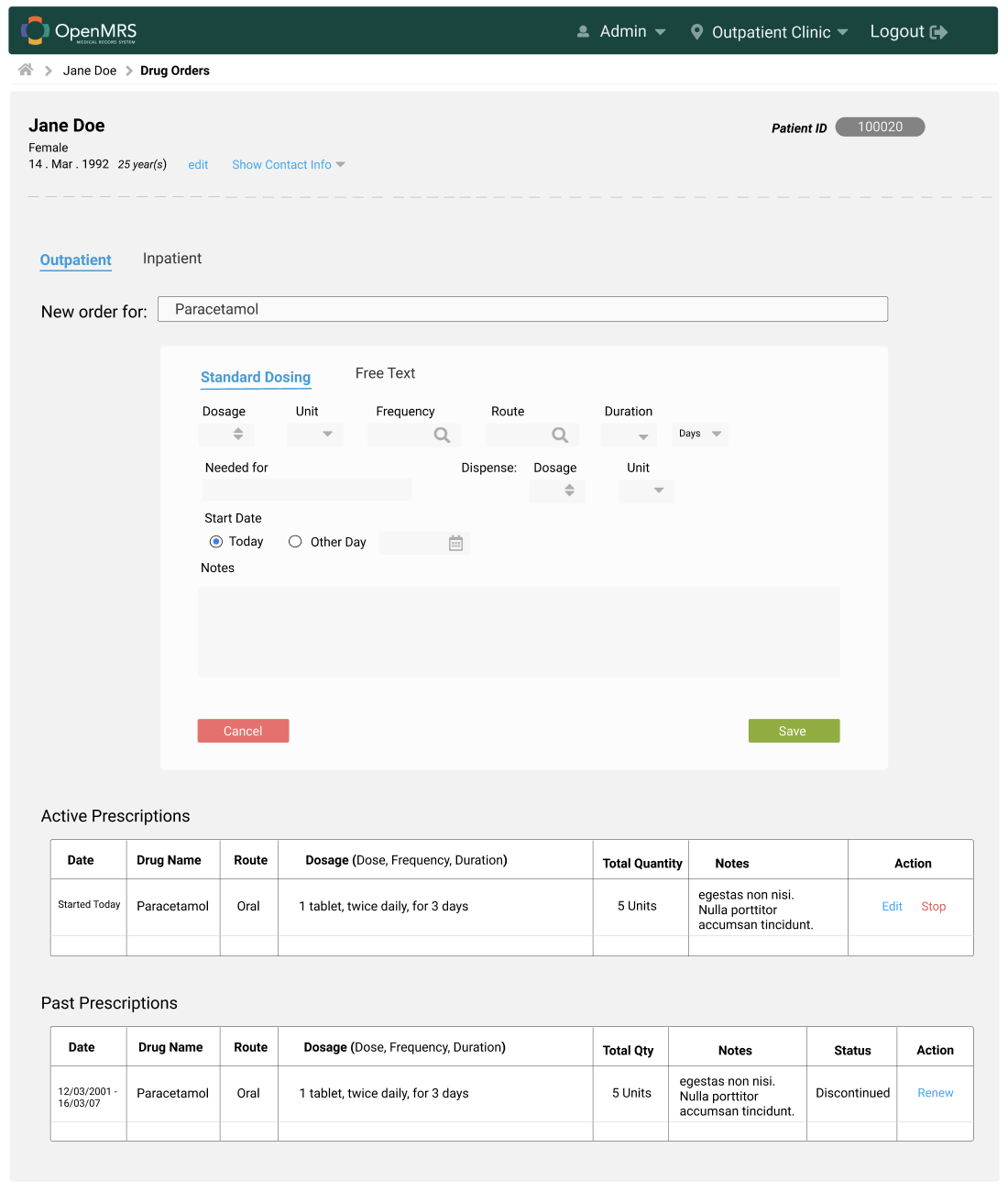
We are redesigning the order entry ui application using ReactJs.This application is currently implemented using Angular Framework. Attached are the screenshots of the current and the mockups of the proposed design. Any suggestions towards this feature are highly welcome. thank u.
Seems good improvements for the Order Entry UI applications. I would like to add few comments about this
Is it possible to hight light the Patient Information from the grey background? Because the bottom part (Even Outpatient or inpatient) is common for the Patient. If possible, you can use some different background color to highlight that part like the current design.
Here you have simply mentioned the Male or Female below the Patient Name. Can you think about using the image to illustrate this one . Let’s add a Square Image on the left side to patient information and add the Male or Female image to that one based on the patient sexual information.
The taps (Outpatient and Inpatient) are not visible like an actual tap. Is there any way to improve the UI/UX for the tap content?
Can you use the tap view to show the Active Prescriptions and Past Prescriptions? Then somehow, we can reduce the total height of the Order Entry UI applications
New mockup also contains only texts for the action menus like Edit and Stop. Can you use some icons with the name to indicate the Edit and Stop actions.
Some labels(Dosage, unit, …) are located on top of the text field input sections and some other labels(Needed for) are located left to the text field input sections. Can you work to make this consistency? It will be good if we use one styling format over there.
Alignments should be considered while working on the UI/UX. Can you please fix the alignments of the input fields, New Order for, and the white color big box?
The suggestions mentioned above are just from my view . Feel free to discuss if you have any concerns.
@geofrocker I’m excited to see this project getting worked on!
You should know that the current orderentryui design was done by two people (me and @jteich) with almost no input from anybody else. So you should not assume that it has the perfect workflow. And further, most people on Talk will not really be familiar with how it works, since it never made it to a 1.0 release.
Therefore I suggest that before you start making small tweaks to the screen layouts, you should begin by pasting screenshots of the entire workflow of the existing application that you’re using as a starting point, so that people can give feedback on the overall flow as well.
Also glad to see this moving forward!
Here are a few things I noticed – happy to help more as you continue.
I like your display of Active Prescriptions shown on the first screen, because it gives you the option either to deal with existing/old prescriptions or to start a new prescription on the same screen. You do not need to have the Active or Past Prescriptions shown once the drug is selected, though; at that point they will no longer be relevant to the workflow.
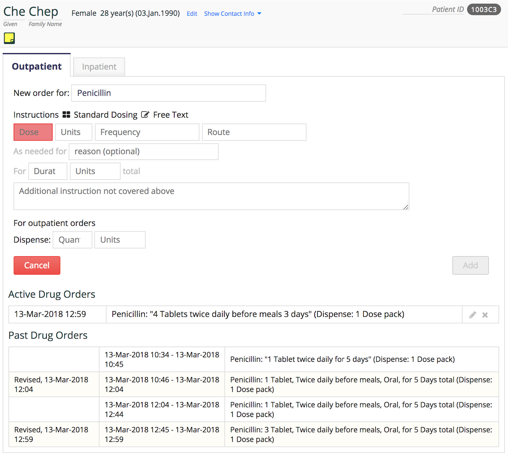
You will find that, for outpatient prescriptions, it is necessary to select not only the drug (“Penicillin”) but also the drug form (“tablets” – as opposed to “liquid”, etc.) and possibly the strength (“250 mg tablets”) BEFORE you can get to the “after the drug is selected” screen – the prescription isn’t fully specified without them. For inpatient, you don’t have to do that because the nurse and the pharmacy usually make that choice for you.
Field controls:
Dosage (“Dose” is more correct) – either an free number entry field, or a selector. If a selector, your system needs to be smart enough to know all the common doses for all the drugs.
Frequency – should be a selector; there are few enough choices
Route – same
Duration – almost always a free number entry field
Dosage (after “Dispense”) – should be just “Number” rather than “Dosage”. This also would be a free number entry field.
I should mention that we designed a really nice set of screens for doing this on a tablet, as part of the OpenMRE Ebola project. See Figure 1 in the article we wrote about it. I would particularly like to steal the idea of screens B (shows the most-commonly-used drugs) and C (shows available drug formulations for the generic drug you select).
Can be used (eventually) to support any type of order. While we may start with drugs ± tests for now, we want to eventually expand to referrals, procedures, radiology orders, supplies, diet, activity, nursing instructions, etc. At this point, I’d avoid hardcoding in labels like “Active Prescriptions” or the assumption that all orders will neatly fall into the same table structure. Let the order type dictate the order form details and the rendering and, if we use a table (though tables work better on desktops than phones), then limit columns to those that work for all orders (i.e., “order” and “action(s)”).
Responsive UI. The design should be able to scale from desktop to tablet to phone without having to be re-written.
I highly recommend that the Andela team focus only on the specific use case of Drug Order Entry for now, and we keep the UI specific to this (e.g. “Active Prescriptions” is fine). Once that is built and released, we can add Lab Orders, and this may require changing some text labels, or even the whole screen layout. (Full order entry is a huge project, and its size and complexity have the potential to distract…)
That said I agree with Burke’s that you should not use a table with many columns for this, but just write out the whole order text in a single column. This is probably more familiar to doctors, who are used to doing this on paper.
This will allow both structured and free-text drug orders to be recorded, and it will also pave the way for other types of orders to be listed inline as Burke points out will happen in the future.
FYI the API has a mechanism for different types of dosing instructions to be defined (the main one is SimpleDosingInstructions) and the thing they have in common is that they can all be represented as a string.
We have two implementation ideas concerning how to approach the new Order Entry UI OWA; these are listed below:
Would require installing the existing Order Entry UI omod and the new OWA.
Would require installing only the new OWA without the existing Order Entry UI omod.
With option no. 1, after installation, the admin navigates to the clinicianfacing page containing the patient details. From this page, the admin can proceed to the new Order Entry UI OWA by clicking on the PRESCRIBED MEDICATION link.
With option no. 2, the Order Entry UI OWA is available as a shortcut card on the admin homepage. Clicking this card takes the admin first to the Find Patient Record module to search for or select a patient, after which the admin is taken to the Order Entry UI OWA.
My challenge is how to handle linking the Find Patient Record module to the Order Entry UI OWA.
No, this new OWA should be free-standing, when used against the OpenMRS Platform (which includes the REST API).
If there is any required business logic in the OMOD then please ask for advice on whether we can move it out to the core platform in some way.
At least this is true for the standalone screens for ordering meds. Listing current orders on the patient dashboard can’t be done purely in an OWA, though I think that could be moved to the coreapps module.
In order to set up a link from the main OpenMRS UI into the Order Entry OWA, you would do this using with extension, which for now you have to manually set up, but I hope eventually can be automatically done via the OWA manifest file.
Thank you very much for the detailed feedback. This is really valuable to the team. Please if there is a documentation we could use for the manual setup, we would appreciate if you could spare a few minutes to share it with us.

 . Let’s add a Square Image on the left side to patient information and add the Male or Female image to that one based on the patient sexual information.