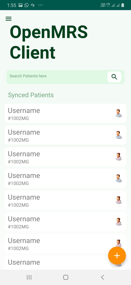
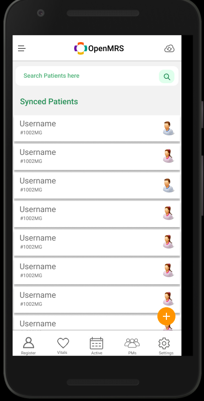
These are some changes in home screen UI. In this, I have created the search screen as the landing page and all the options will be now available in the navigation drawer. This is the basic structure of the new flow. Please review this and give suggestions. Thank you
3 Likes
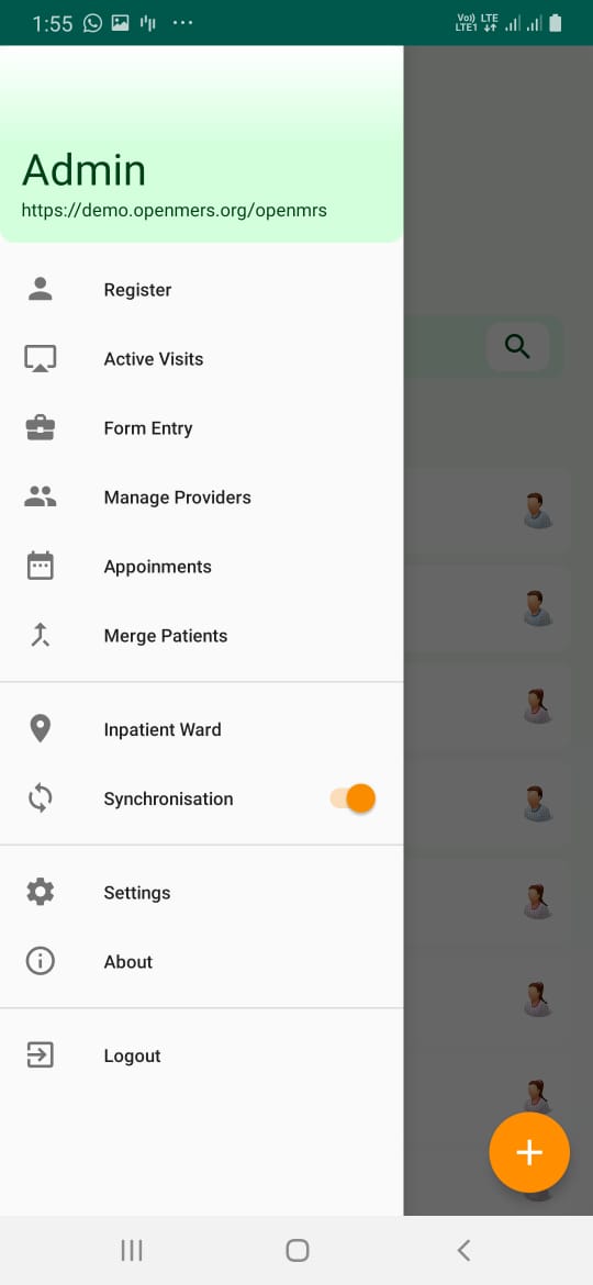
This looks good @gauravdewat , but I think we should keep the app bar so that user can quickly switch locations, go to settings, enable dark mode, etc. Also, design a collapsible bottom app bar for the main functions of the app.
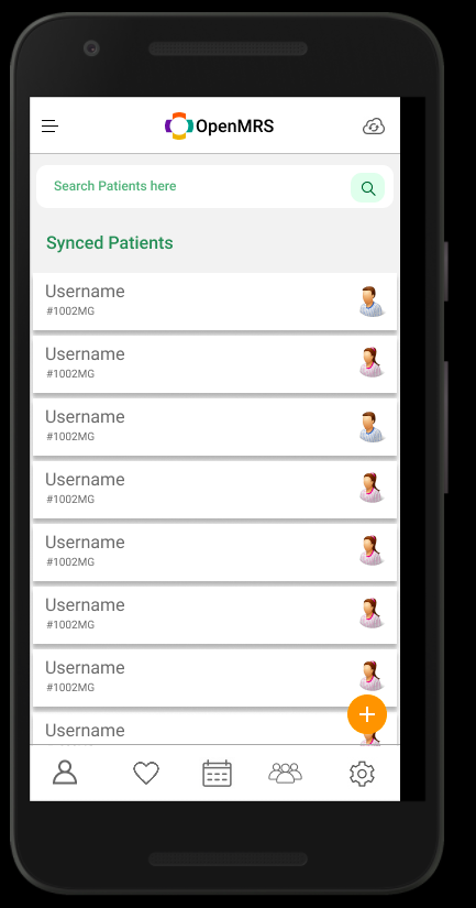
New design iteration for home screen @f4ww4z. It has all the main functions in the bottom bar with the settings option for accessing the color mode change option and the sync option can be accessed from the toolbar. Additional functionalities can be accessed from the navigation drawer.
These designs are only for explaining the UX flow and color scheme can be changed further.
Kindly review this. Thank you.
1 Like
Good design @gauravdewat
1 Like
Thank you @abdelaty
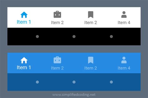
Looks good @gauravdewat , except that the bottom nav should have text descriptions e.g.
1 Like
The design looks good! Great work!
Just a small suggestion though, wouldn’t it be more user-friendly if the location (e.g. Inpatient ward) was indicated somewhere in the home-screen? Even better if there is a drop-down toggle for it so that doctors can easily identify and switch between locations without having to check the menu.
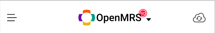
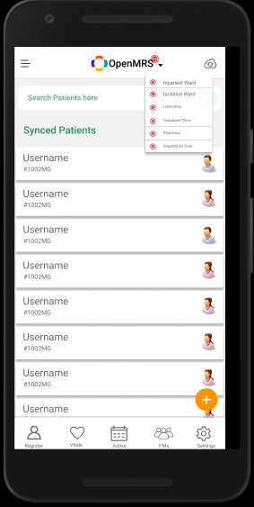
This red circular disk with icon represents the location(here registration desk). This comes with a drop-down option to change it from the toolbar itself.
@gauravdewat I think it would be best to leave the OpenMRS logo as is. For the location, what about having it at the top right corner but below the top bar and above the search bar? That too with the full text of the location?
If not another alternative would be to have the location right next to the sync button in the top bar.
@f4ww4z what do you think?
@sanjula In the current application, Location can be changed from any screen within the app. So keeping the “change location” button on the toolbar will be easy for the user as it will maintain a design consistency. If we implement it in the home-screen as you have said then for each screen we have to find a different spot for placing the “change location” button.
I’ll share some more designs, help me with those. Thank you
DropDown would look like this.
Oh… if the location of the dropdown has to be changed for every screen, then that’s not a good idea.
My concern was if having the location dropdown overlapping with the OpenMRS logo will be overbearing… and whether it actually adheres to the Material Design guidelines…
1 Like
Need flexibility to add new menu item.
For additional menu items we have a navigation drawer which can accommodate all the new features. @prapakaran
1 Like
@gauravdewat This looks good, except use the original OpenMRS logo and don’t place anything else on top of it. I suggest to move the location dropdown further to the right, just beside the refresh button on the top right.