Dear Community!
Please give feedback and suggestions on the UI (below) for Home dashboard for the 03 RefApp.
@grace @eudson @gkinyua @amugume @jamiearodi @wamz @pauladams @lousa
Dear Community!
Please give feedback and suggestions on the UI (below) for Home dashboard for the 03 RefApp.
@grace @eudson @gkinyua @amugume @jamiearodi @wamz @pauladams @lousa
Hi @gomare! As far as I am aware, the home page will be what was made in the intial designs, as is being worked by PIH. CC: @chibongho @mogoodrich @michaelbontyes @mksd @mksrom
@vasharma05 Sorry was not aware. we have started on this epic [O3-2797] - OpenMRS Issues assigned by @grace
@vasharma05 - although PIH is working on component enhancements in patient management (and which are typically rendered in the home app), we aren’t leading up any particular refapp design. As far as I know the home app is totally generic, entirely driven by extensions, and the refapp implementation is based on the existing designs in Figma. We certainly support any effort to continue to make the home app configurable and ensure it meets broad community needs.
@gomare - what kind of feedback are you looking for?
Hi Everyone, Mea culpa on some of the confusion here. @pauladams and I talked about this a lot in person and async in Kenya a few weeks ago, and then I worked together with the UCSF team esp. @jamiearodi and @gomare last friday to outline this epic and associated tasks: Jira
We clarified this on this week’s Thursday O3 Squad call, and PIH members of the Queues squad confirmed that this does not block their Queues work; in fact, is quite compatible with their ongoing work on the Queues extension(s).
The vision here is:
So to be clear with some visuals here:
The main feedback we’ve been hearing on Slack and in the Zoom call comments on the O3 Squad call this week is the same as exactly what @aojwang wrote in slack: “Let’s think about role based dashboards so that the home page makes sense to everyone. Data team will want to monitor a few indicators and will not want for example anything to do with active visits or even the queues.”
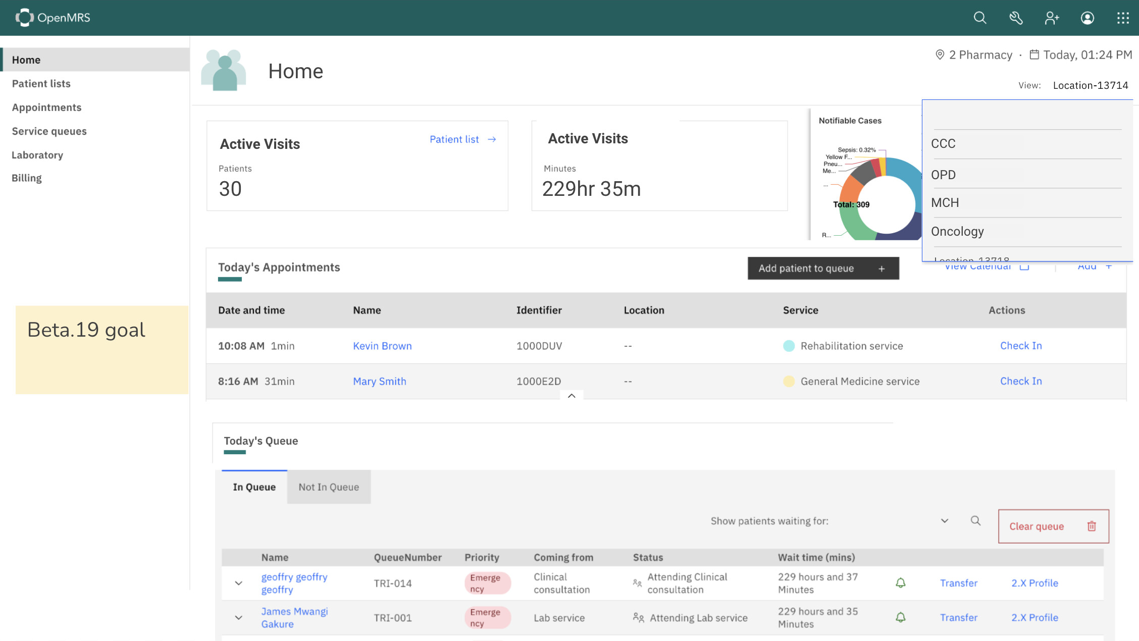
So @gomare and @jamiearodi this is something for you to start thinking about and planning for, for a future cycle of this work. Maybe aim for Beta.19 release to include this? You’ll likely want to talk through how to model this, e.g. maybe connect w/ @alaboso ?
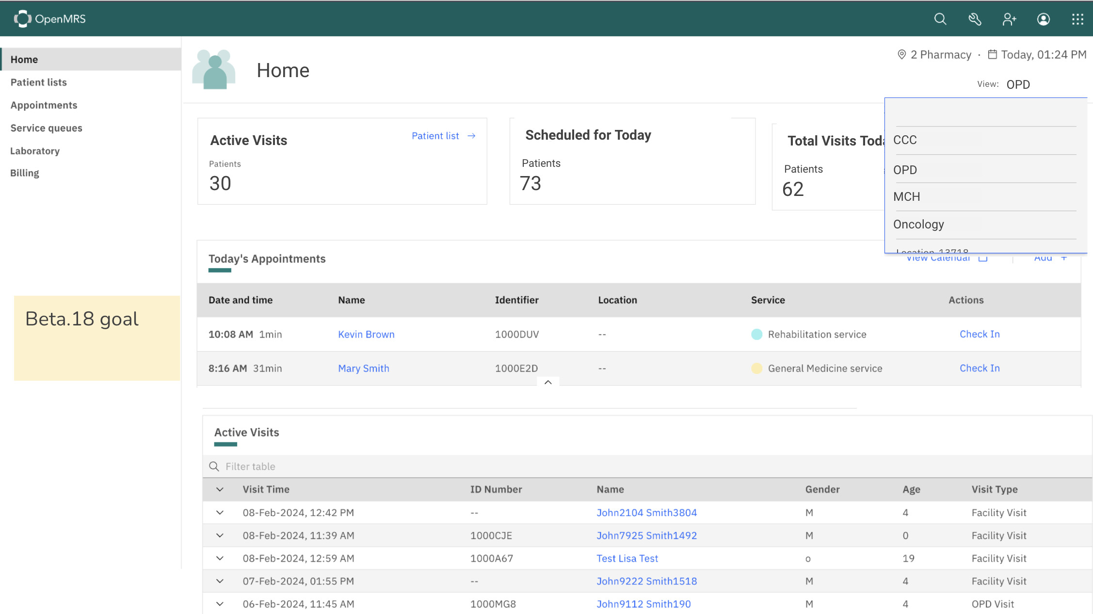
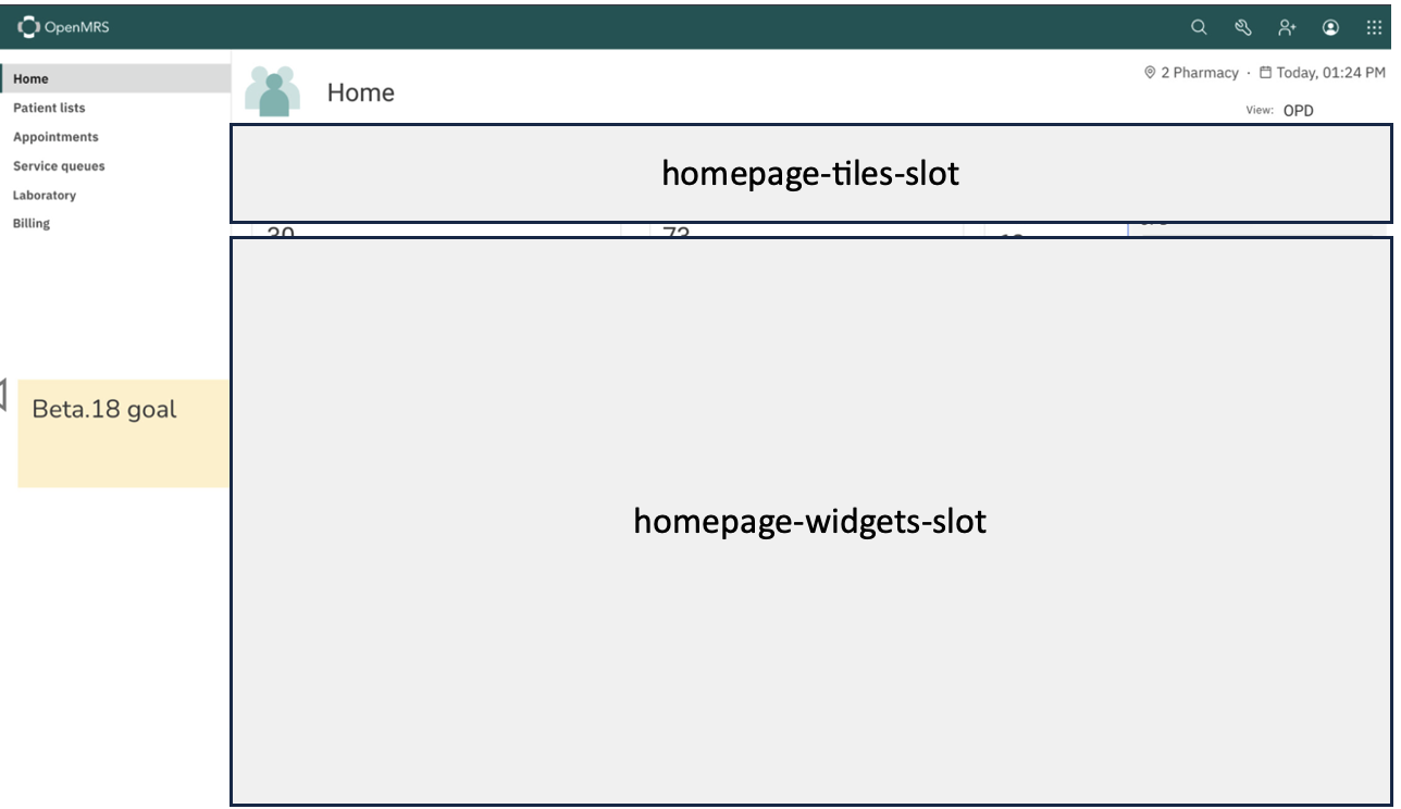
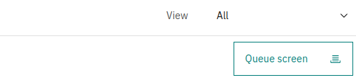
@grace as a mini-target for Beta 18, we could lay some ground work for us to build on top of. What seems to be consistent with the designs as well as other apps is the layout of;
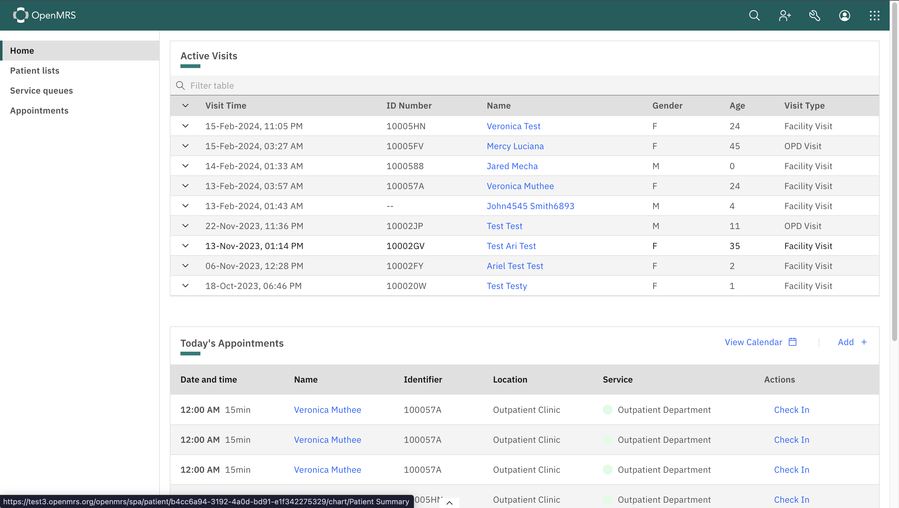
We already have the homepage-widgets-slot(3) that houses the appointments and active visits so a mini target would be to;
homepage-tiles-slot (2)We could leave out the location switcher/dropdown for now so it doesn’t complicate this
All data, logic and permissions are defined within the individual esms so we can always decide what views/widgets are displayed in the individual frontends or implementations.
@ibacher @dennis @vasharma05 what’s your view on this?
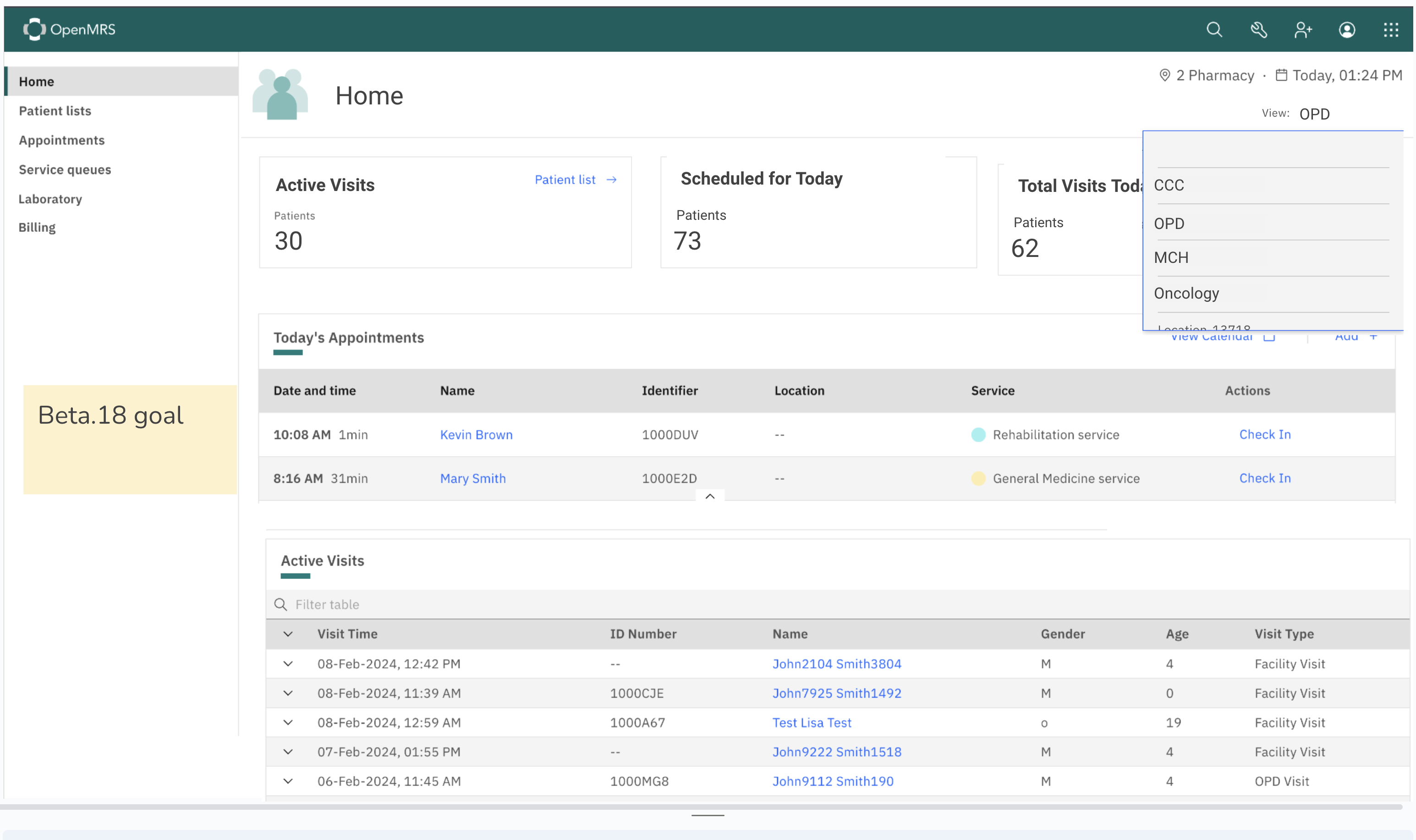
One thing that I continue to struggle with with the O3 refapp designs is when the “View” switching is based around Locations, and how this exactly relates to the “Login Location” that is associated with the active session.
In general, I think the “View” that is part of these designs works best when it is separate from Location. For example, in the case of Appointments, this is the list of available Services, which is clear based on the “Select service type” text:
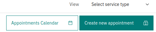
This works less well when the view is ambiguous as to what it represents. For example, in the case of Queues:
In this case it is less clear what these “Views” are - are they Queues? Locations? Services? It is not obvious from the UI, and not even obvious when the list is viewed or an option is selected since in many cases a Queue, Location, and Service might be 1-1-1 and named synonymously with each other (eg. the Triage Queue at the Triage Location offering the Triage Service).
In general, I would be interested in exploring more the idea that the Location that you are logged into drives more of the functionality and behavior of O3, especially in the home app. For example, if you log into the Pharmacy you’d see different options on the left-hand nav, and different widgets in the Home component than you’d see if you were logged into the Emergency Department, Laboratory, or Registration desk locations.
Once you are logged into a location, the available “Views” would also be limited. For example, if only certain service types are available at your session location, then the service-types you can choose from in the “View” might be limited to only those. The same with Queues.
I would be interested in how others see this system evolving and if what I describe resonates with other implementations. For PIH, we have extensively built out our O2-based system in this way, where the UI is heavily driven by 2 factors - what Location you are logged into, and what Privileges that you have. This has worked well for us.
As long as switching one’s Login Location is relatively easy and painless, then viewing information at other Locations by switching one’s login location should be straightforward. And this also provides the ability to restrict which locations a user might be able to log into based on privilege, if that ever becomes a need.