GSoC 2026: Improved Appointments Calendar View

,

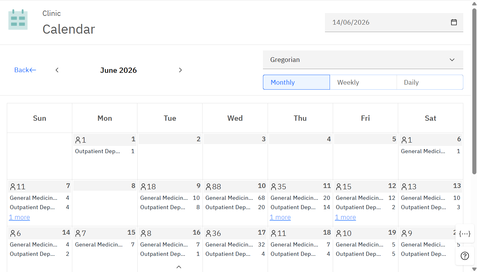
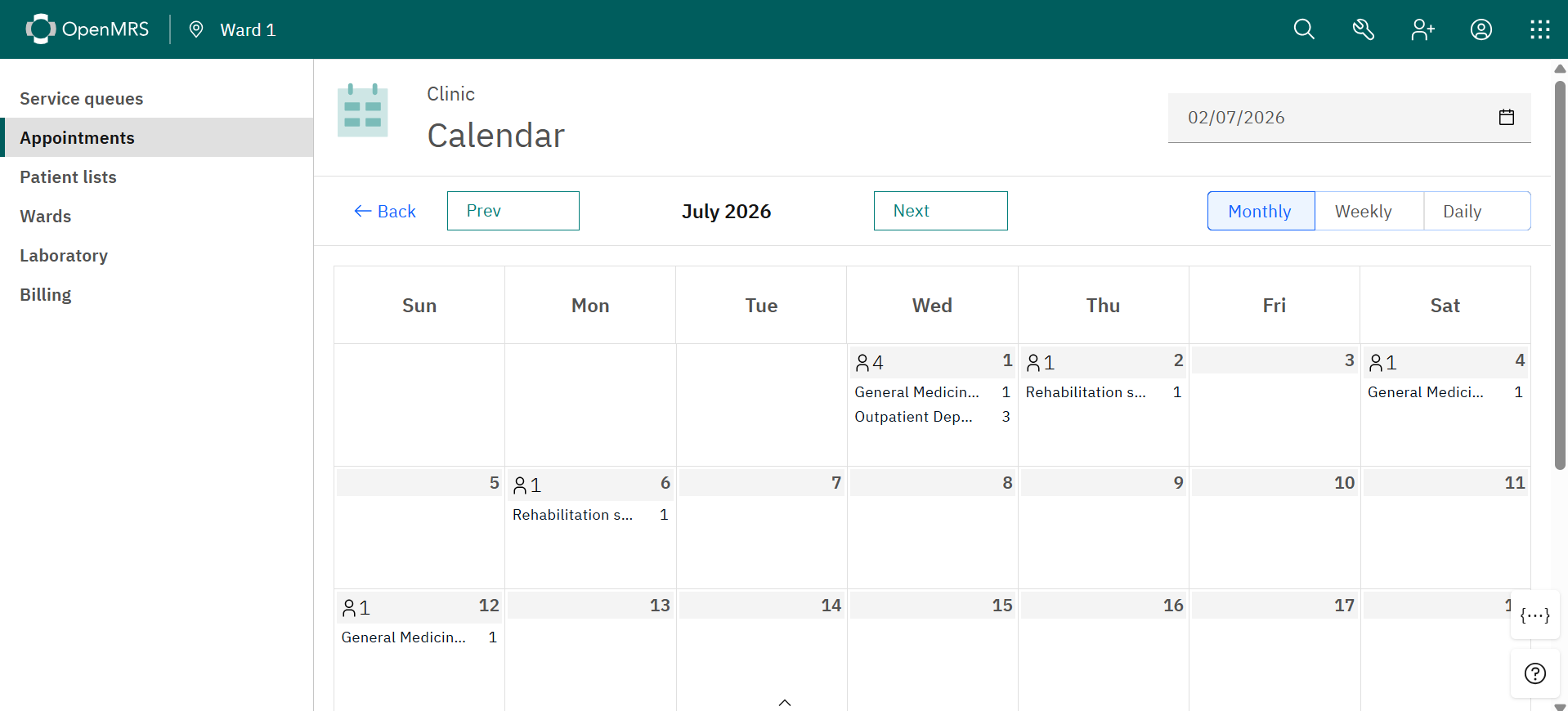
The current appointments calendar in OpenMRS O3 provides a basic monthly overview with appointment counts grouped by service. While functional, it lacks the features needed for efficient clinical workflow and detailed schedule management.

Key limitations include:

● No drill-down capability: users are restricted to a monthly view and cannot switch to weekly or daily views

● Lack of detailed data: only aggregated counts are shown instead of patient names, time slots, and statuses

● Disruptive navigation: clicking a date redirects to another page, breaking context

● Limited global usability: tightly coupled to the Gregorian calendar system

This project aims to transform the calendar into a more flexible, interactive, and user-friendly system.

Core objectives:

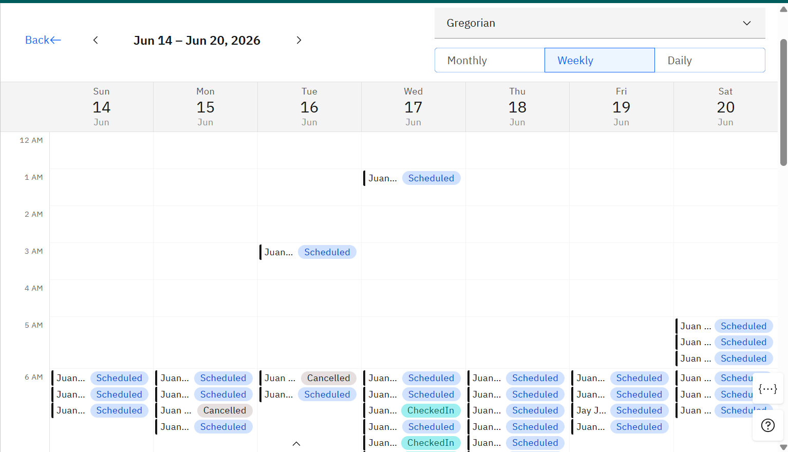
● Introduce multi-view support (monthly, weekly, daily)

● Display detailed appointment data directly within the calendar

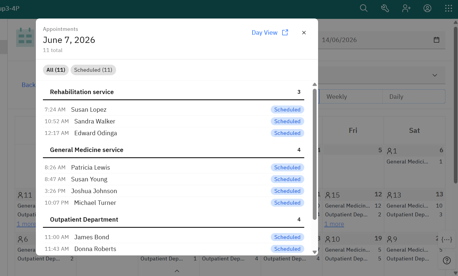
● Replace navigation with modal-based interactions to preserve context

● Support multiple calendar systems for global adaptability

● Improve UI/UX, responsiveness, and interaction flow

The implementation will extend the existing OpenMRS appointments module by leveraging:

● useAppointmentsCalendar and OpenMRS REST APIs

● React-based microfrontend architecture

● Carbon Design System components

Overall, this project will significantly improve usability by providing a more intuitive, efficient, and context-aware scheduling experience for clinical staff.
1 Like

@pratikdeb07 Thank you for taking this up, and we are looking forward to an improved appointment Calendar View. @fanderson, @robaikisia , @kmuiruri. Based on your implementation experience with appointment scheduling, any suggestions you have on this work would be very welcome.

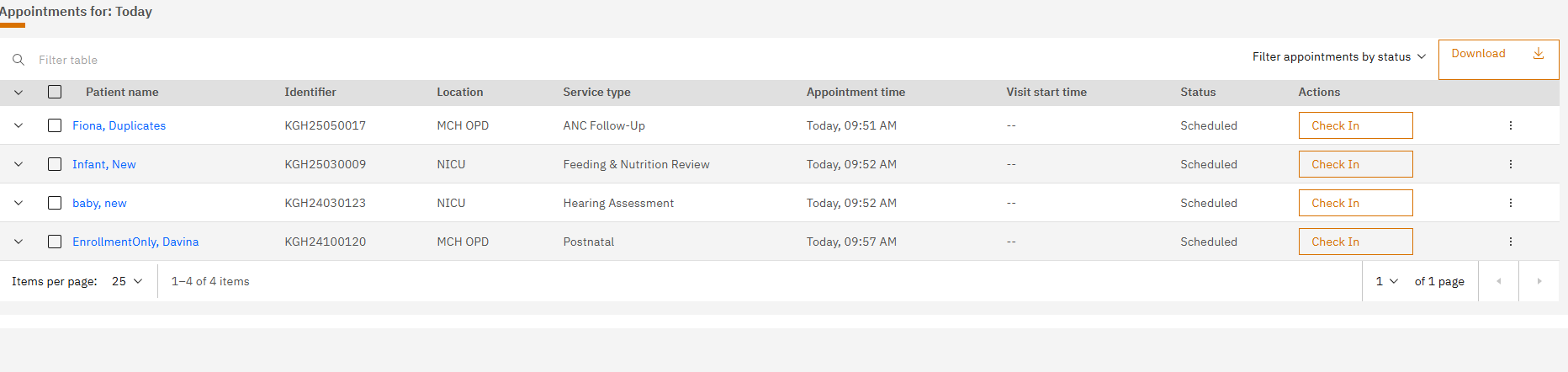
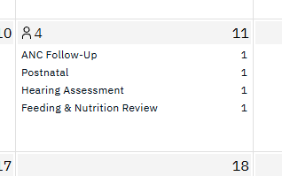
Thanks for these detailed objectives @pratikdeb07 .I’m not sure if this is part of your scope, but in our implementations we sometimes have the same provider seeing all the patients at one location even when there is more than one service type at that location. It would be helpful to have the option to view appointments by location in addition to service type. For example, on the list view, you can see there are 4 appointments at 2 clinics (MCH OPD and NICU)

On the calendar view, there is no way to sum the appointments by location

1 Like

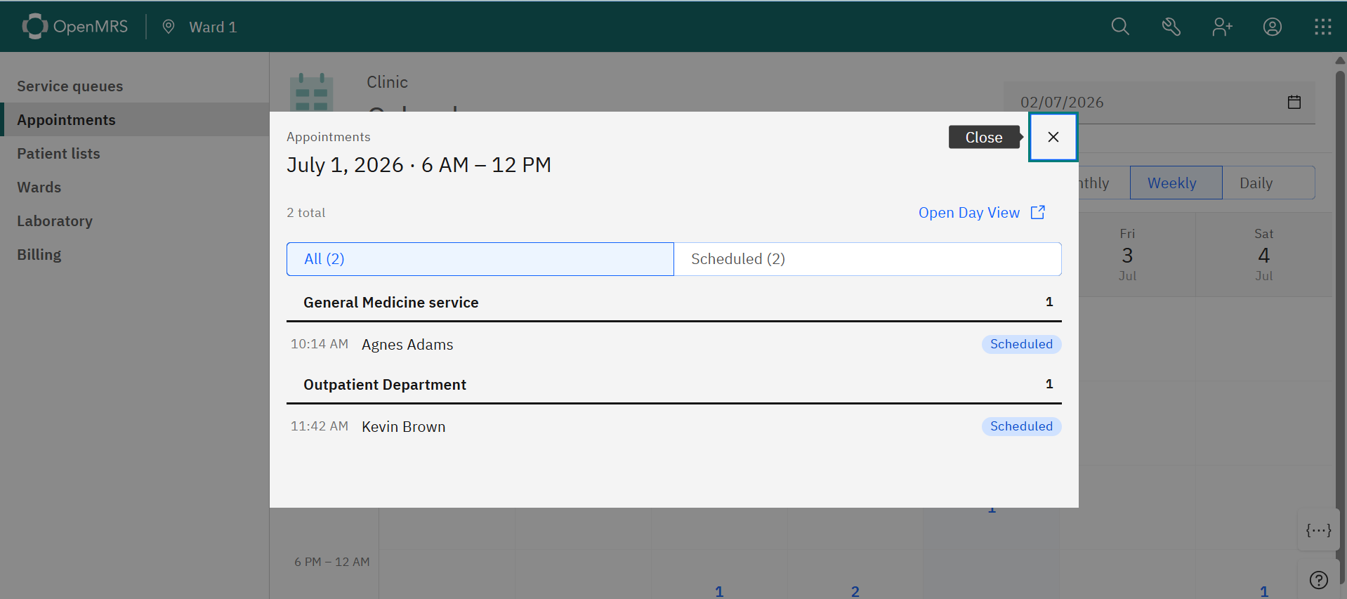
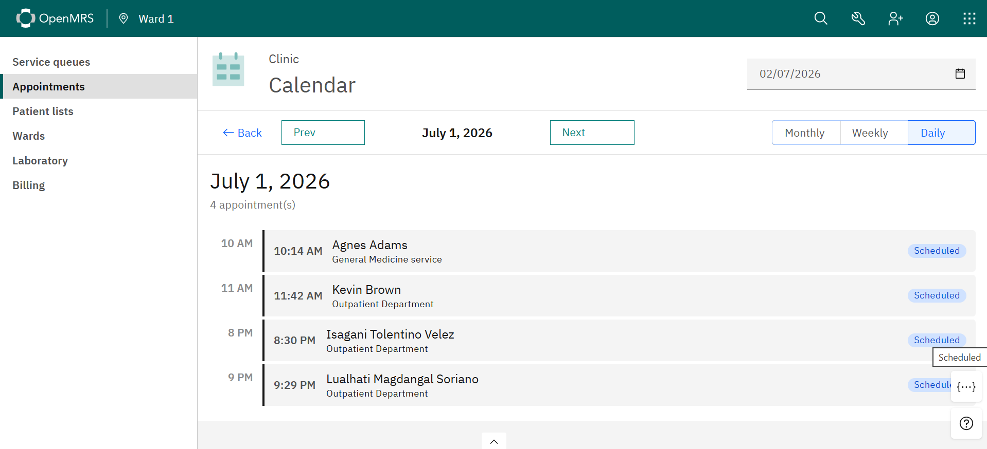
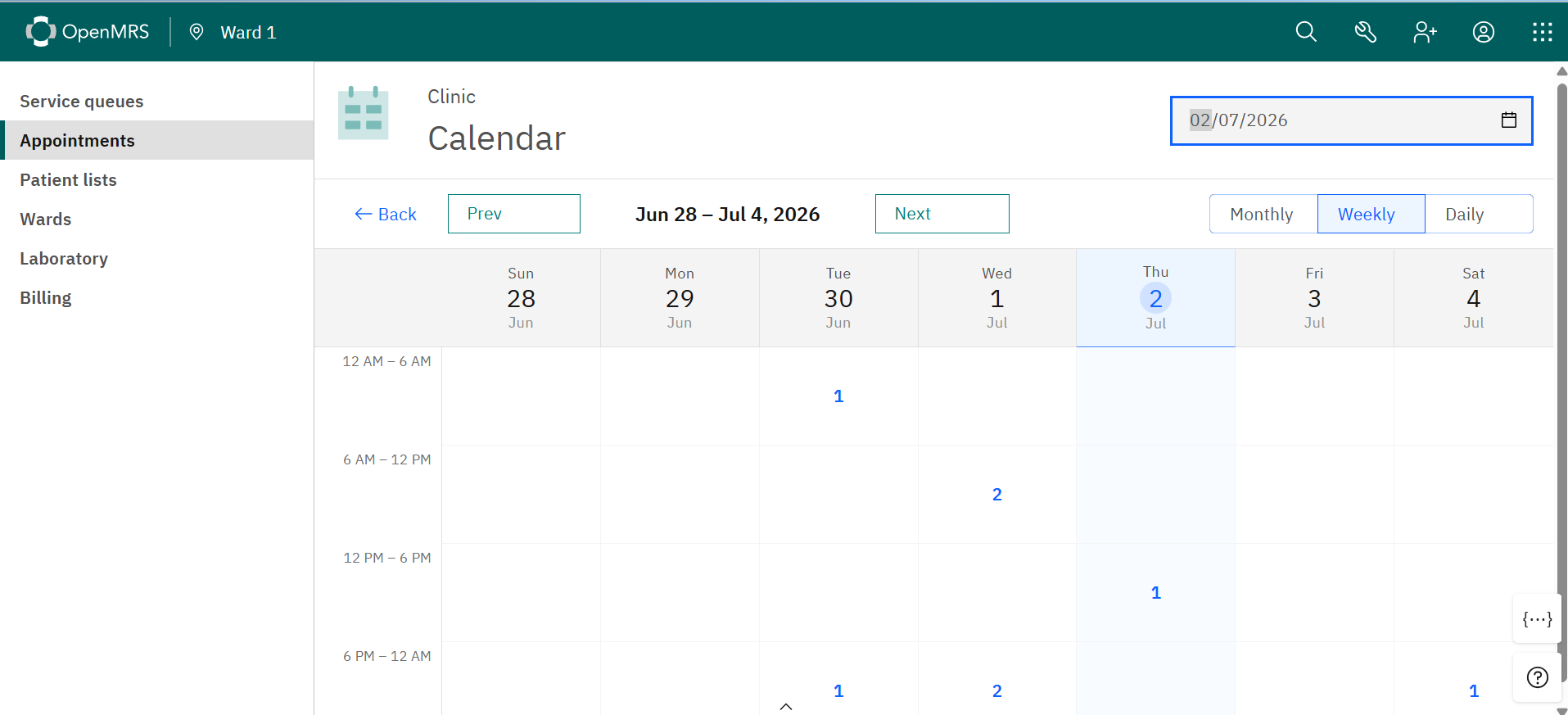
Here are some of the Screenshots of the implementation

1 Like

Sure I will talk about this with @bawanthathilan .What’s your thought on this @bawanthathilan ?

Looking great Pratik. Do we have anyone on the UI/UX side who could provide some suggestions and feedback on these UIs? @jayasanka @ibacher @dennis

Thanks for this feedback @fanderson, really useful to hear from someone with a real implementation perspective.

Our focus right now is on the multi-view calendar (monthly/ weekly/daily), modal-based appointment details, and non-Gregorian calendar support. this is a genuinely valuable use case providers seeing patients across multiple services at the same location is a common real world scenario, and filtering by location would directly help with that.

I’d like to note this down as a potential follow up enhancement once the core scope is delivered,

thanks again

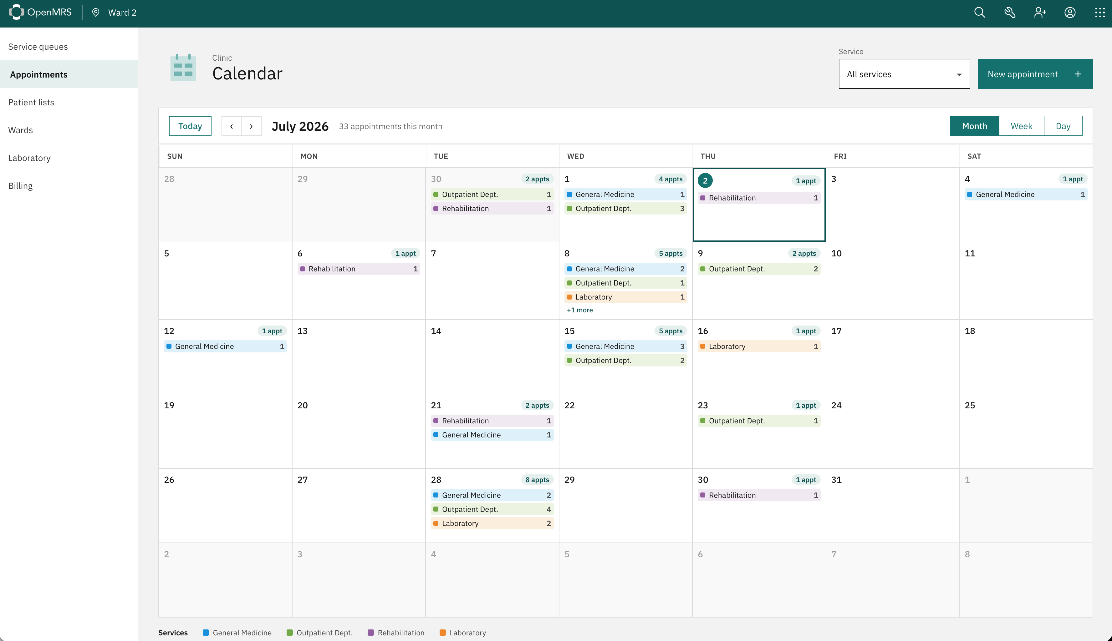
This is the Updated Ui of the Improved Calender view Project. Please Check this!

1 Like

@pratikdeb07 Great work, thank you very much for your contributions. Some quick observations, and please feel free to seek further UX/UI feedback via the #ux-design-advisory Slack channel

Monthly view:

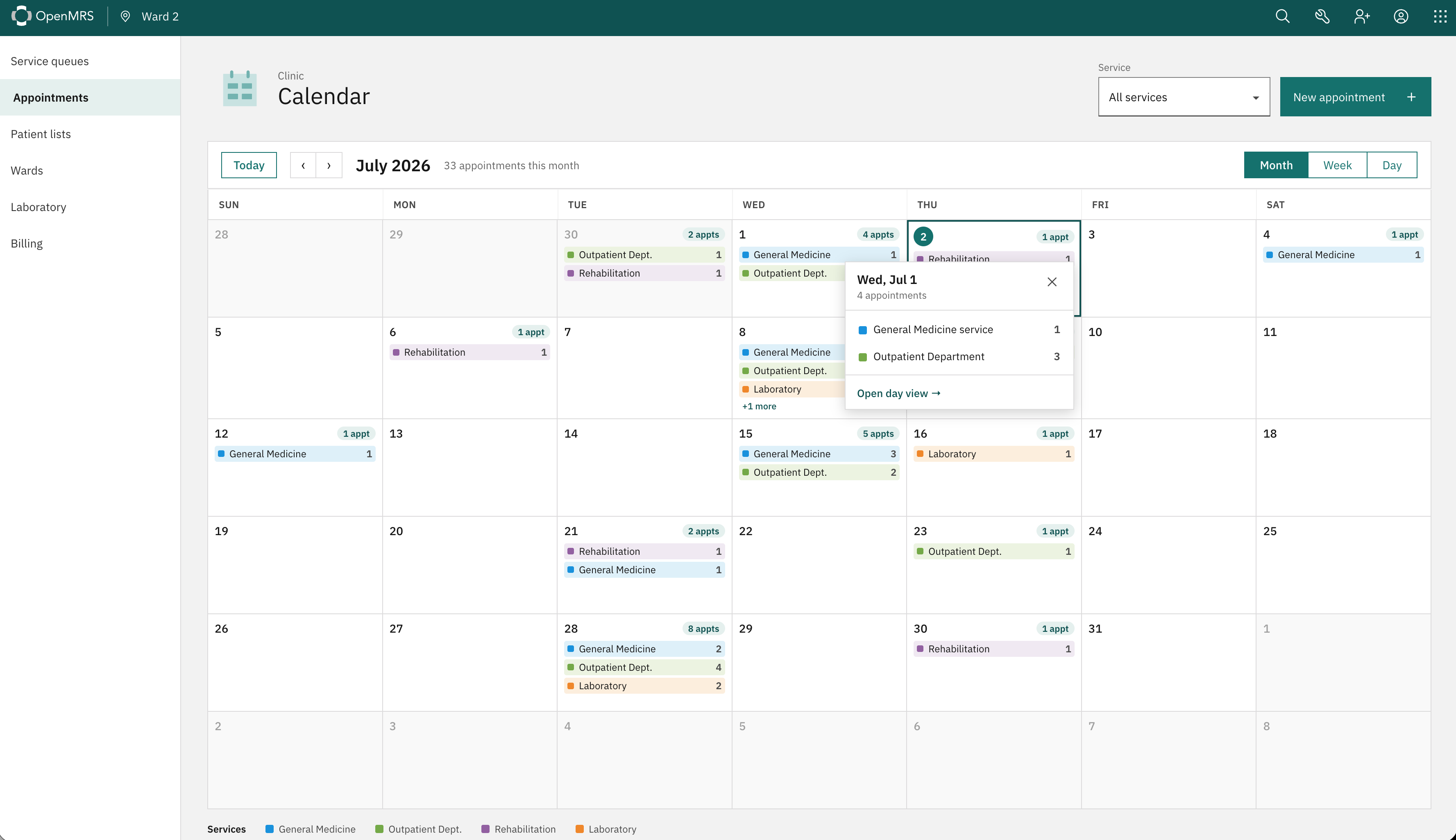
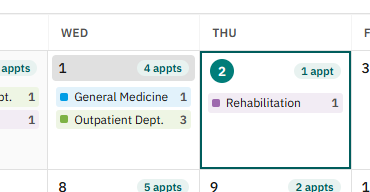
  • The multiple counts make the cells feel a bit busy. Each service count plus the total competes visually with the day number in the top-right corner. Could we show just the day number and service names by default, and reveal the appointment counts (per service and total) on hover?
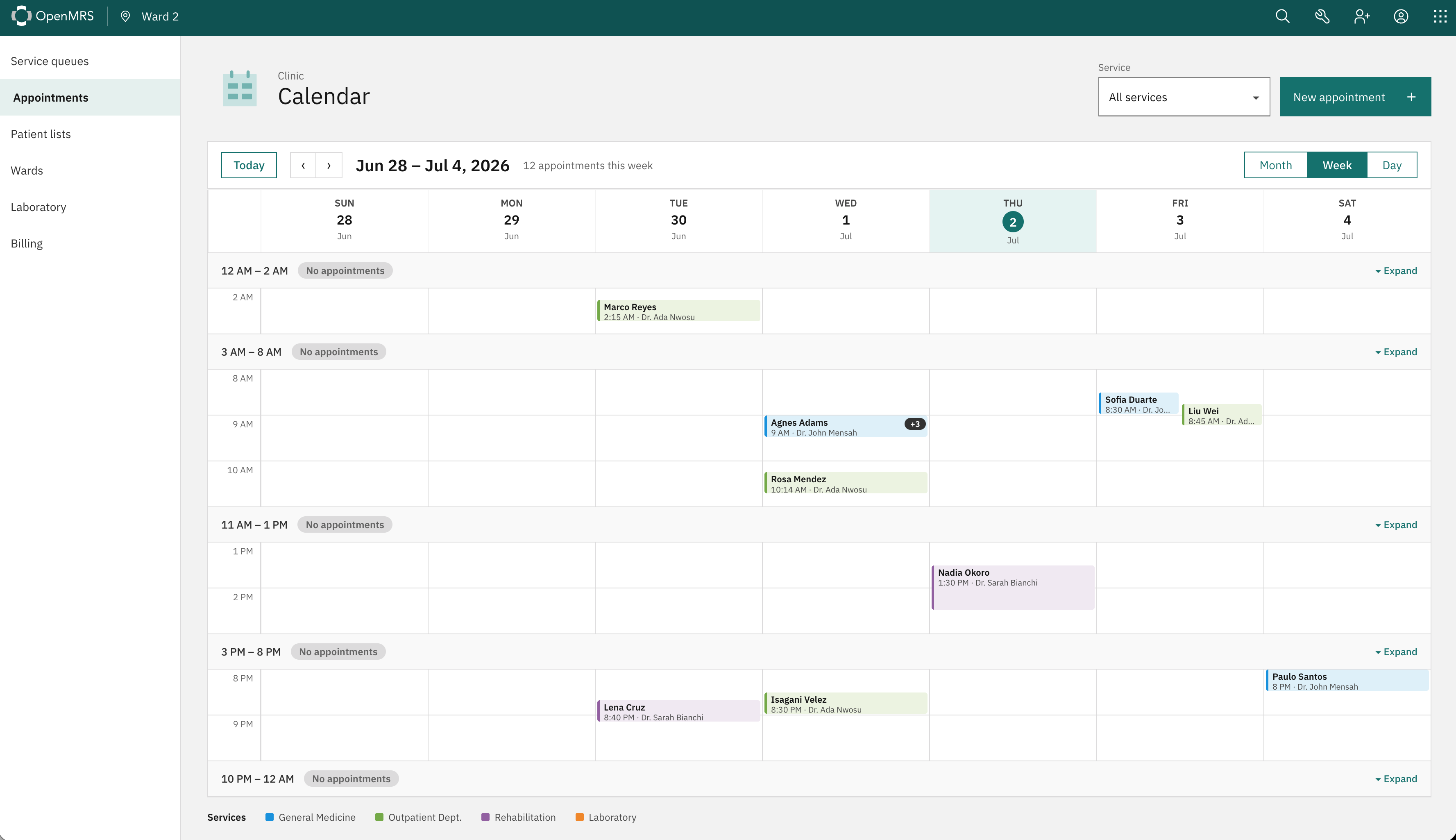
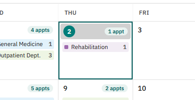
  • There’s currently no way to identify today’s date in the monthly view. Could we colour-code the current date the same way it’s already done on the weekly view (where Thu is highlighted nicely)?

Daily view:

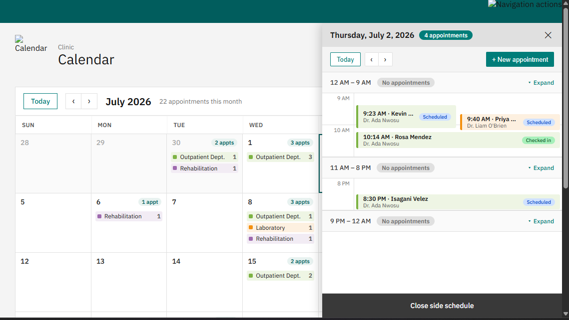
  • In addition to time, patient name, and service, could we also include the provider name on each appointment? It would help clinicians quickly see who’s assigned to each patient.
  • There’s no indicator of the current time. Consider adding a “now” line (a horizontal marker at the current time) so front-desk staff can see at a glance where they are in the day.
2 Likes

Thanks for the feedback @veronica. On a recent call, @bawanthathilan, @pratikdeb07, and I went through Pratik’s initial designs and polished the flow a bit further.

You can find a interactive mockup here:

:jack_o_lantern: CLICK MEE!!!

Some changes:

  • Month, Week, and Day views are now more consistent.
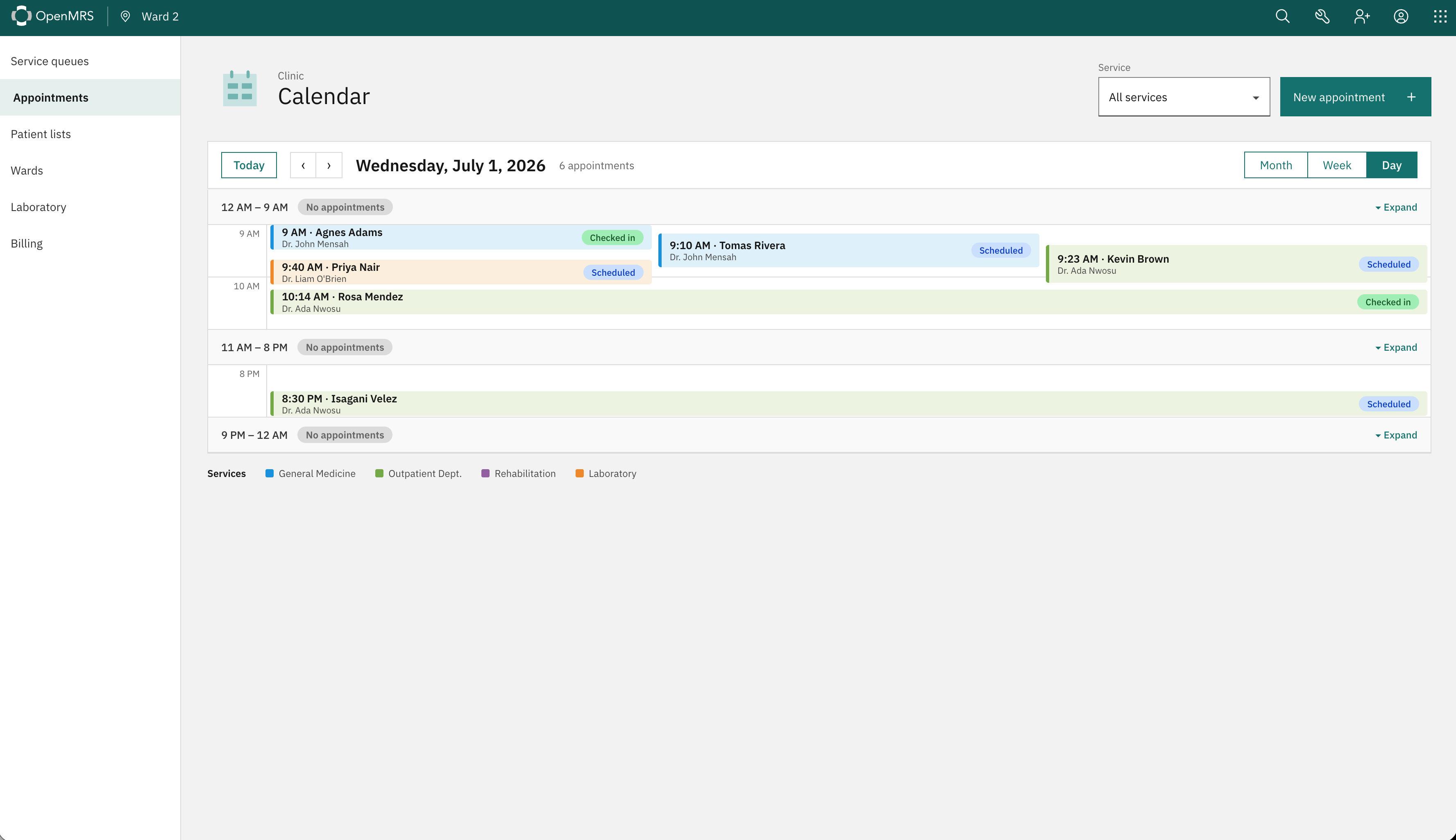
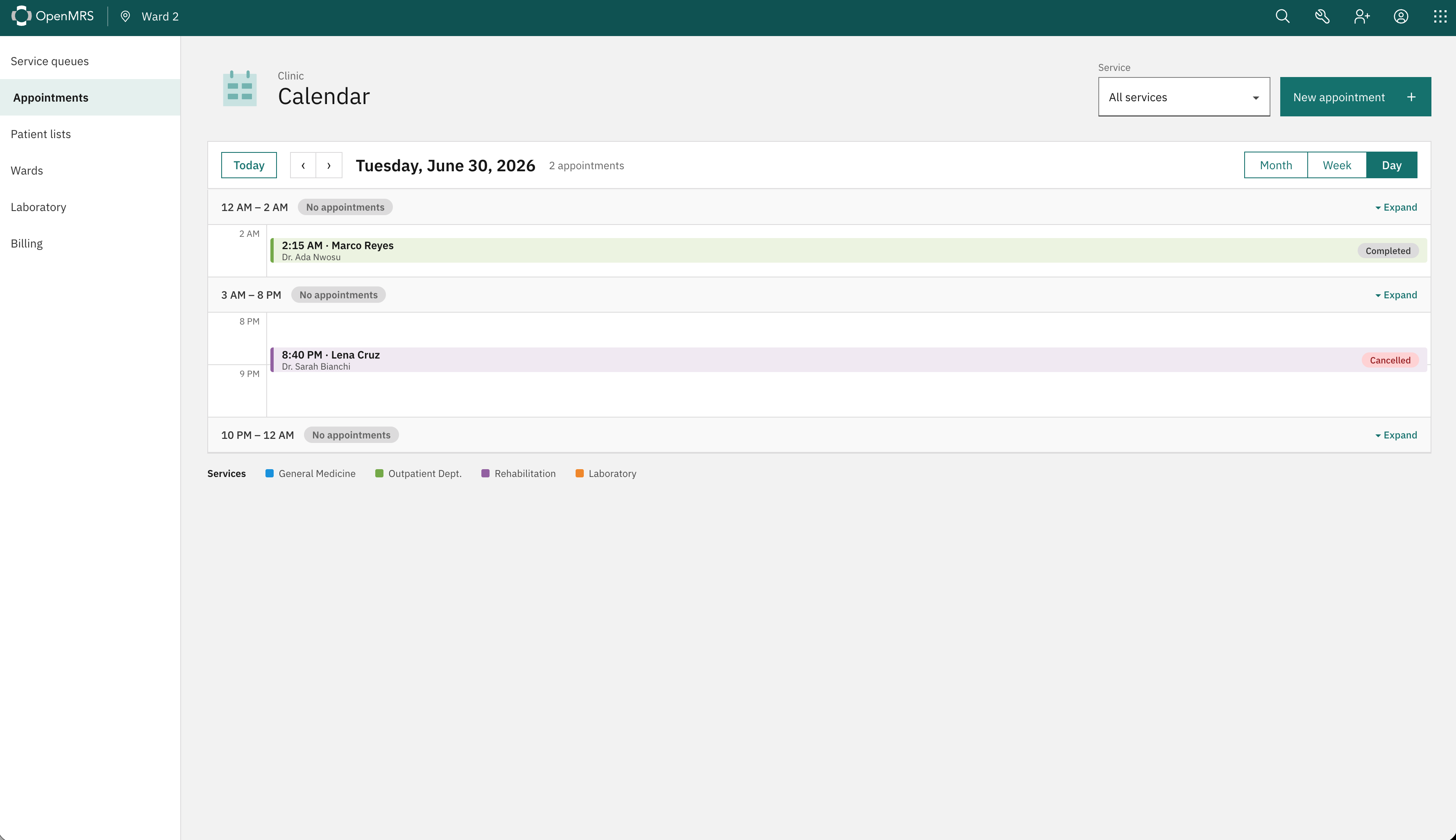
  • Appointments are now colour-coded by service type.
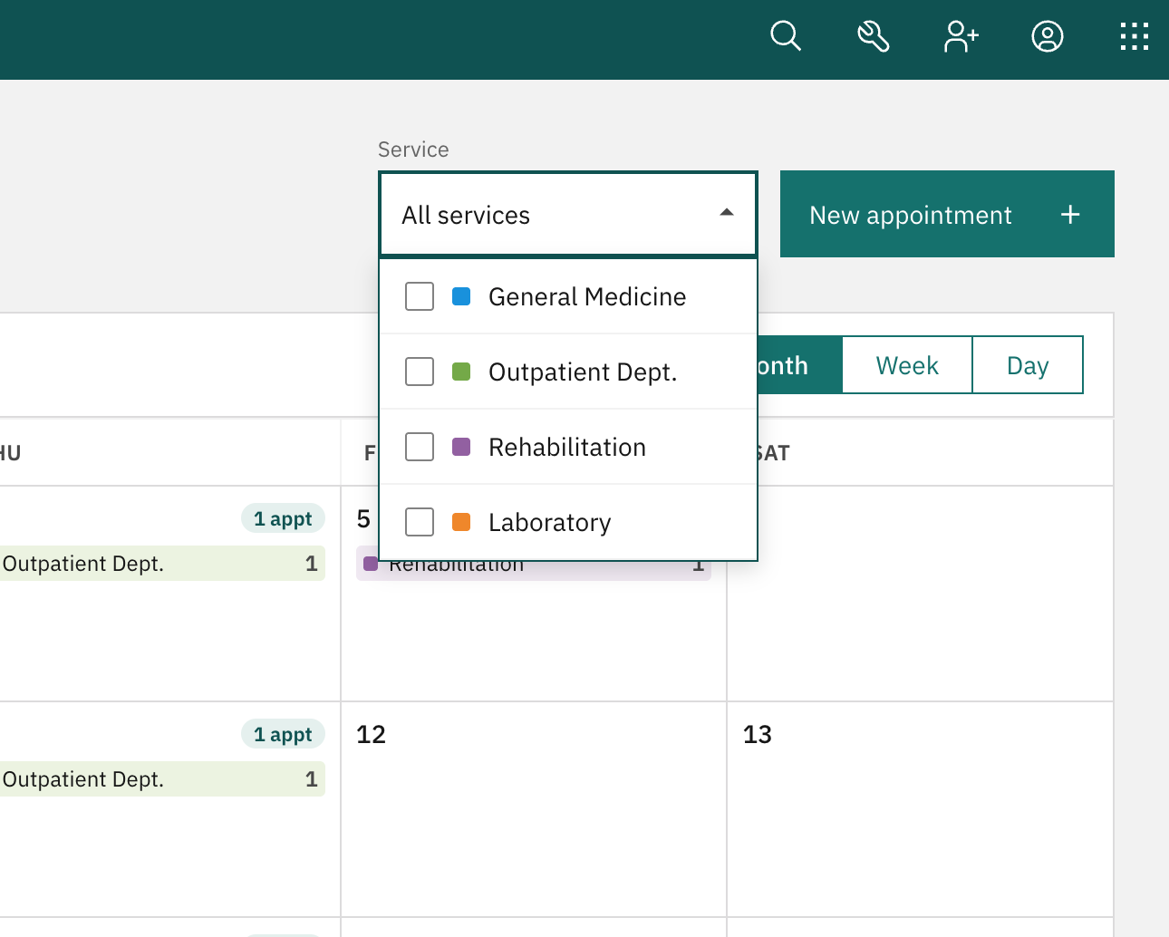
  • The calendar can now be filtered by service type.
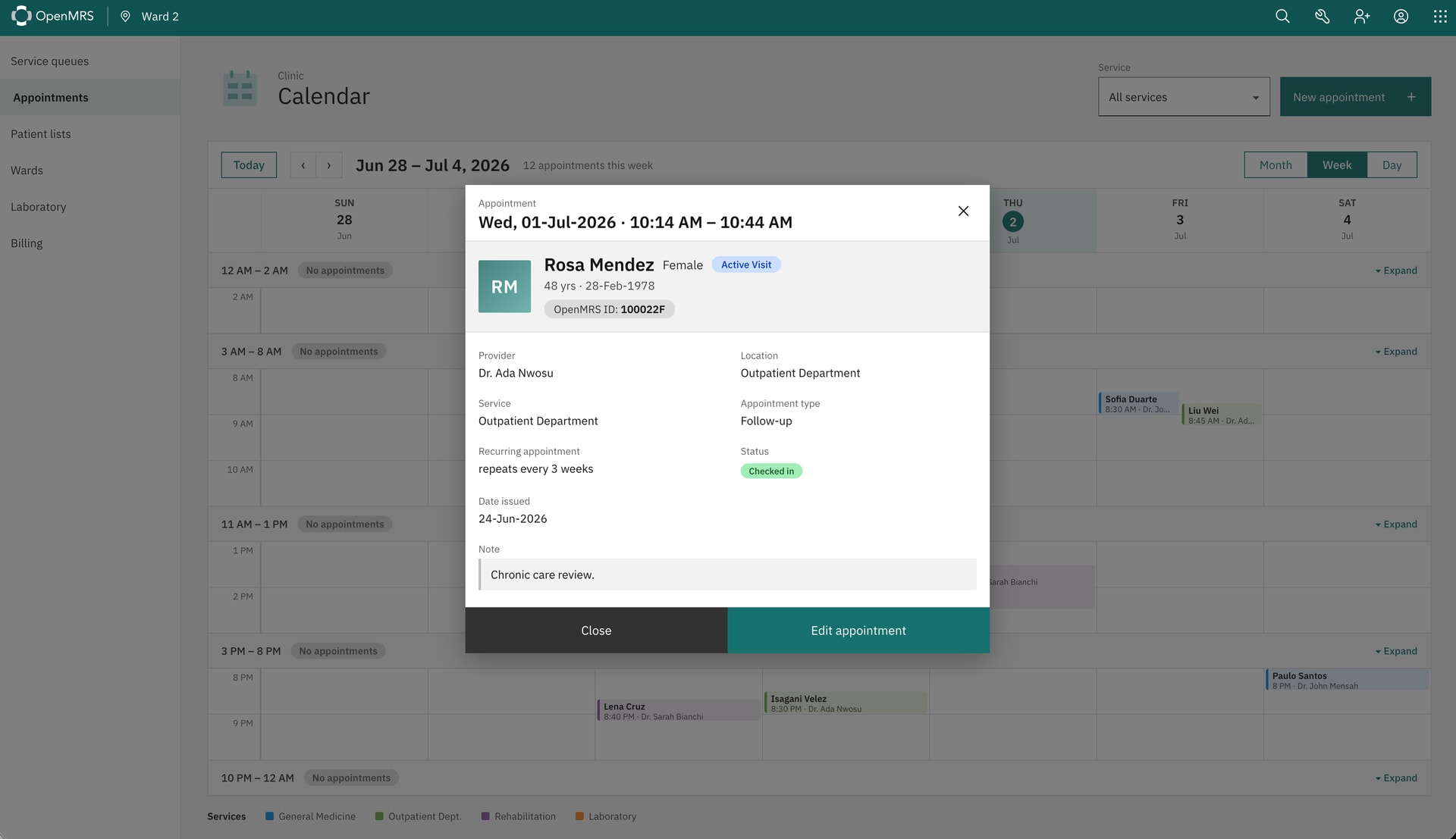
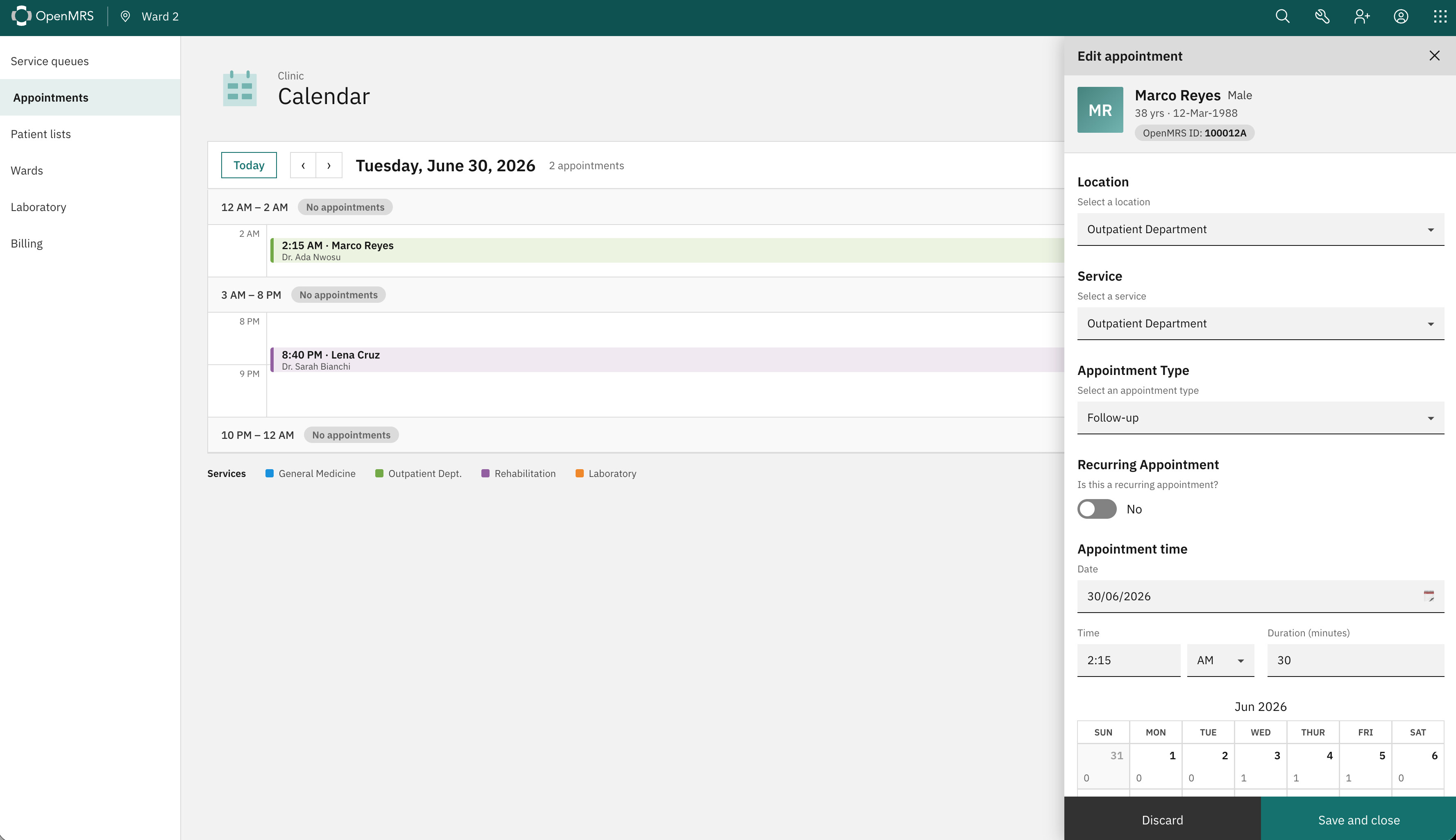
  • Appointment details now use fewer modals and keep more calendar context visible.
  • Appointments can now be edited directly from the calendar.
  • Provider name is displayed on the appointment

I’d encourage you to visit this mockup link and try these tasks yourself first. If you can complete them quickly and naturally without having to think about where to click that’s a good sign:

  1. Can you find Rosa Mendez’s appointment on July 1?
  2. Can you identify which service has the most appointments this week?
  3. Can you find an available slot between 9:00 AM and 11:00 AM?
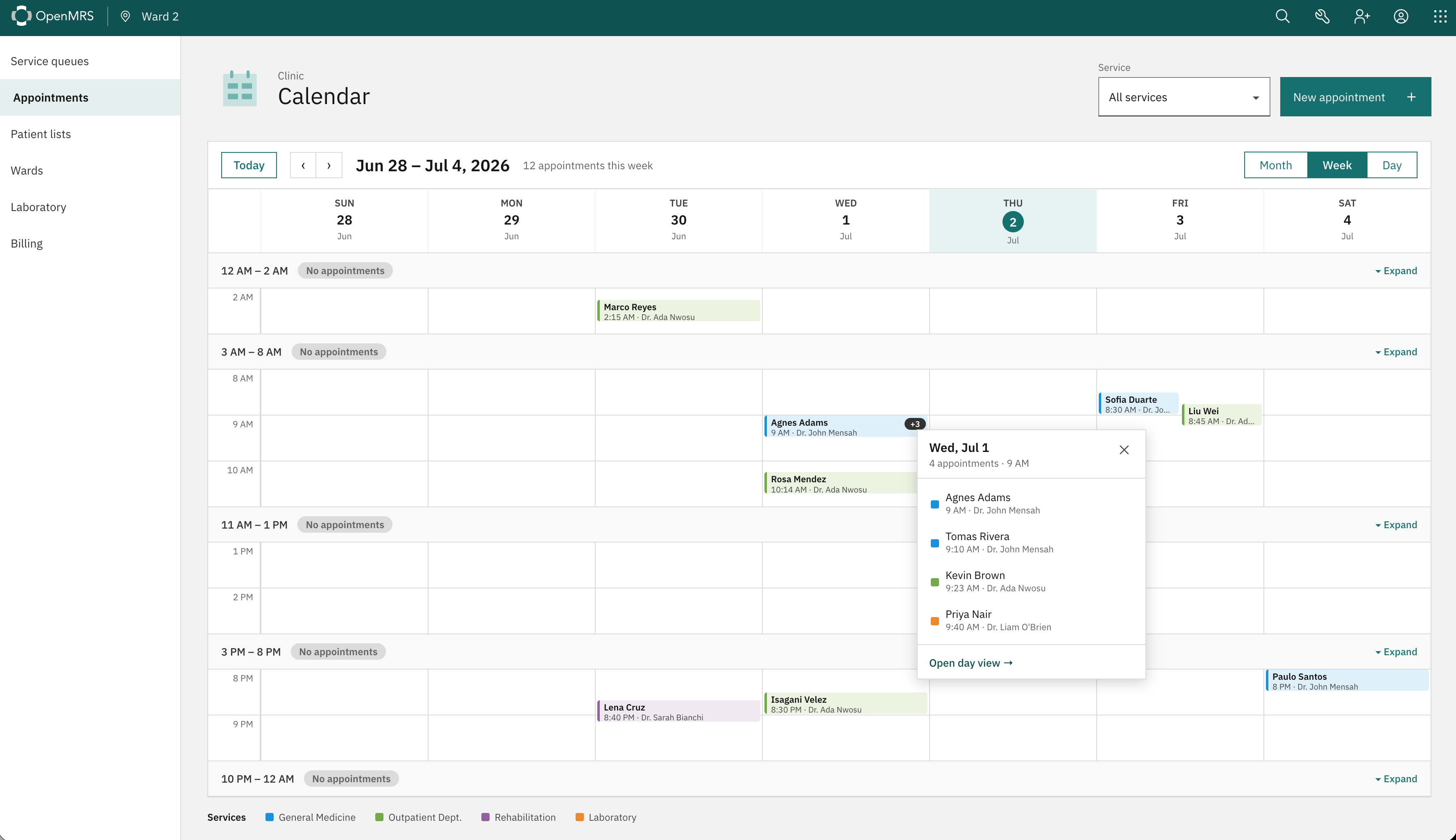
  4. Can you open an appointment hidden behind the +3 indicator?
  5. Can you switch from Month view to Day view while keeping the same date selected?
  6. Can you find how many appointments Dr. Sarah Bianchi has during the week of June 28 to July 4?
  7. Can you filter the calendar to show appointments from only one service?
  8. Can you open an appointment, review its details, and edit it?
  9. Can you tell which appointments are scheduled, checked in, completed, or cancelled?

Let us know how easily you were able to complete them and where anything felt unclear or required extra thought.

cc: @ibacher @dennis we’d love your thoughts on this as well.

I think my biggest problem here is with the week view. Specifically, it seems like these should be displayed by service or provider. I think the 4th screenshot makes clear why this is a problem: at a glance, I can only see that there are 3 additional visits at the same time as Agnes Adams, but then in the detail, I can see that these are multiple appointments for different services and providers.

I’m pointing to this one line because I think the mock-up suffers a bit from not reflecting the real information density of a realistic clinic where we should be thinking in terms of something like 30-80 appointments / provider / day and each service running 2-10 providers. I think that kind of detail is important to get right because while I think the designs here are great (they are!), but I don’t think they’ll scale well to real-world use where something like 300 appointments in a week seems ~right.

I’d also think that in the day view especially, it makes sense to think of appointments as something like “cards” which should render at something like an “ideal” maximum width maybe on the scale of these and then compress elegantly if there are more appointments to be shown. What gets hidden when there are 8 patients in a single 10-minute slot across all services? How do we keep this display “readable” on a tablet view?

.

Why does clicking on an appointment open an overlay? Just open the workspace in a read-only view (we’re adding too many overlays and it’s a pattern we should avoid).

On the card itself:

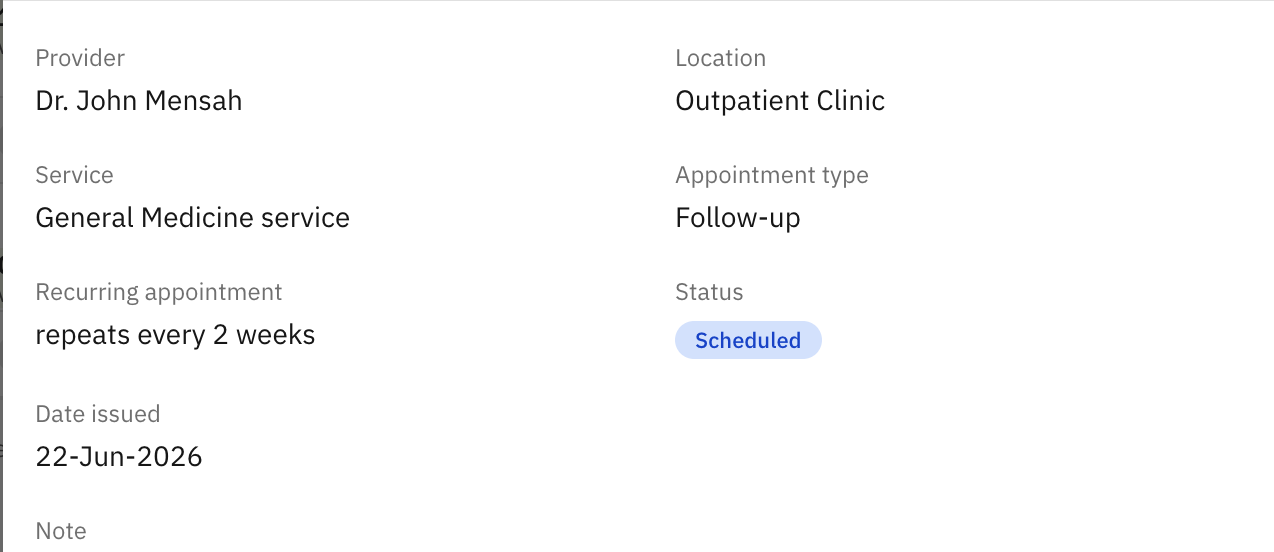
I think it’s important that we be able to raise the most important details at a glance, so, for example, the status should probably be at the top, not the bottom and the location is probably not very relevant (as a user I’m probably most concerned about appointments I need to see or check-in so their probably all in the same location and service). These fields can be moved towards the bottom.

I can see the value of the recurring appointment here, but the other thing I probably want to be able to see at a glance is when is the patient next due in. This could be their next recurring appointment, but it could be an unrelated appointment (e.g., next med pickup or the like).

I saw @veronica mentioned this above, but in addition to filtering the view by service, we very likely want to be able to filter it by location (i.e., those appointments for the room I’m working in) or provider (where that’s available).


I don’t mean this to be all criticism, I think this is working in a good direction and would be an improvement over what we have right now, but I think there are a lot of little things we need to make sure we’re thinking through.

1 Like

Yeah I think let’s have the ability to sort appointments in the table view. also, when a doctor views this, may they see information relevant only to them so that they see clearly their schedule?

1 Like

Filtering mockup looks really good!

My two suggestions:

  • If you haven’t already, identify & connect with end users at two or more implementations who are currently spending a lot of time with appointment management (I would guess these would be more likely to be clerks than providers) to get your most valuable feedback.
  • I’m just guessing, but I wouldn’t be surprised if users would want filters and view to persist across sessions (e.g., if I work in the Foo specialty and prefer the day or week view, don’t make me apply filters and change views every time I visit the appoijtment calendar). As you get feedback from real-world end users who would use the feature, you might find they have a couple of favorite views/filters, in which case the ability to manage a few quick links to set filters/view state might be handy.

Good work!

1 Like

The mocks are nothing but lovely @jayasanka, here are some of the feedbacks I could think of while toying w it.

  1. The filter is a multi-selector filter, behaviorally it should stay open so that users can select multiple options without having to reopen it. I am pointing it out here if it isn’t already in the plan.

  2. Can you identify which service has the most appointments this week?” Not at first but yes once you notice the stat text.

  3. Can you find how many appointments Dr. Sarah Bianchi has during the week of June 28 to July 4?” No, wasn’t there supposed to be a filter for that?

  4. About the intermediary popover that takes the user to the Day View: as we discussed, the popover provides no additional information and is effectively only acting as a confirmation dialog box. If the purpose is only to enforce user intent, I can think of a few ways:

    i. Shrink the hitbox to just the top of the box that highlights on hover and tap

    ii. Another way I could think, instead of taking the user to the Day View when they click on a date, we can open a mini Day View like a workspace on the left of the screen. Something like this:

I’m open to hear what you and others think of this.

1 Like

Thanks everyone for the feedback! :heart:

Here’s the version I presented today: https://omrs-appointment-mock-v2.surge.sh

We’ll go through all the feedback and get back to you soon. Thanks again!

2 Likes