Dear all,
We have received feedback from many implementations that the current UI for appointment scheduling is not very user-friendly, especially when dealing with a large number of patients. Have others been hearing the same feedback? Is there already some work planned to address this?
Specifically, some feedback includes the following:
a. The current “Add new appointment” screen takes-up only about 30% of the available screen real estate and the user cannot interact with any other elements on the screen anyways when this menu is open. While the initial argument was to enable the user to see appts when creating a new appts for that day, this argument lies redundant once users increasing start using recurring appointments, which our team is currently working on.
b. The scroll on the right side menu is not ideal and forces users to spend time scrolling up and down to view information and hit save (yes, we know this is dependent on screen resolution, but our customers have seen this problem from training users in multiple screen sizes). Moreover, as our team adds the feature to enable recurring appointments, it will require more scrolling by users
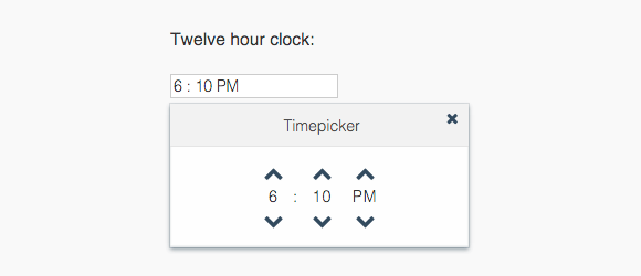
c. “Select time” is not user friendly, since the user has to type in the time with am/pm. The alternative could be using a time picker such as below instead of having users type in a time for each appointment.
d. If you have extra screen space you can show messages for conflicting appointments in the same screen and have the users resolve the conflicts, instead of opening a new tab with that information - refer to mockups for recurring appointments here.