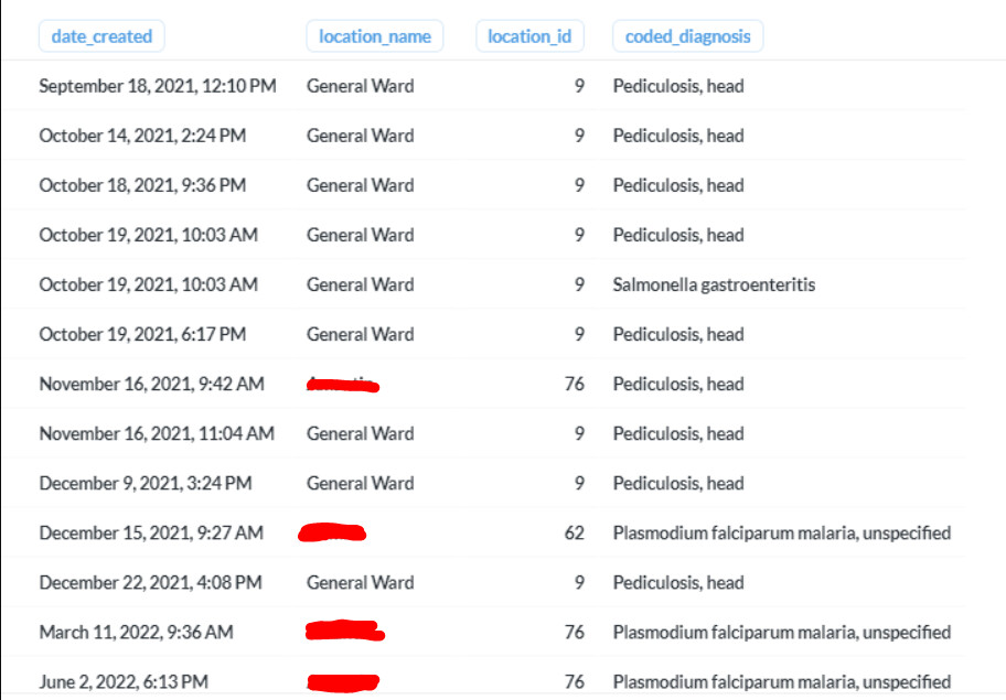
Goal: Creating a Bahmni Mart Report to aggregate diagnosis per location and time to be able to view increases on certain diagnosis based on these two criterias (location and time)
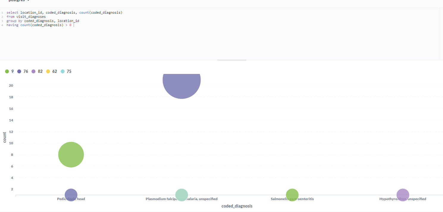
X → The Diagnosis
Y → The Location IDs
Bubble Size → The number of cases
Questions: \
How can I replace the IDs on the Chart with the actual Location Names (location_name) (I think the bubble chart wants numeric values only in its Y axis)?
I know I did not include the time factor yet, so any recommandations on a different chart type or approach would be appreciated.
Not a direct solution, but giving you some tips that might help solve this better.
It appears you are using Metabase to connect/query the OpenMRS DB directly, and you are not queryign the Bahmni MART database. Is this assumption correct? The reason I ask this, is that OpenMRS DB uses the OpenMRS Data model (OpenMRS Data Models), where-as Bahmni MART, extracts data from OpenMRS DB and transforms and then stores it into mart DB (in a flat easy to query structure). Plz confirm which one you are using… OpenMRS or Mart DB?
In this case, you are actually wanting to show multiple things: Different Diagnosis, Count of Each Diagnosis, Locations and Across Time (4 dimensions). In that case, you can choose Location as a dropdown(filter), and then bubble chart over time (x-axis) + bubbles of diagnosis (with size of diagnosis as count). Or try a Stacked Chart. See this: Which chart should you use?.
First maybe start with a table, and then see what visualisations feel useful. An Area chart can also be considered, where X axis is time (months), Y axis is count of diagnosis, and each trend line is for each diagnosis (or a selected list of diagnosis) and overall filter is location (to generate the chart).