That will be great , i was starting to look into it today but i guess it would take me much long to even figure out which class to fix ![]() ,
So your help would be much aprreciated
,
So your help would be much aprreciated
@mozzy so to fix the extended padding on the left and right side of the page, I removed the left and right padding from the body-wrapper element:
However, looking quickly at the Ref App it looks like that padding is still being applied… is the body-wrapper css being defined somewhere within the reference application module as well?
its being defined in the reference application module, but just as a scss import from uicommons.
So in the browser , the element in the uicomons is being overridden by the element defined in reference application module.
Let me try to update the ui commons dependence in reference application module to the latest snapshot and see
After testing , @mogoodrich , my analysis above is right and its better now, theres an improvement. Just that we need to raduce that padding futther.
When i look at chrome’s dev tools ,the body-wrapper css , from the reference application module ,now reflects your updates , since i have updated the ui commons dependence in the reference application module.
After , deploying above change on the qa-server , @mogoodrich , your changes can now be reflected on the qa.
But we still need further improvement to completely remove of that slight padding. Am still looking for which element is now still putting in that padding after clearing it off from the #body wrapper
@mogoodrich , i have tried out several options and the easiest option , that doesnt affect other elements, was to remove the padding from this bootsrap element here like
<div class="col-12 col-lg-3 p-0">.
Atleast ,it makes the general actions column increase a little more in width lIke below
That seems to me the most easiest hacky solution to avoid the word wraping in there , Atleast its an improvement .
And also
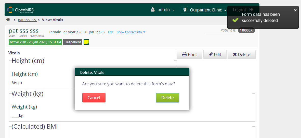
Created A ticket to correct that , and also to give a succes message when form data has been succesfully deleted
https://issues.openmrs.org/browse/RA-1693
PR here
cc @mksd
Thanks @mozzy! Yes, sorry, we had to update the uicommons dependency to pick up the change, I forget that you’d like have to do that with the reference application as well.
And I agree that there’ still more padding we want to remove… you PR to coreapps looks good, I just reviewed it. Thanks!
1 Like
@dkayiwa @mksd , could you please help look at those Prs i created above , and if possible ,merge them in so that we get close to our release
- https://github.com/openmrs/openmrs-module-htmlformentryui/pull/26
- RA-1688 : Expand General Actions Column to remove word wrap of action titles by mozzy11 · Pull Request #277 · openmrs/openmrs-module-coreapps · GitHub
Thanks
cc @mogoodrich
@mozzy I went ahead and merged the Core Apps one, thanks for digging into this!
1 Like
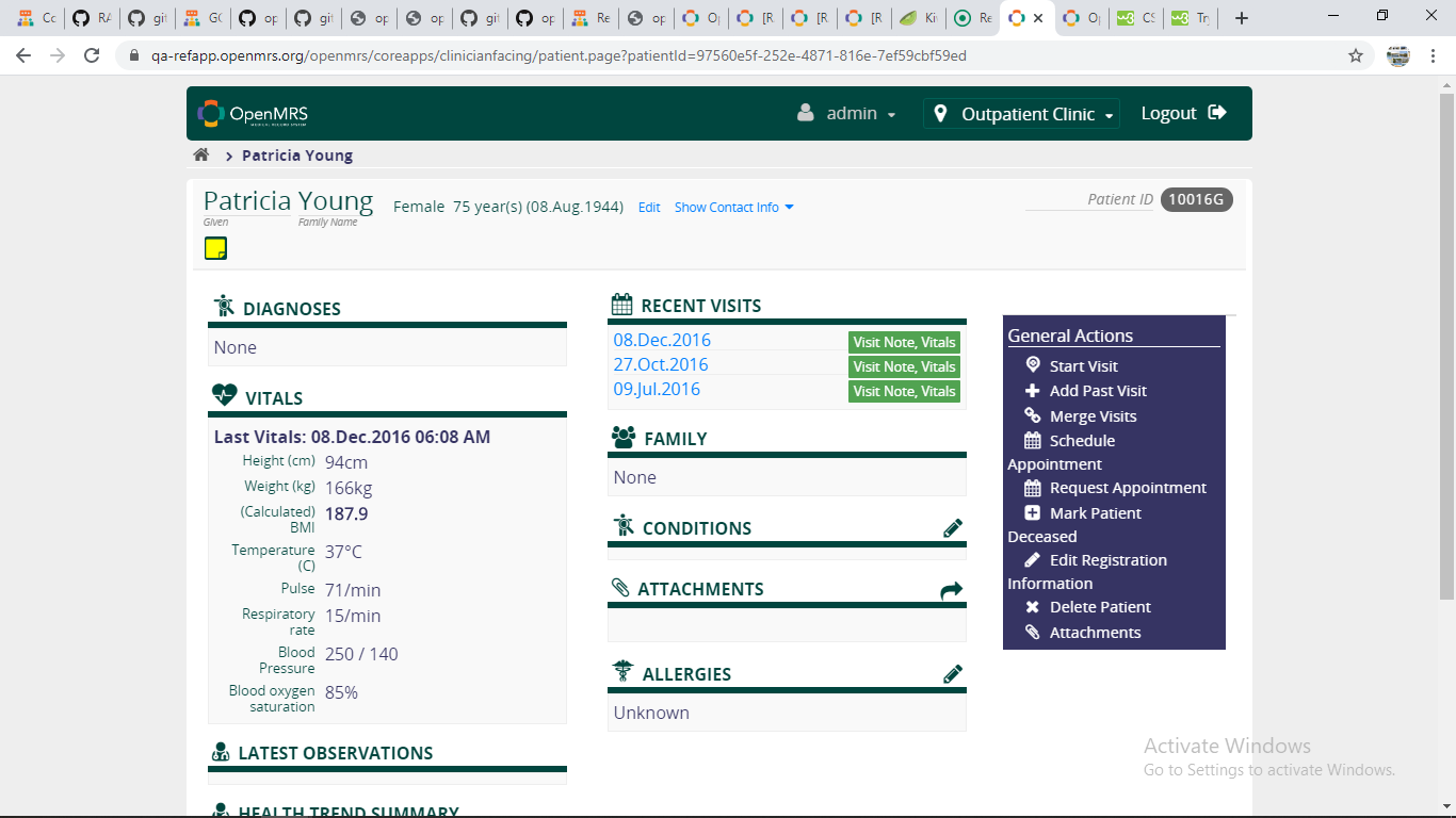
@mogoodrich @dkayiwa @mksd , are we confortable with leaving the patient dashboard as it is for now (see above screen shot) ,
Note ,in the Actions colum , its only the “Edit Registration information Action that is still over wraping”
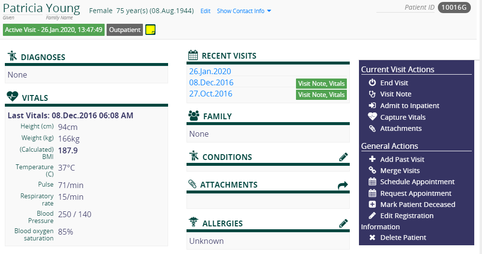
An option to improve on that , we could change the following bootstrap column ratios here from 9:3 to 8:4 , to make the Actions column more wider enough to completely remove the remaining word wraping
it would look like below
I’m fine with not extending the the actions column further. In the PIH-EMR we have different action titling, and, especially with some of the longer French names, we already have additional wrapping (even prior to the Boostrap upgrade, I believe).
What would be great would be if we could align the text better when wrapping… specifically, in the example above, it would be better if “Information” would be indented slightly so that it lines up with “Edit” instead of appearing flush left, under the pencil icon.
I would not switch from 9:3 to 8:4… it’s more important, in my opinion, for the widget columns to be as large as possible… we were dealing with some funky display issues initially after the Bootstrap upgrades that we were able to to fix by removing some of the padding, etc.
Thanks for working on this!
Take care, Mark
1 Like
That makes sense @mogoodrich , sure we need the widgets columns as large as possible
Besides the above (am going to attempt to fix) ,
is there any current issue that would block us from having the beta release this week wednesday 04/feb ??,
i would want to go ahead and release the remaining reff app modules in snapshort version , so that we can have the BETA-RELEASE tomorrow (05/feb) or on wednesday (06/feb). ??
that includes the following modules
- registration app 1.15.0-SNAPSHOT
- emrapi 1.28.0-SNAPSHOT
- reference application 2.10.0-SNAPSHOT
- core apps 1.26.0-SNAPSHO
- ui commons 2.11.0-SNAPSHOT
- html formentry ui 1.10.0-SNAPSHOT
- allergy ui 1.8.2-SNAPSHOT
- appointments sheduling ui 1.9.0-SNAPSHOT
- attachments 2.2.0-SNAPSHOT
Any objections ??
cc @ssmusoke @mogoodrich @dkayiwa @ruhanga @mksd @samuel34
Will have it resolved by tomorrow
1 Like
Ticketed that here https://issues.openmrs.org/browse/RA-1697
Fine with me.
Health Summary Trend has an issue with date overlaping the Heart Rate(HR) column…this is due to the static nature of the columns…unlike in the previous version when they were flexible depending on the content size…Can this be fixed too in this release. @mozzy @ruhanga @dkayiwa
1 Like
@reagan , go ahead and create a ticket , ill make it ready for work and you go ahead to fix it. Thanks for discovering it
@reagan done