Thoughtworks is excited to announce an initiative to uplift the Bahmni User Experience, starting with the clinical app, introducing a split-screen view for consultation and patient dashboard. This enhancement is a step towards modernizing Bahmni and improving the experience for clinicians.
Reasons for the Change
We had been receiving feedback from our clinician users over time. The current Bahmni patient dashboard, while flexible, does not fully align with modern clinical workflows and expectations. Clinicians have had the following complaints:
Navigation is hard
Tab switching is painful
Lots of info to be filled. Easy to lose context.
Disconnect between dashboard and consultation
Forms can get too long
Medications tab is limited and complex
Not good for mobile screens
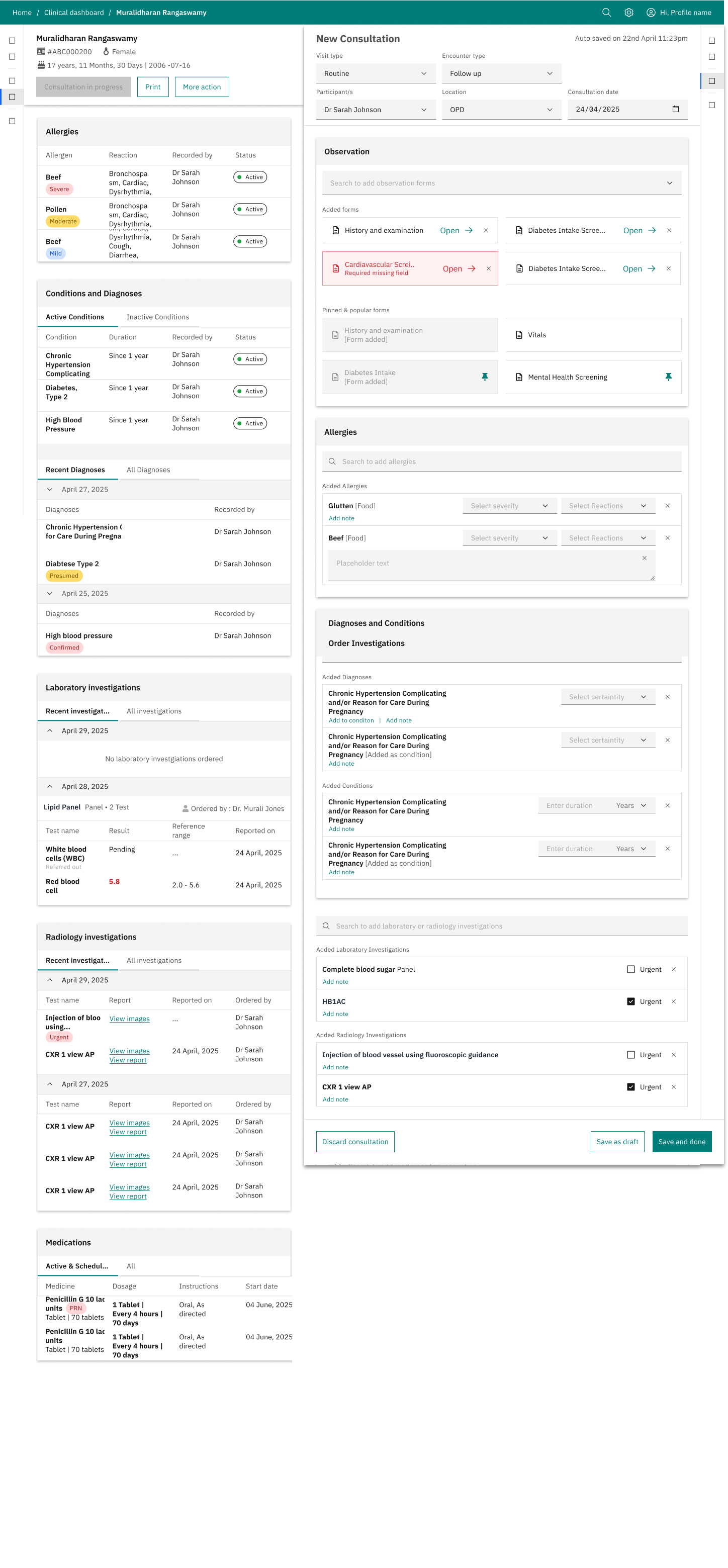
The introduction of a split-screen view addresses many of these points by simplifying navigation and providing relevant information in context. It allows clinicians to view patient history and record observations/write prescriptions side-by-side, providing the relevant context, reducing cognitive load and enhancing efficiency.
Beyond improving the user experience, this UX uplift provides an opportunity to modernize Bahmni’s underlying technical architecture (Angular JS.14). The current Bahmni codebase is over 12 years old, which has led to:
Increased Maintenance Costs and Complexity
Restricted ability to quickly integrate new features and respond to evolving market demands due to the legacy technical stack
The technical limitations have directly contributed to the outdated look and feel of the current interface.
By moving to a split-screen view, we are not just changing the interface but we are leveraging this opportunity to adopt a modern technical stack. This modernization effort will allow Bahmni to support future innovations, and continue to serve the evolving needs of our users. Eventually we hope to move all the Bahmni implementations to the new UX.
What you can expect
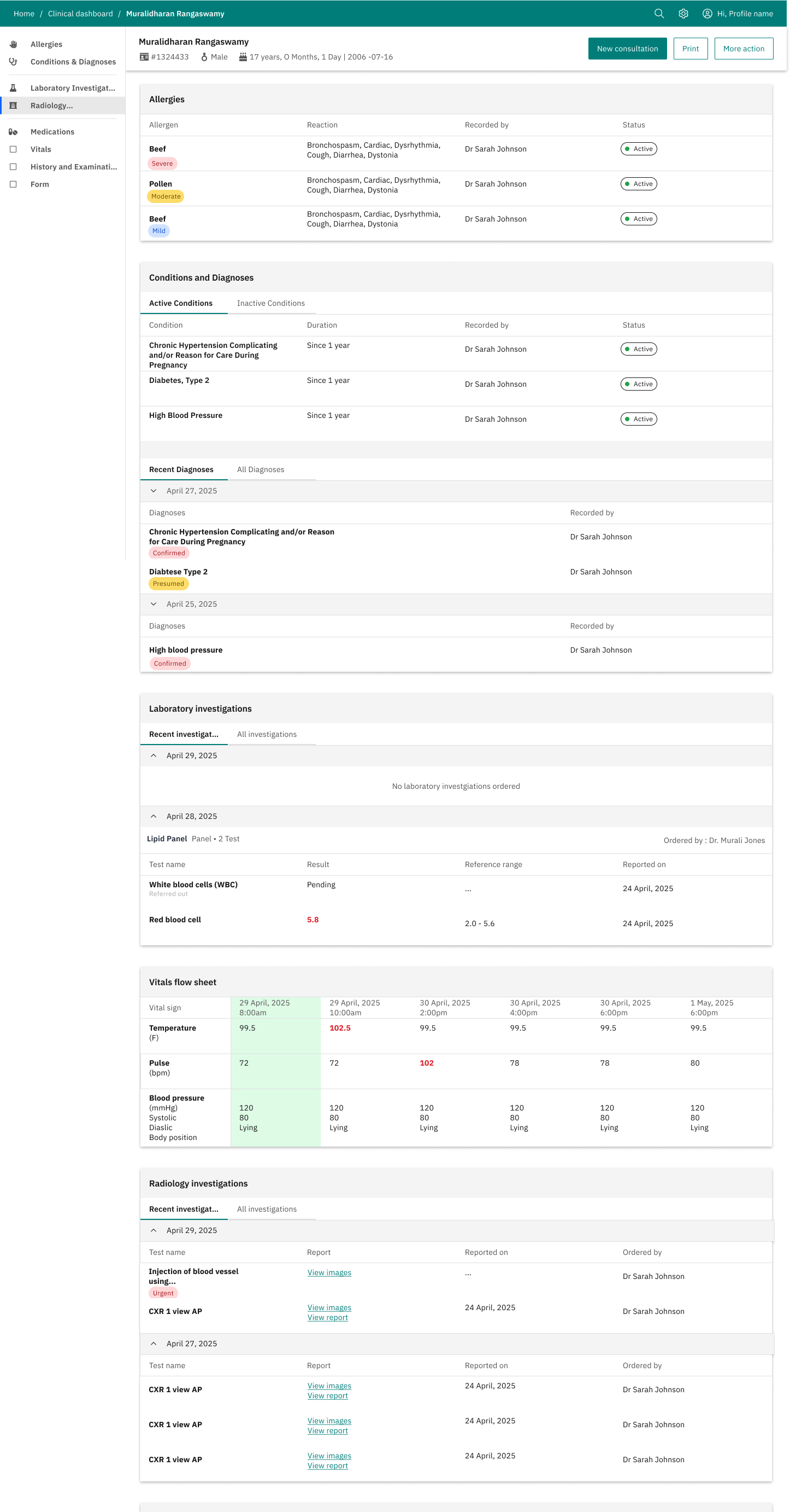
Here are a couple of screenshots for what the fully developed clinical interface could look like.
Yes, and no. The new UX is designed for screen sizes 7” and above, so it’ll support tablets but not mobile phones. We think Mobile phones require different UX altogether and we would rather build fit-for-purpose apps
Would this be more performant?
Yes, but we have not done any performance benchmarking yet so we do not have any statistics at the moment.
Would it be backward compatible with existing app configs?
Yes, but there would be some updates to the app configs. We will come up with a migration path when we are ready for a release.
Are we looking to migrate other modules?
Yes, migration of other modules is on the roadmap.
Is there an environment where I can try out the new UX?
Not available right now, but we are working hard to make this publicly available as soon as possible. We will post an update on this thread when it’s available.
What we expect from the community
Please comment on this thread and share your views and feedback with us.
@akhilmalhotra in Ozone, we offer both O3 and Bahmni (EMR) as options for the EMR app within the HIS.
This dual option within the OpenMRS ecosystem is easier to support when both O3 and Bahmni (EMR) share similar (ideally identical) backend configurations, particularly in terms of the following assets: Core, REST WS, and most importantly, the FHIR2 module.
My question is: will this evolution lead to an increase backend convergence between O3 and Bahmni (EMR)?
@mksd I would really really hope so. For the new frontend, the team has decided that FHIR is going to be API standards that is to be supported. I believe there is already some extensions, and in near future, various first level models like Immunization, Procedure, DocumentReference etc are going to be worked on.
@tendomart yes. we hope to follow the Atomic design, and simple module breakdowns, that are to be published on npmjs. I believe there is still work to be done, and its early days. Please provide your feedbacks when the source code is available.
mainly that. also, we already have some parts of IPD, Lab Entry built on Carbon. But this time around, we decided to be lil smarter. We are keeping an abstraction over the carbon components, so in case, we do want to spend a lot of time modifying all across the system in future - we can make the changes much faster. Plus we werent focusing on Mobile phone. There’s also Polaris (Shopify), which seems to have a wide following.
First and foremost, my hearty congrats and all the very best to the @akhilmalhotra and entire bahmni team.
Some points:
It looks way too similar to OMRS’s latest version. How much have we deviated from or taken cues from them, especially on the UI aspect?
While developing, kindly make sure there is an option for implementing customization as modules (example: WordPress and extensions). This would pave the way for powerful customization and upgrades from third parties, which they can even monetize if needed (e.g., WhatsApp integration, QR code generation, etc.). These will not fall under your “to-do list,” but hospitals may need them in the current era to make life easier for staff and doctors.
Instead of making everything customizable only through coding, I really wish the admin page inside Bahmni can be used to customize what gets shown and what does not. This should be the central point for configuring Bahmni for each hospital/clinic. Examples:
From your screenshot, there should be an option to rearrange sections (Allergies, Conditions, Diagnosis, etc.).
Define what is most needed in a new consultation — either for lengthy history-taking or fast OP disposal.
Color scheme changes. Logo uploading , hospital specific customization..
Ability to add/remove - Enable/disable extensions/add-ons, etc.
Please discuss or arrange a meeting among developers and doctors to define what is most needed in this UI. That will give a clear-cut approach.
YES, please change the Medication UX. Bring back the Bahmni NEXT version — it was pretty cool and fresh.
I do agree that when it moves to smaller mobile screens, UI development can become strenuous. In that case, I would propose developing a suitable app that simply works as a wrapper for the main website. Even in my current setup, I have deployed a few tablets and some mobiles for staff data entry. Having Bahmni cater well to mobile devices is the right direction. The current Bahmni UI is already decent in adapting to different screens.
Please move away from OpenELIS. It’s pretty hard to code(thats what developers told). The current way of printing reports (not being able to group them, arrange them in order, or print specific panels on each page etc) needs to change.
Kindly look into other major commercial software before starting a roadmap. It might give valuable insights into what needs to be integrated into base Bahmni. One example is the growing need for integration with social platforms like WhatsApp, etc.
Define a clear workflow before starting the UX redesign. Even now , appointments , IP module (careview) , etc seems very disconnected.
From the screenshot , (too early to comment) , we need to have unique color for specific permanent modules like , for eg : blue for consultation , red for medication , green for observation/conditions/diagnosis .. etc. This will give a clear permanent visual cue to search for color for specific data. having dual color or bland design will get confused when data keeps filling up.
@akhilmalhotra I’ve been pointed to this thread by another person in your team, so I’m keen to also understand the timeline for this if you have more clarity on it now.
Hi @daniel1 I can’t promise a date but we are making steady progress. We give progress updates in our PAT calls every Wednesday. Looking forward to see you there.