Hello all…
Within the appointments app, we provide two similar tabular views that display Today’s appointments: one within the “Home” context and one within the “Appointment” context.
The layout of these tables is inconsistent, and, more problematically, the actual actions that happen when you click on options like “Check-In” and “Complete” vary between the two pages.
After discussions with @aojwang we have decided that it makes sense to replace the table rendered in the “Home” context to use table used within the Appointments view (or, at minimum, change the Home view so that the actions are identical). We just wanted to run this by the community in case there were any other users of the appointments app that may have objections to to this.
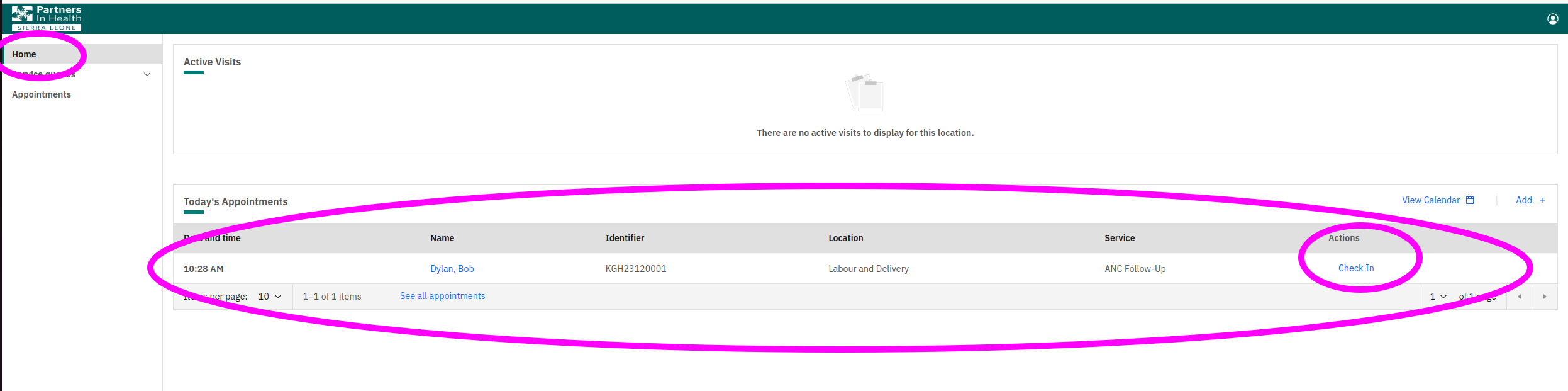
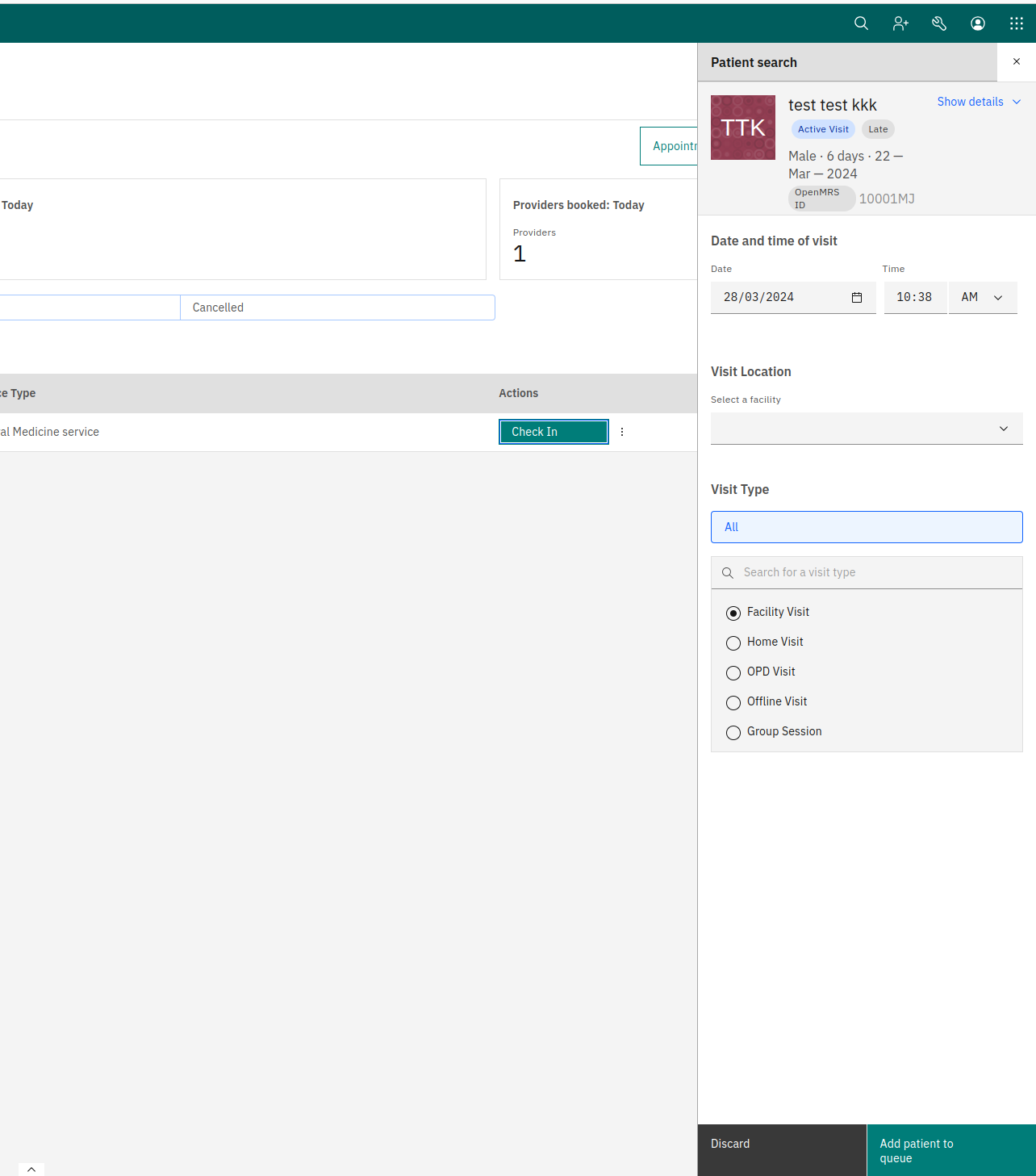
Here’s what the “Home” view looks like:
And, as an example, what happens if you click on the “Check-In” from this page:
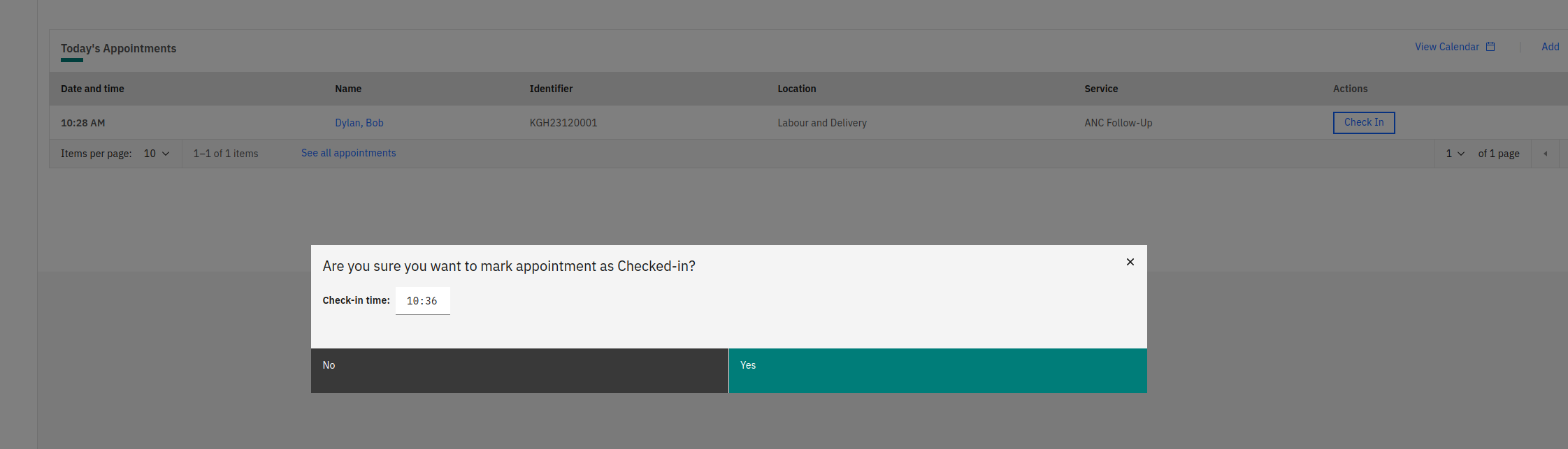
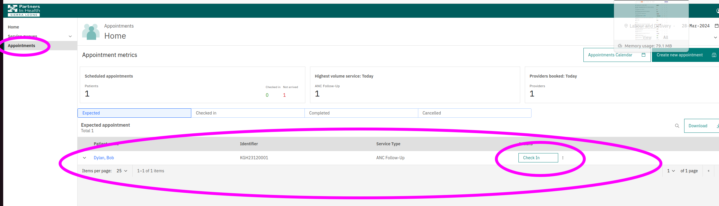
While this is what the Appointments view looks like:
And what clicking on that Check-In link does:
We plan to change the “Home” view to perform in the same way as the “Appointments” view. (And then can continue to make refines to the “Check-In” and “Complete” behavior, while making sure they stay consistent between the two views).
Please me know if there are any objections.
@grace I lost of the list of people I was supposed to flag on this, could you potentially flag the relevant parties? Thanks!
Thanks and take care, Mark