I’m working on the GSoC project “Improving functionalities of DHIS Connector Module” and Location Mapping feature is a major part of my project. So I have designed few layouts for the Location Mapping User Interface.
-
A drag and drop UI:
With this layout, users can drag an org unit and drop into the corresponding Mapped org unit slot. But this may be not practical with DHIS2 instances which have many Org units.
-
A layout with a location mapping table
With this layout, users select the OpenMRS location and corresponding Org unit from drop down list and can press the submit button to save the mapping. In this method, users will have to add the mapping one-by-one. And if the users need to update a mapping, they’ll have to delete that one and add it again.
-
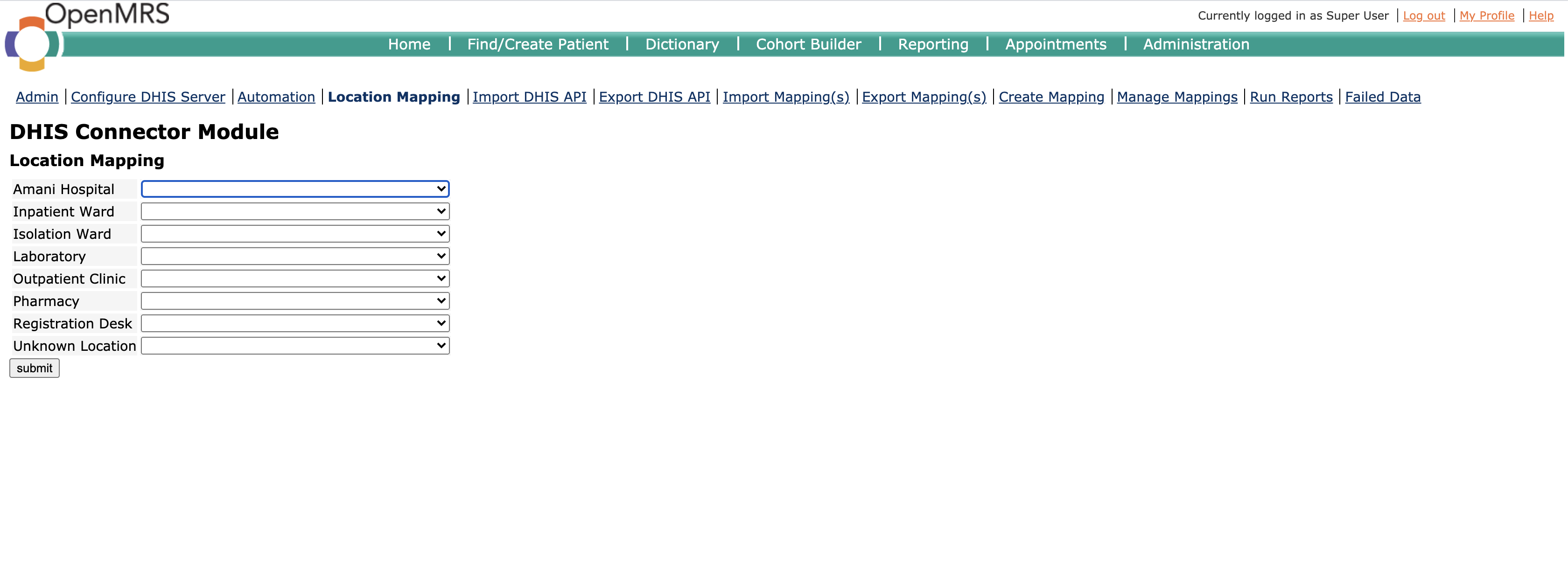
A layout with all locations
With this layout, users can select the mapped dhis org unit of each location by using the dropdown list. And users can update the mappings whenever they need.


At first I thought the first one is better, but now i feel that it’s not much user friendly. I showed these layouts in the weekly meeting with my mentor last week and had some suggestions .
I would also like to hear your suggestions about the location mapping UI layouts.