Hello everyone,
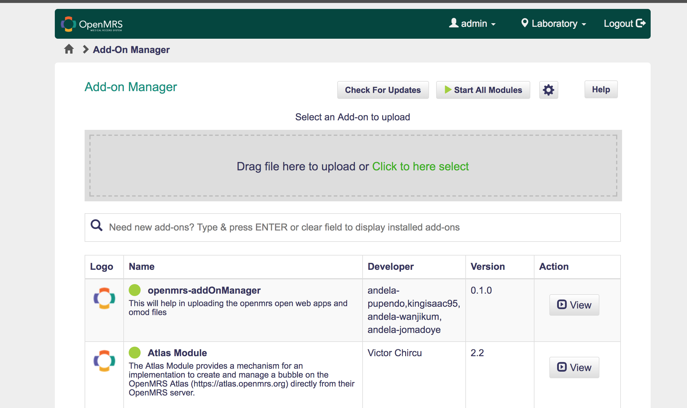
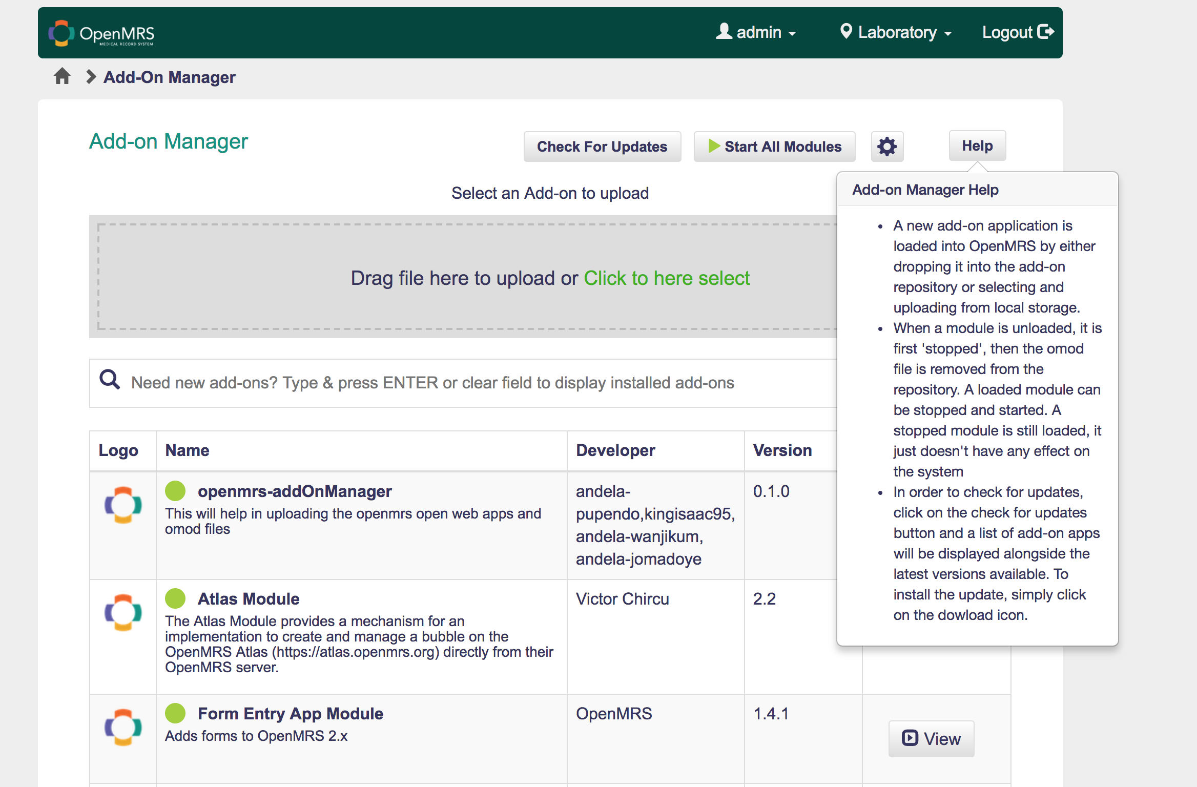
In order to add the Add-on manager help text, we were thinking of modifying the Add-on manager UI as illustrated in the attached template images. We’d really appreciate your thoughts and suggestions on this.
Hey, I like the idea but maybe I would suggest that you combine the settings and the help button into one drop-down button instead of having lots of buttons on the UI. But it still looks good.
@annette I like the idea of the help button, it goes a long way to guide the user when a user is confused as to how to navigate through the page. The visibility makes it unique, so a user wouldn’t find it difficult to locate a help button. I don’t think it is too much for the buttons on the page.
@annette I think the help should be in a less primary position (e.g. in the settings menu) because the help is not something used with a recurring role. It will mostly be unimportant to a user on subsequent visits
@annette So here are my thoughts on the help button:
It is definitely needed but it doesn’t have to be on the main view. I am thinking it can be mashed with the settings button - popping up a drop down menu with the options of either the help or the settings menu.
The apps user interface and user experience should be all the help the user needs 80% of the time, If the user needs to click the help button everytime to understand the app’s functionality, then we need a top down revamp of the design.
There are also some javascript onboarding libraries like intro js, hopscotch that gives new users a basic rundown of the apps functionalities. They are more detailed because they hover on each button/input and give a summary of what each does. Something to look into.
Great job in trying to smoothen the ease of use of the app.