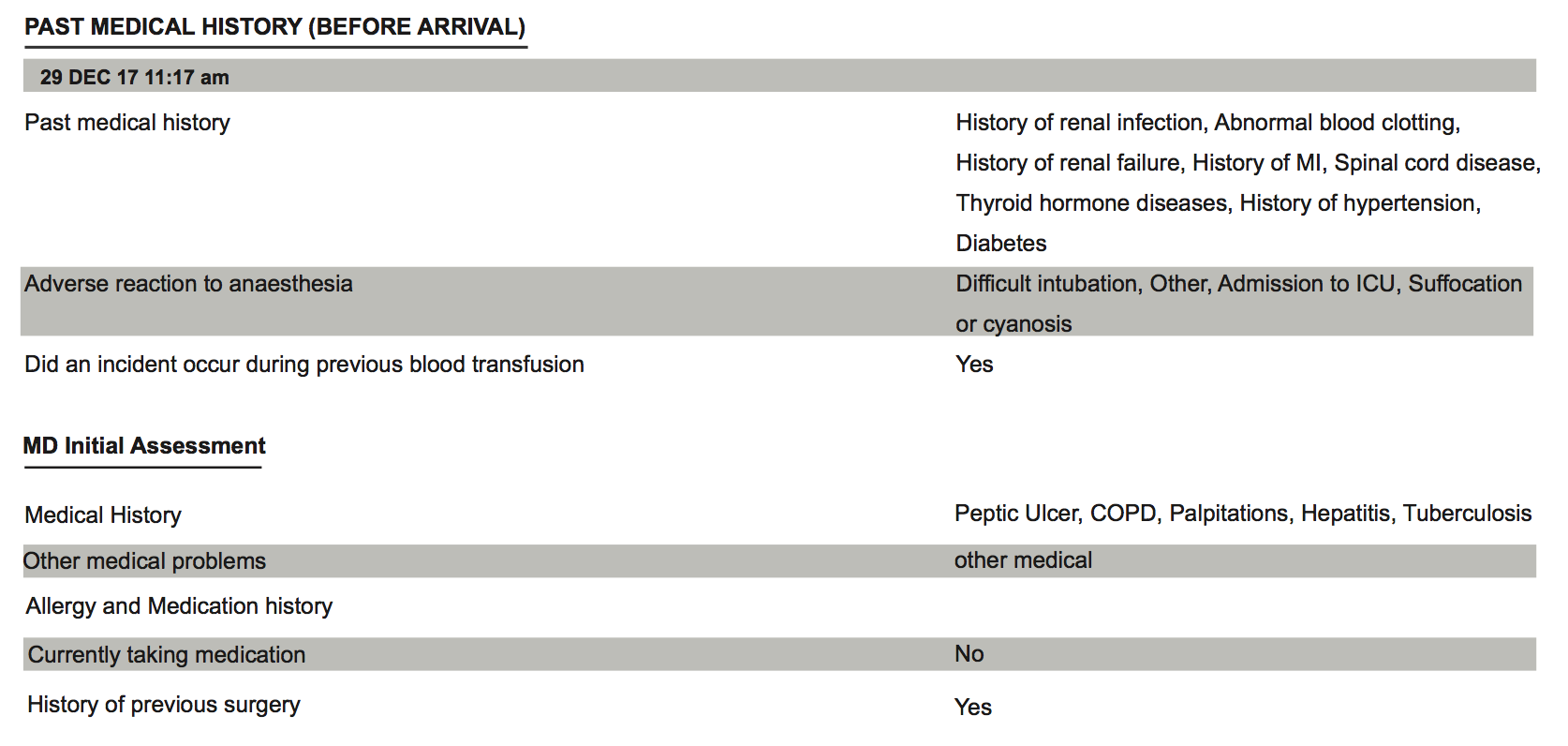
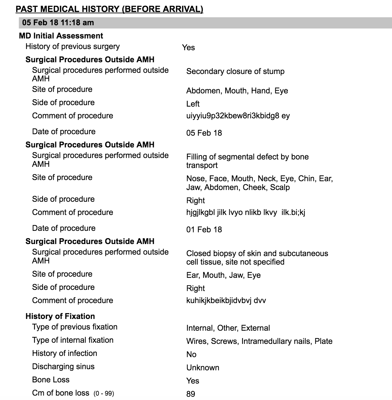
Currently we have 17 implementations that are based on 0.88 version of Bahmni. The print from the beginning of the implementations has alternate colouring in print summary. As part of an upgrade to 0.89 we don’t see this feature of alternate colouring in print summary. This will highly effect the readability and our clients may not be happy with this. It would help us a lot if we can get a patch fix in 0.89 for this.
And i think that is intentional for the reason i described above. It’s a feature not a bug!
I am not sure how to meet both the needs. And i still feel wrapping on the right for this multi-autocomplete type concepts might not be the best solution. It might be better to give it a first class treatment.
If it’s reported that alternate colouring existed and was solving the problem, i guess then the code is different for discharge summary and patient summary (wouldn’t expect so) because i have never seen this in discharge summary and i guess patient summary is being used only by the implementation in question. if alternate colouring was serving the purpose for the implementation then we may choose to fix the regression as temporary solution though reiterating that alternate colouring and right indentation feel too simplistic solutions for this to me.
If alignment fixes the problem in some implementations and some implementations don’t need it, do you think it would make sense to make it configurable on the print?
have a config like “alignAnswersOnRight” and default it to false?
If this is true, I feel like this is a regression, and you should be free to bring back the alternate coloring. (Though I also agree that this may not actually be good when printed.)
Could you clarify what you’re asking for here?
Are you suggesting that all answers in the summary would be right-aligned? This seems like a big decrease in readability, because a user can’t scan down the answers with the left alignment to anchor them.
I think the correct quick-fix is to have “Fracture of…” be to the right of “Surgical Diagnosis” instead of below it, i.e. something like this:
Surgical Diagnosis  Fracture of bone following insertion of orthopedic
                    implant, joint prosthesis, or bone plate ...
@pramidat While this looks good, I think it wastes a lot of space and paper when printed. Any particular reason why the answers are given less space (40% or less) Since it is the answers which are word wrapping, it would help to give answers more space.
What about a reverse of space allocation? say 1/3rd to questions and 2/3rd to answer text with maybe 5 px divider. And let Questions and Answers to word wrap in respective areas.
Section headings, Groups, form headers can continue to use the whole length of the page since those demarcate sections/ headings and help improve readability.
If this is true, I feel like this is a regression, and you should be free to bring back the alternate coloring. (Though I also agree that this may not actually be good when printed.)
Thanks @darius , alternate coloring did exist in 88 and if we do look into trying to bring it back and since some of us do not like the idea of alternate coloring, should we make it a configuration, if it’s an absolute must at our end?