One idea: if the specific goal is responsiveness then we could try adding only the grid portion of bootstrap’s CSS to our own uicommons. (This thread implies we can just import these into the existing SASS build process of uicommons’s CSS.)
Since I’m very familiar with how the current style guide is built, I also took a stab at incorporating bootstrap onto this screen.
Executive Summary
- It’s not too painful to do
- The actual process involves swapping classes from the uicommons style guide for classes from bootstrap.
If we were to do this for the entire refapp, we have to do one of:
- (a) keep both bootstrap and uicommons, which is bloated, and likely to have conflicts
- (b) remove the uicommons styling from the distro, and change all refapp (and PIH, and Mekom, etc) modules to use bootstrap classes, which is a lot of work, and maybe not feasible across all these groups
- (c) leverage bootstrap-sass and rewrite the existing uicommons styles to use bootstrap’s mixins. This requires actual thinking, whereas the other two options are pretty brute-force.
- (d) do things on a page-by-page basis, e.g. new pages and pages that we fully refactor can use bootstrap natively, but take an approach like (c) for existing pages
Details of what I did:
Open a patient summary on demo.openmrs.org in Chrome and do Inspect Element. Then…
- On
bodydisable themax-width:1000pxrule (have to do this twice because our CSS seems to be duplicated)
- this one change actually allows the entire UI to correctly stretch to larger window sizes. (I can’t believe we never tried this before. @mogoodrich, @mseaton FYI )
- Add bootstrap (from a CDN at the top of the
<head>
- this actually breaks some of the good effect from the previous change
- Find
<div id="content" class="container">and change the class tocontainer-fluid.
- this fixes the patient header, but not the content
- Find the next
<div class="container">and change the class torow.
- we’re back to where we started without bootstrap (i.e. it correctly scales bigger)
- now, to handle scaling down…
- Find the two instances of
<div class="info-container column">that represent the two columns and replace the class withcol-md-5 col-sm-6 col-xs-12 - Find the
<div class="action-container column">and replace the class withcol-md-2 col-xs-12
- FYI this means that:
- md: on normal displays all 3 will be next to each other with relative sizes 5/5/2
- sm: on tablet-sized, the two columns will fill the container with equal relative sizes of 6/6
- xs: on mobile-sized, each column is full-width (12) hence stacked.
This actually worked pretty well!
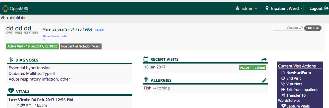
Here is the very wide screen:
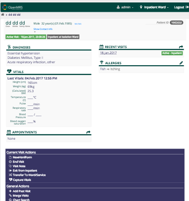
Here is virtual ipad:
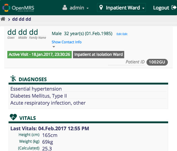
And here is a tiny window size:
(on Chrome’s virtual iphone it actually looks the same as on a tablet; I don’t know why)