Hey guys,
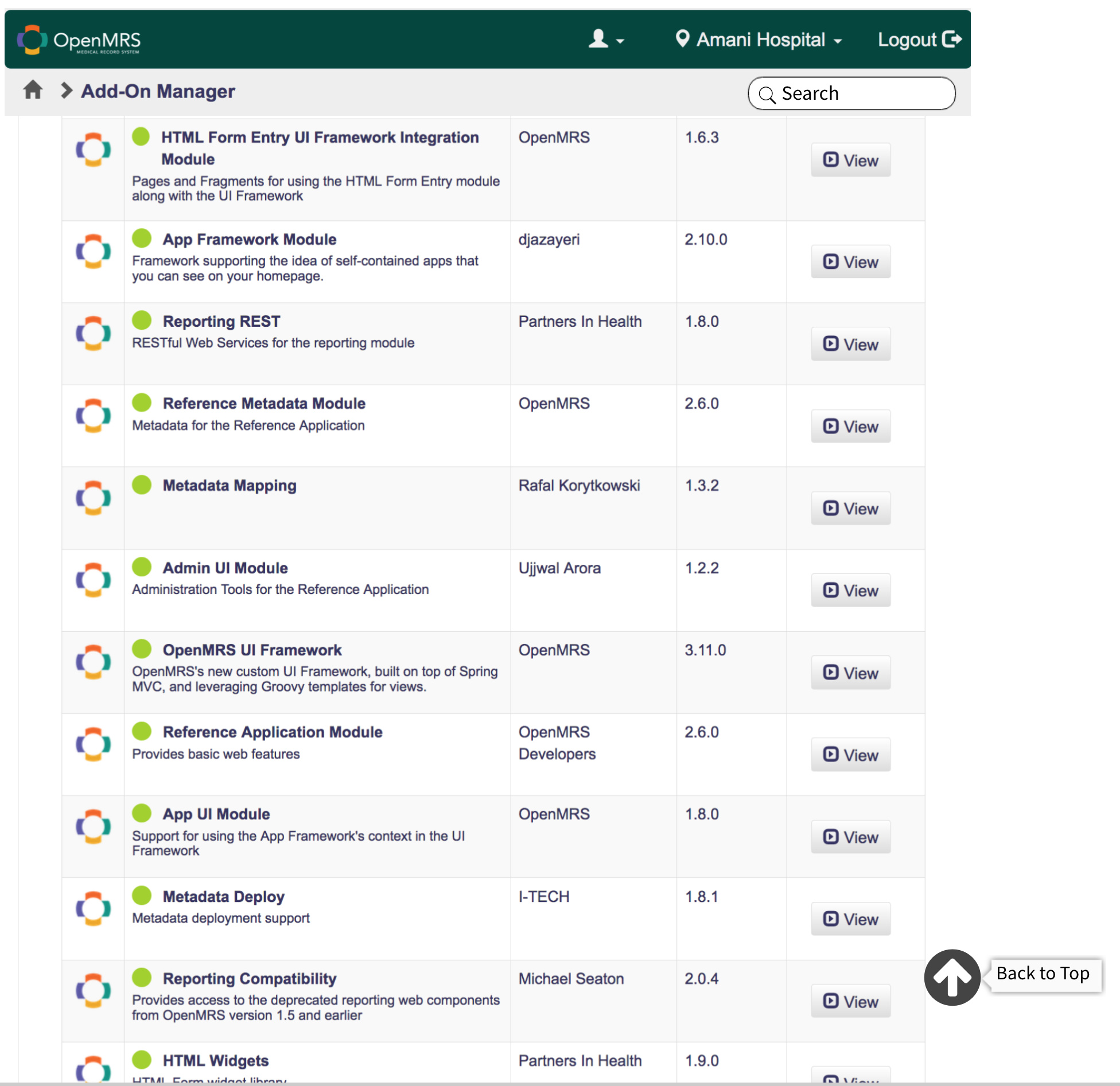
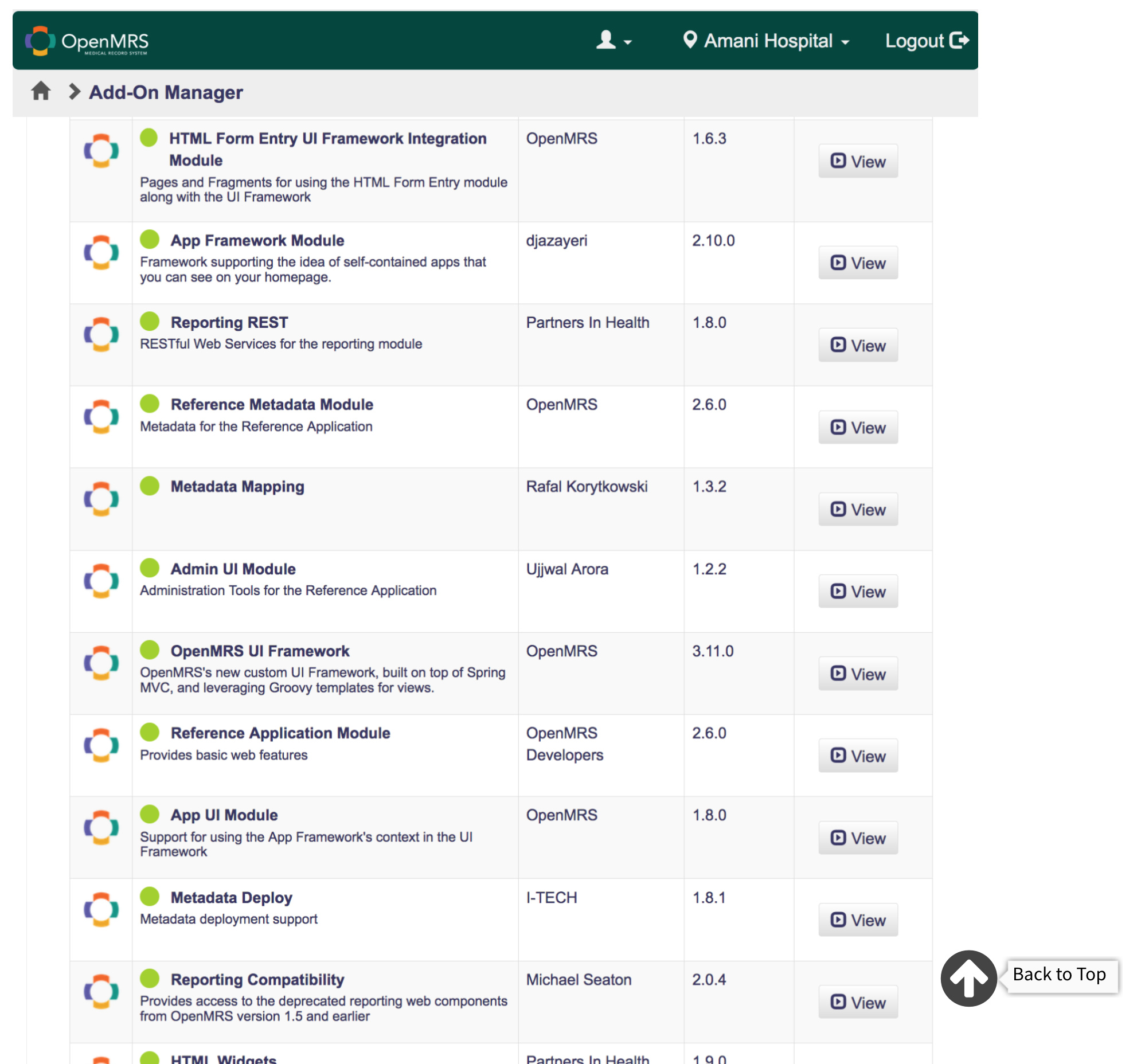
On the current User interface of the Addon manager whenever a user scrolls down there is no sticky nav bar and the user only has to scroll back to the top for navigation.
I have created two sets of mockups giving the app a sticky nav bar and an option to scroll back to the top.
we would like your suggestions and views on this issue.
I totally agree with @annette on this one, having a search button on the sticky navbar means better experience for the user, as they do not have to scroll back up to search for a addon. The back to top button makes a lot of sense too. The second mockup is a better choice for me.